EN
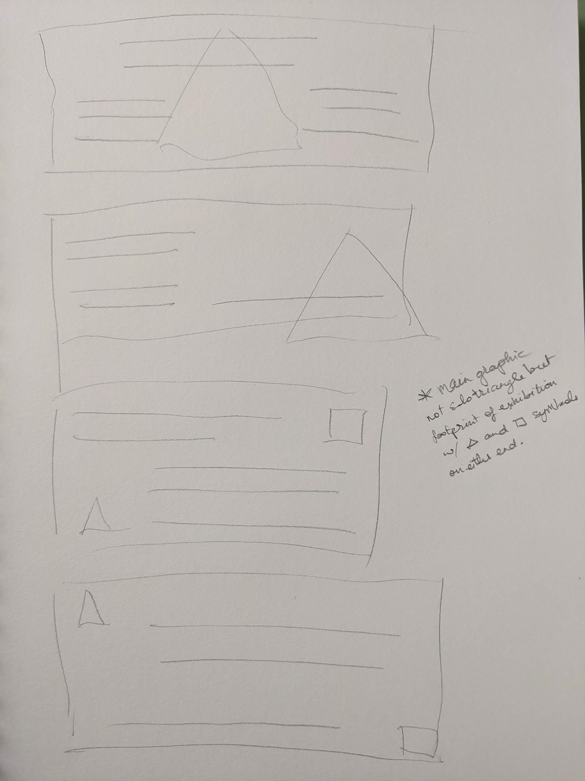
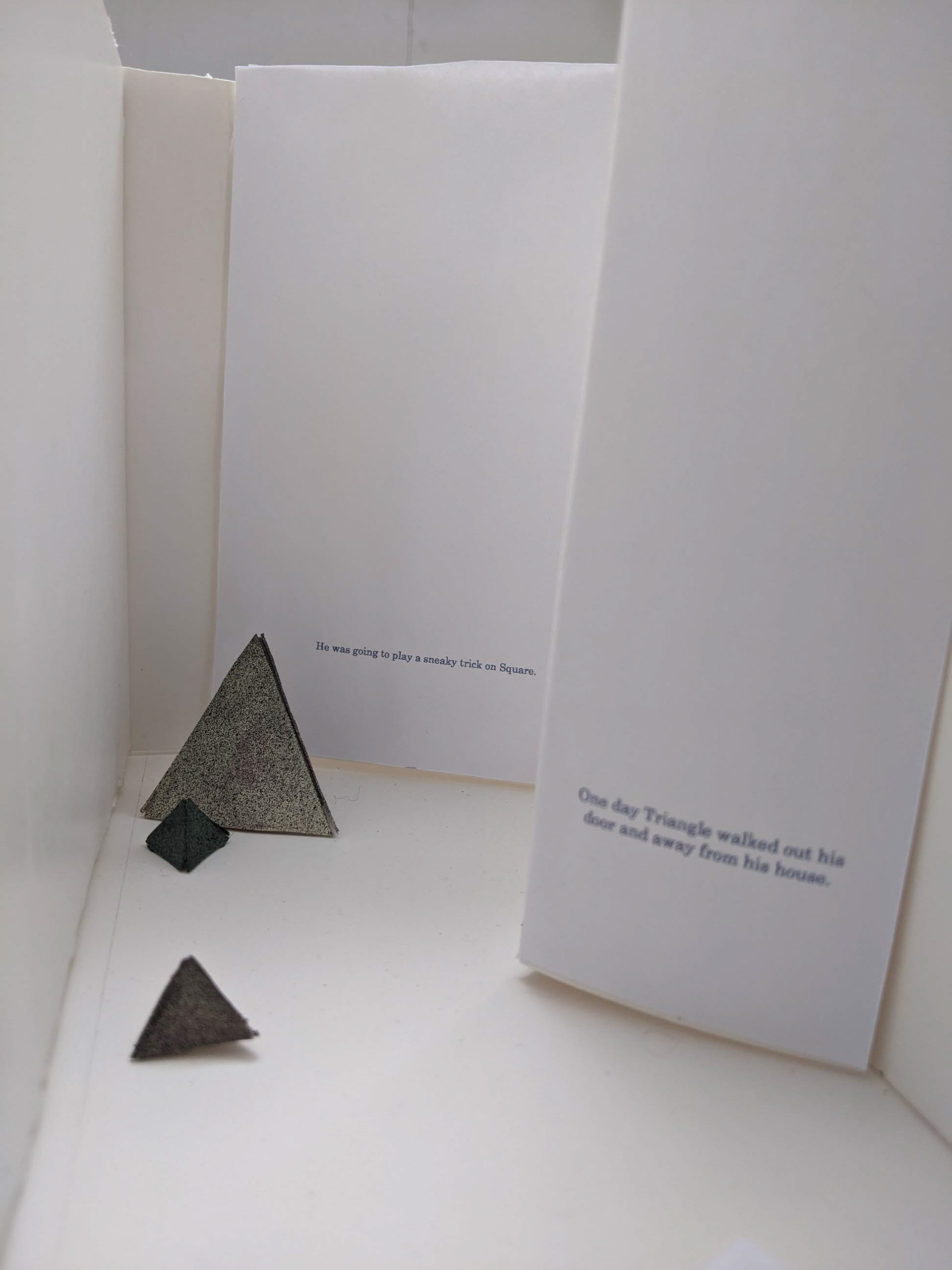
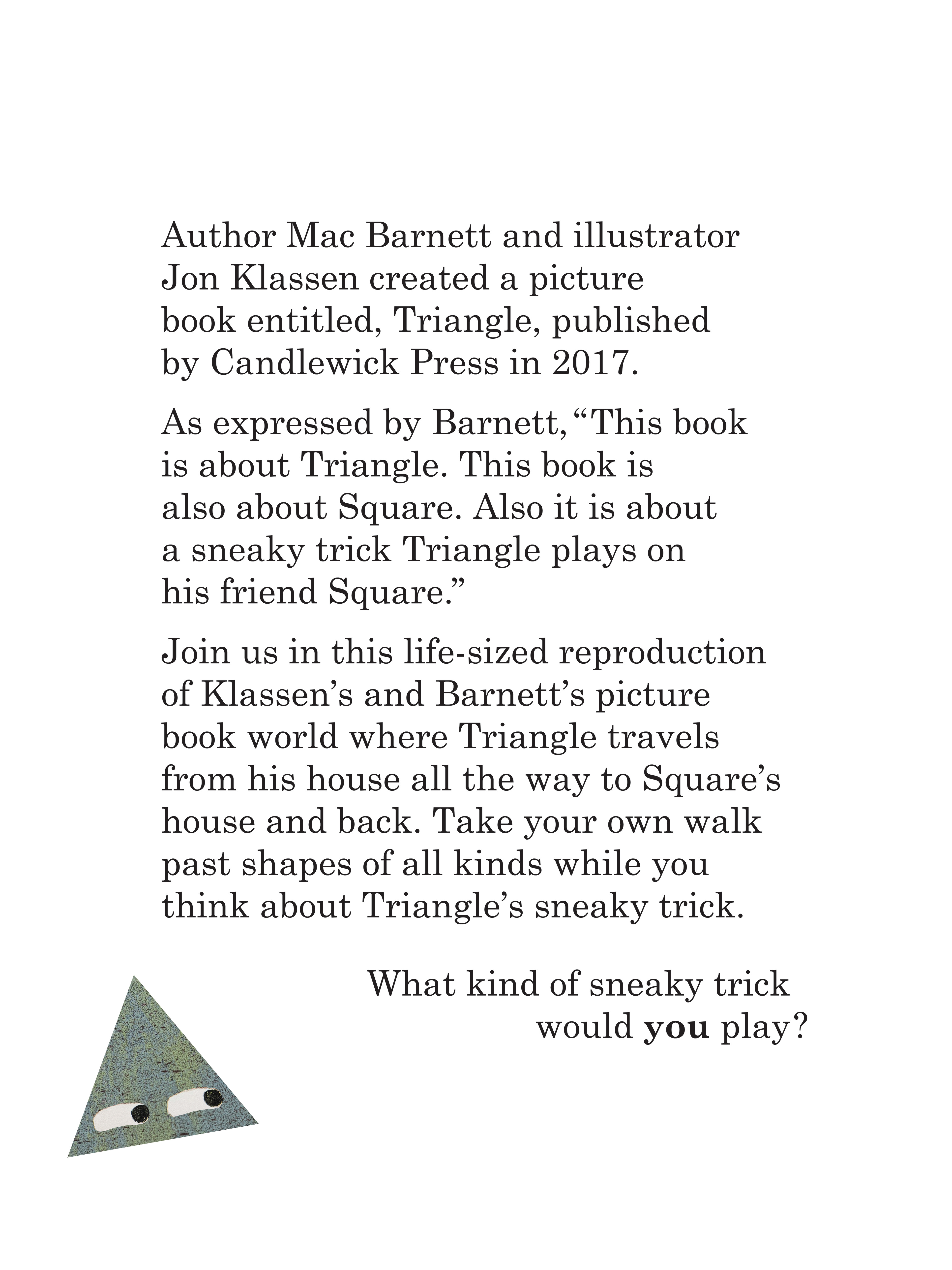
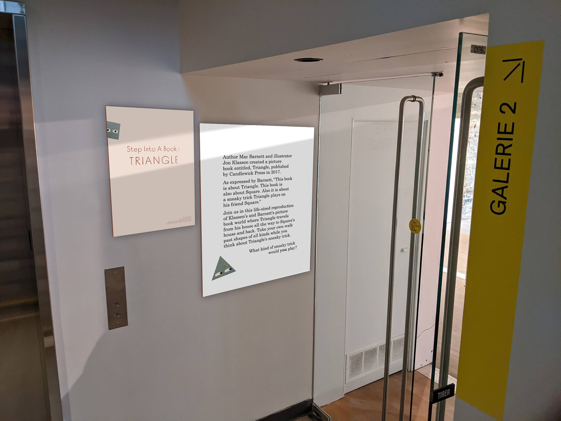
The context for this capstone project was to create a museum exhibition touching on picture book illustration. The concept was that visitors feel like they have stepped into Mac Barnett’s and Jon Klassen’s picture book, Triangle. The content included the physical foot-print of the exhibition, devised to entice visitors to walk through, and the location of tangible and typographic elements within the exhibition.
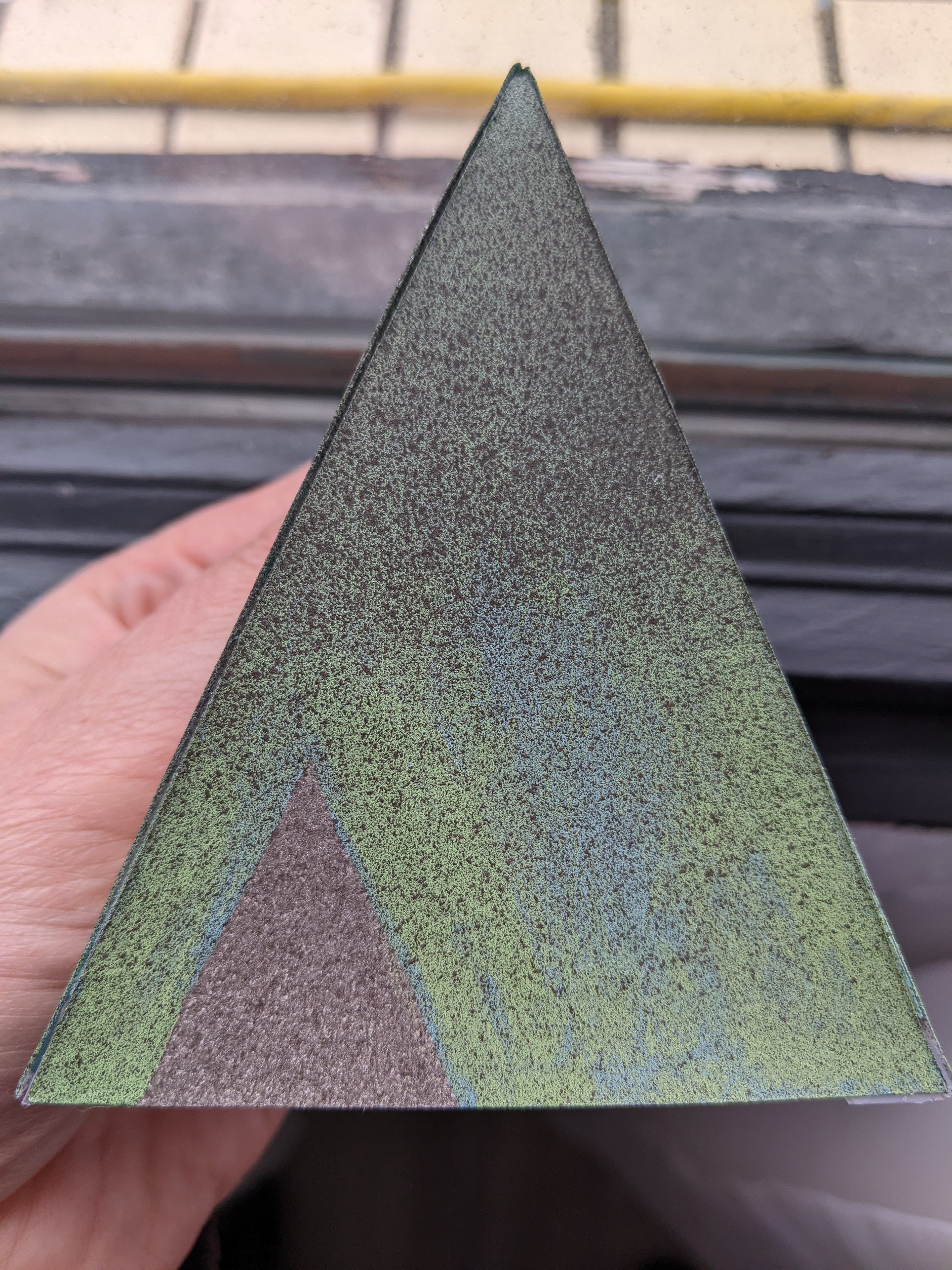
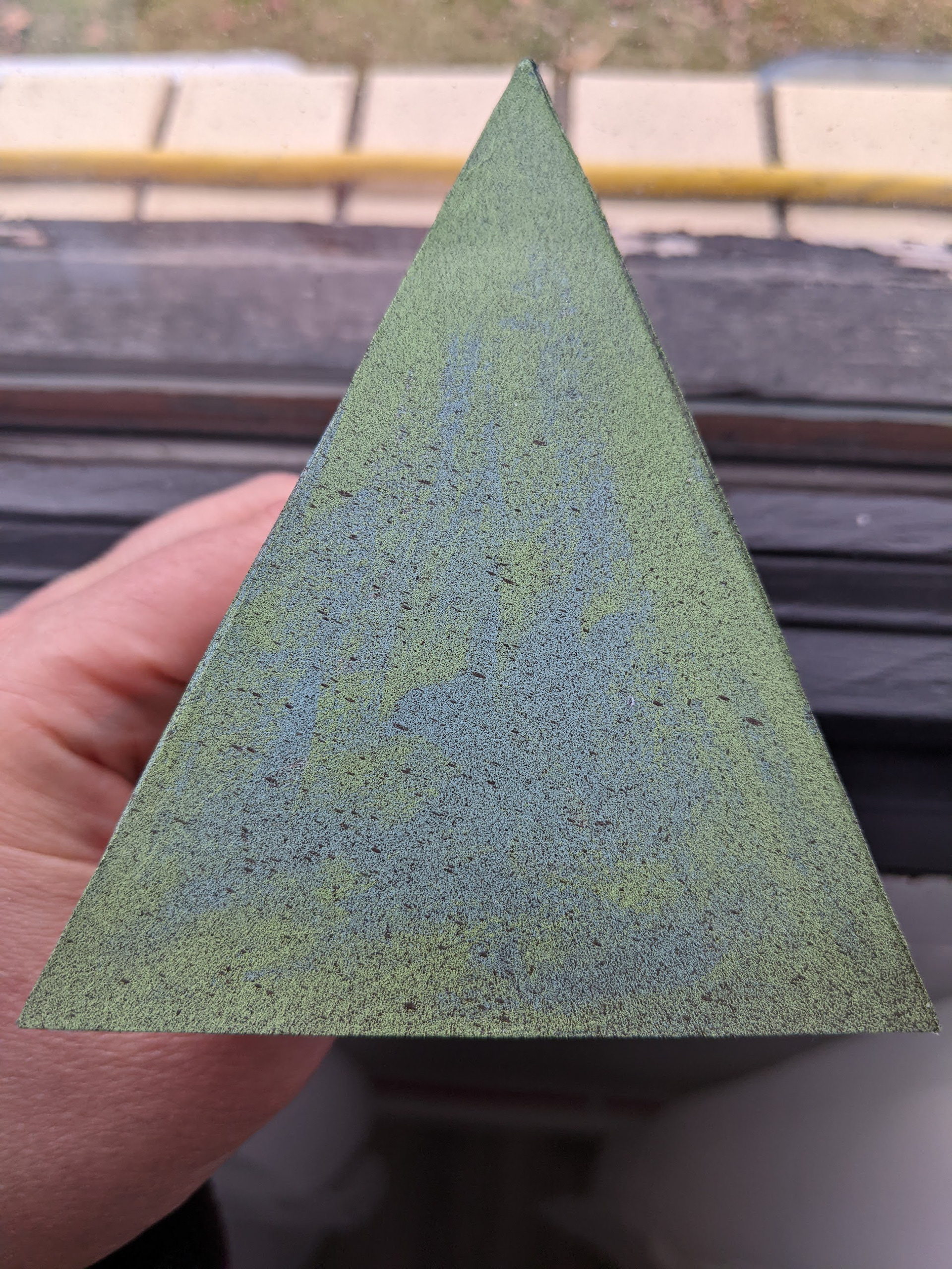
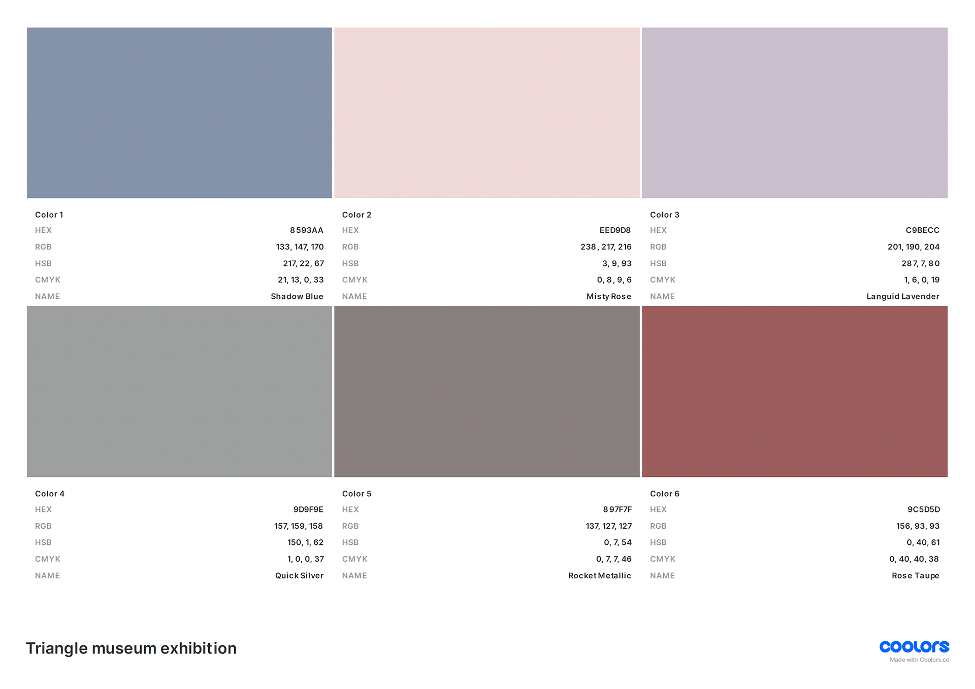
The color palette and general aesthetic of Klassen’s illustrations were respected, and the two-dimensional geographic structure within the book was developed for a three-dimensional exhibition.
Introductory and promotional designs were additionally created.
FR
Le contexte de ce projet de fin d'études était la création d'une exposition muséale autour des albums jeunesses. Le concepte était que les visiteurs aient l'impression d'entrer dans l'album jeunesse, Triangle, de Mac Barnett et de Jon Klassen. Le contenu comprenait le plan de l'exposition, conçu pour inciter les visiteurs à la parcourir, ainsi que l'emplacement des éléments tangibles et typographiques.
La palette de couleurs et l'esthétique générale de Klassen ont été respectées, et la structure géographique bidimensionnelle du livre a été développée pour une exposition tridimensionnelle.
Des visuels d'introduction et de promotion ont également été créés.
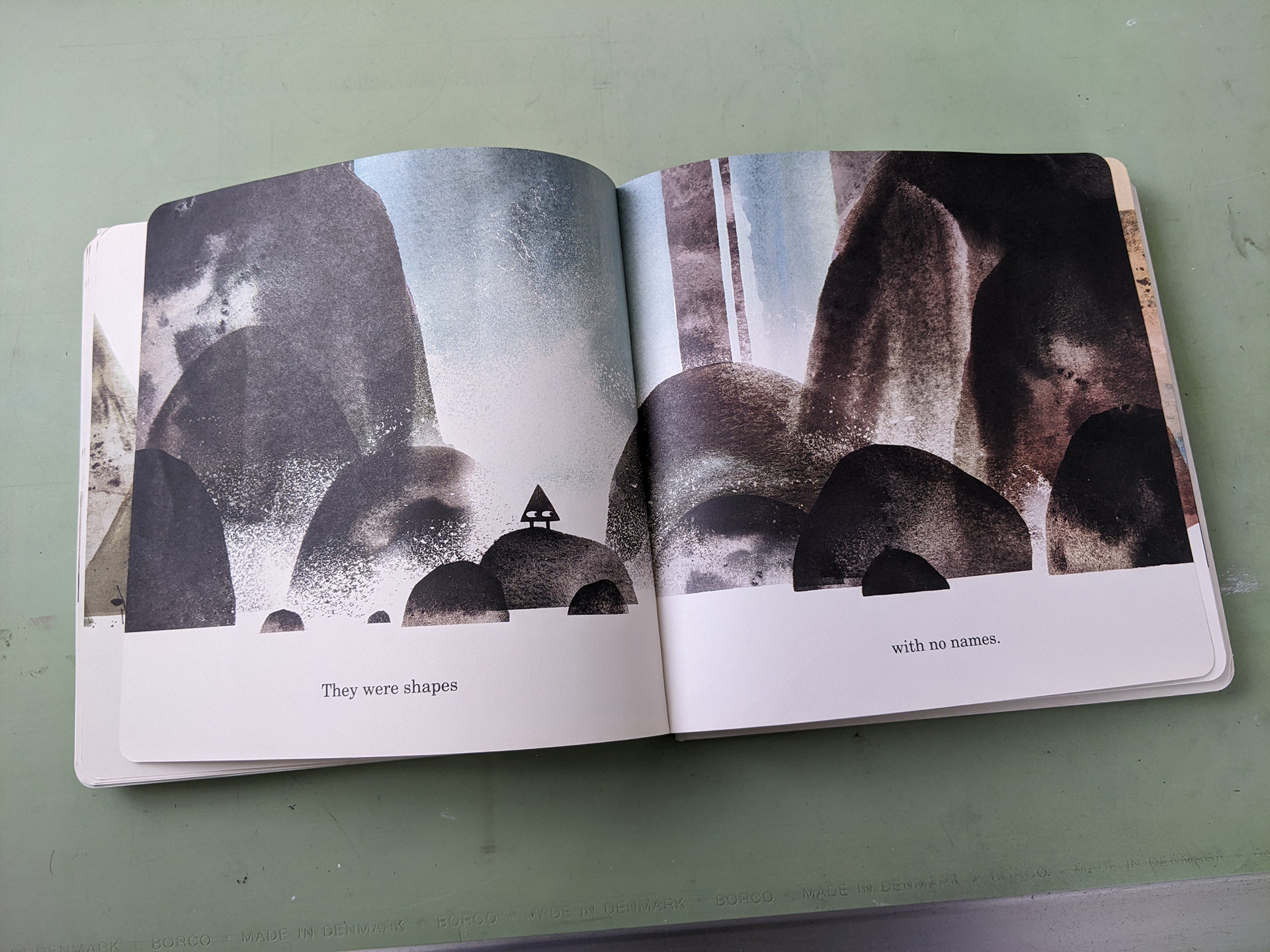
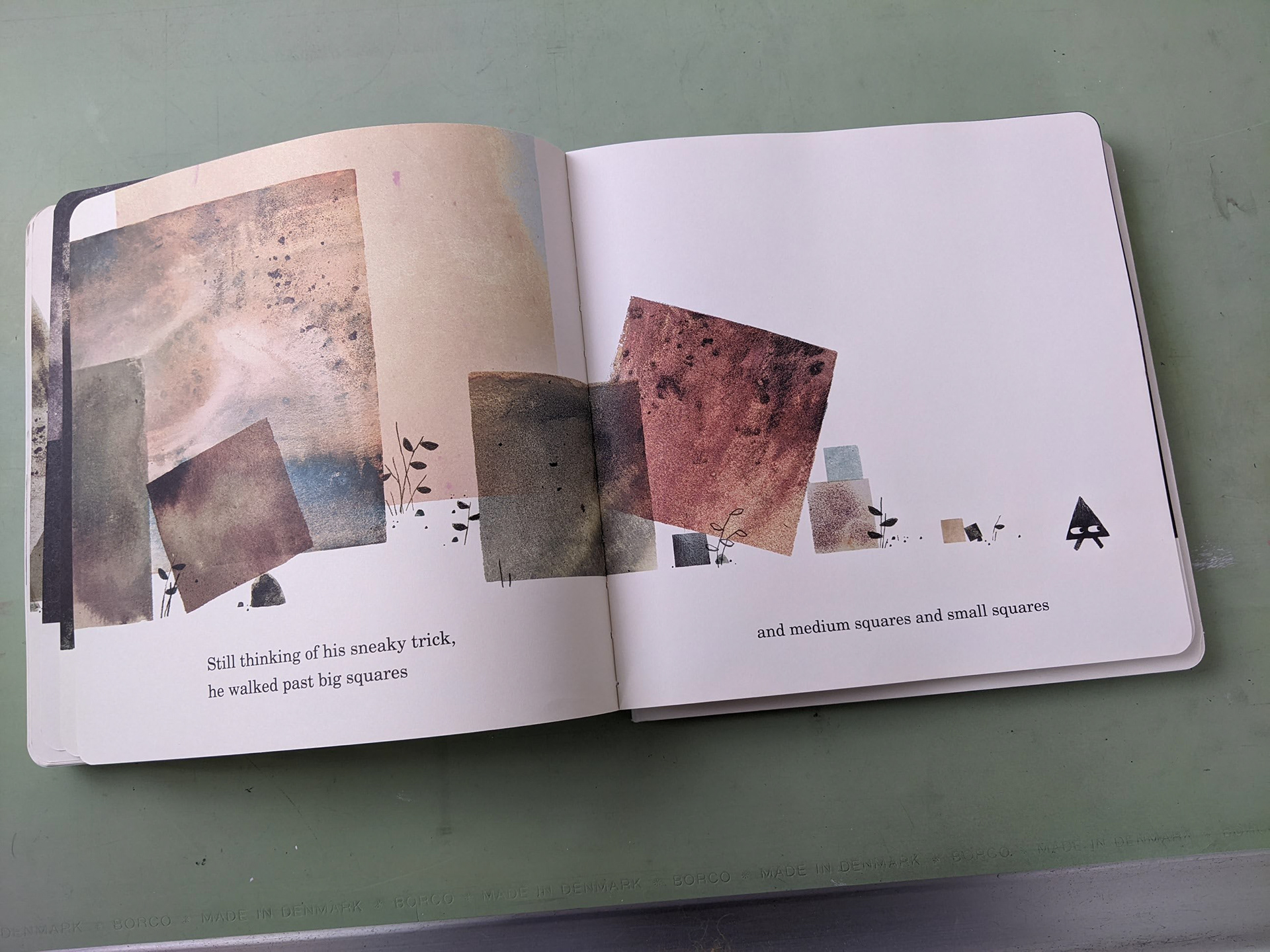
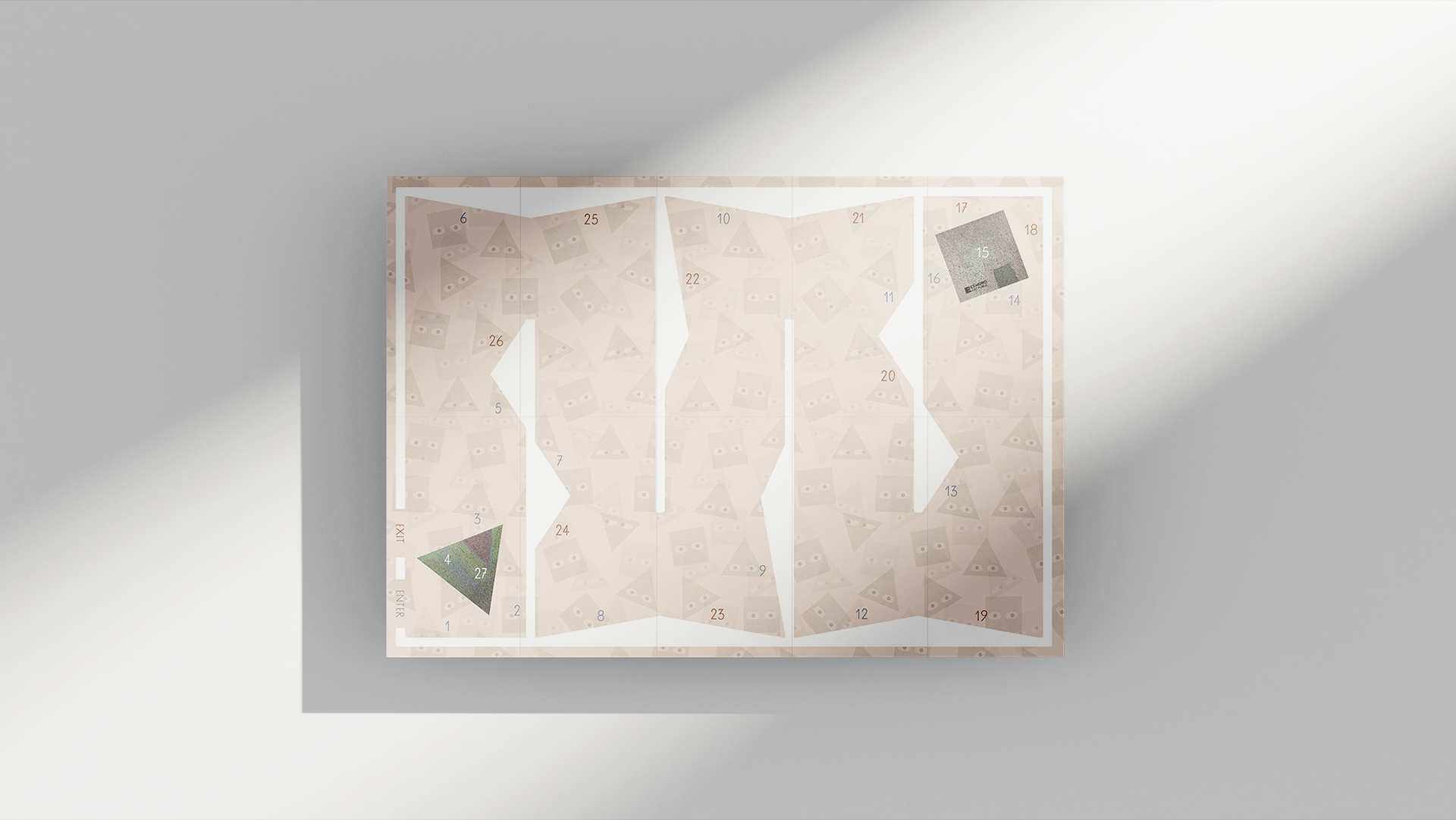
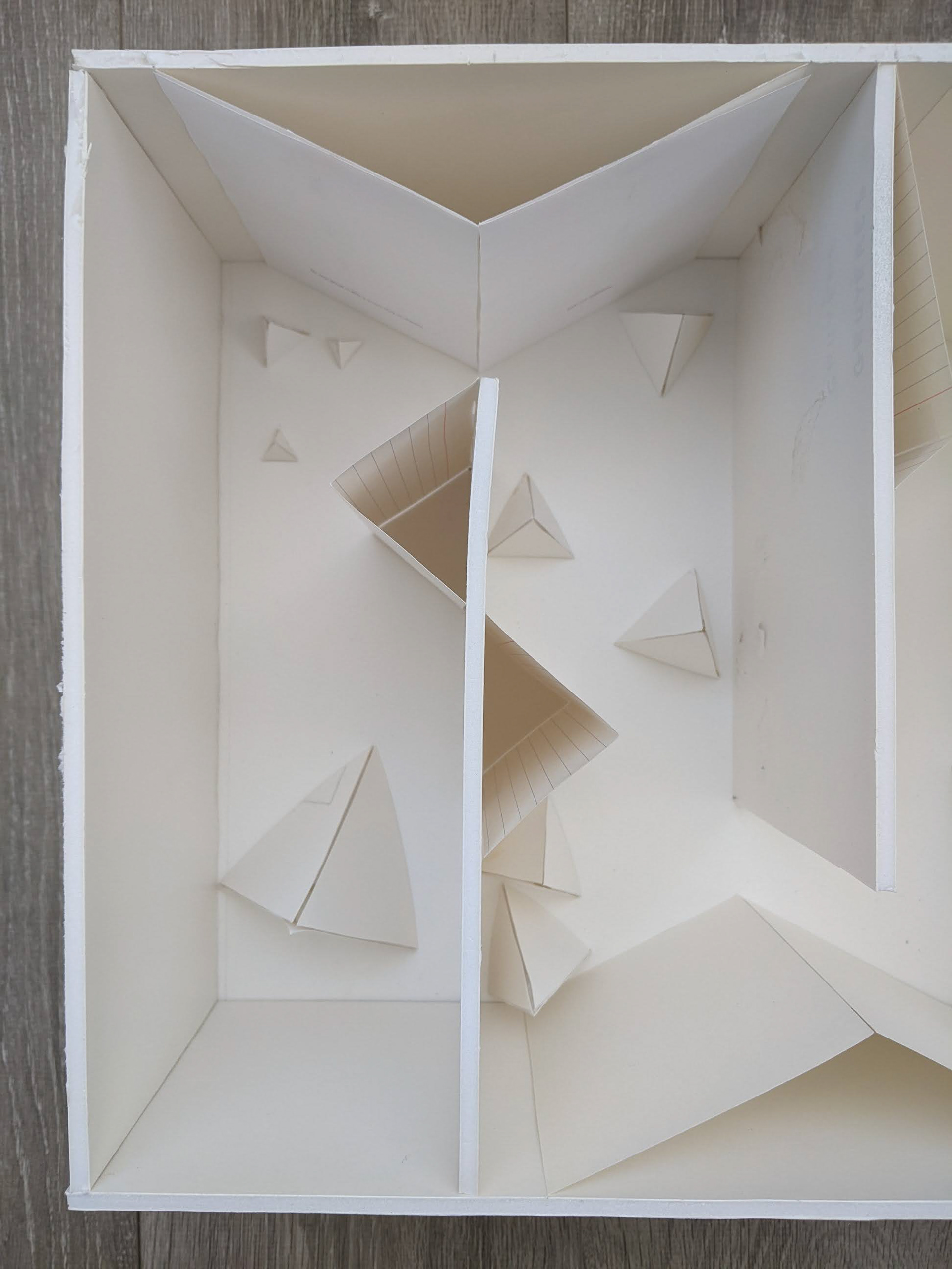
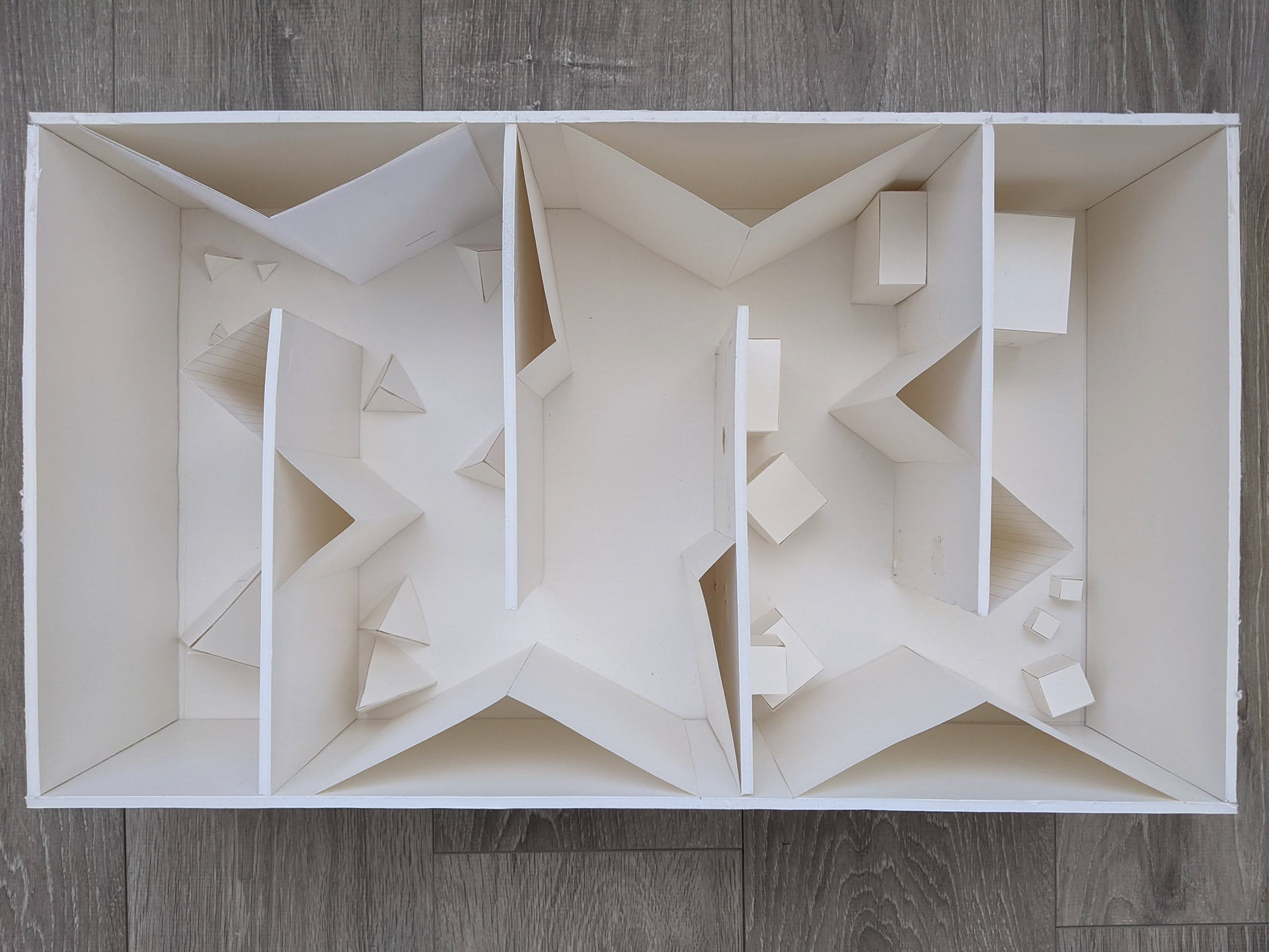
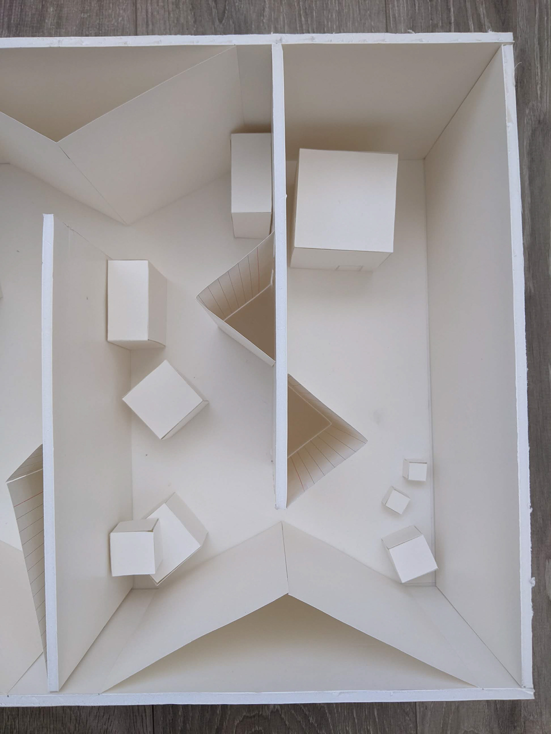
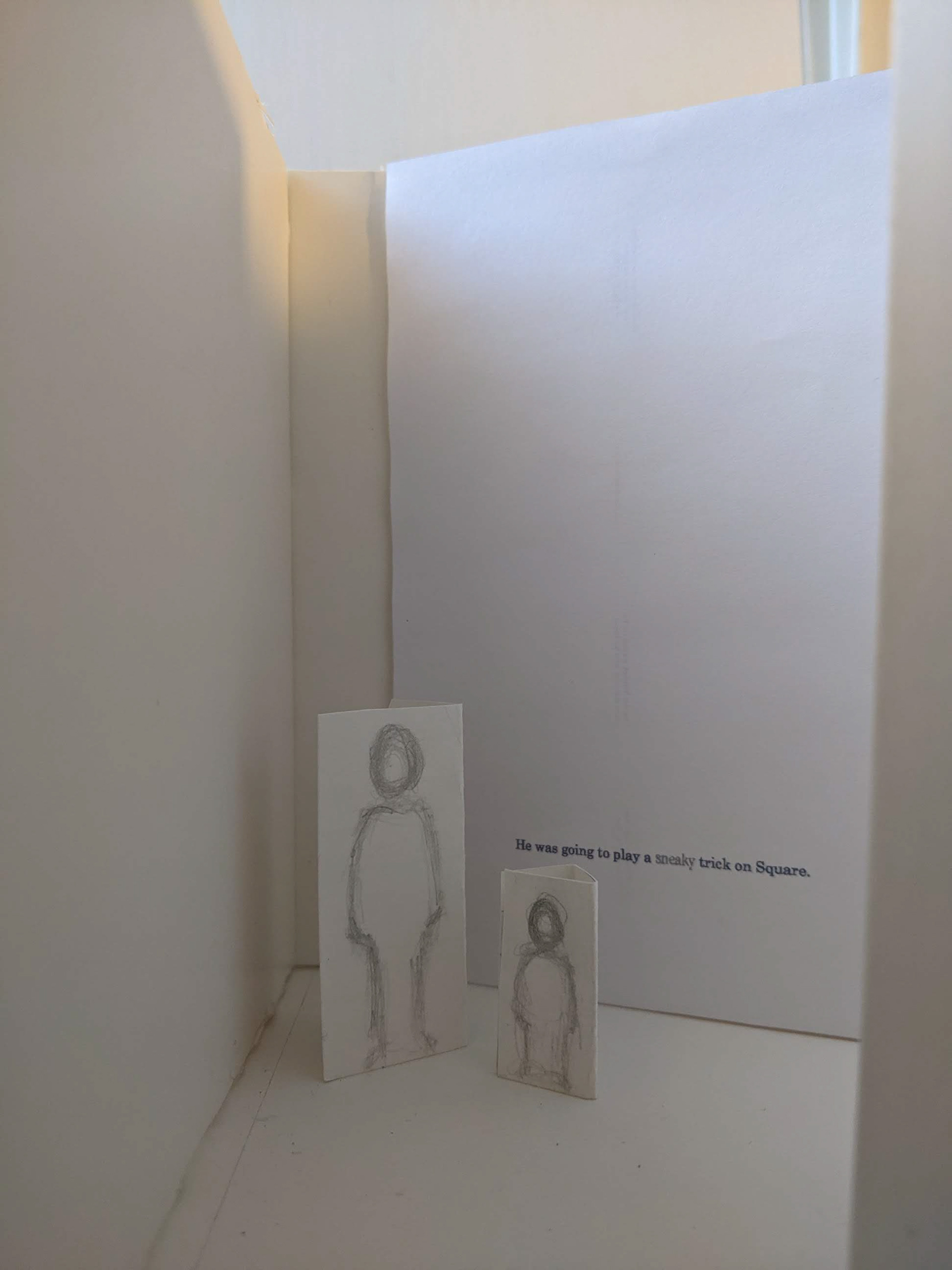
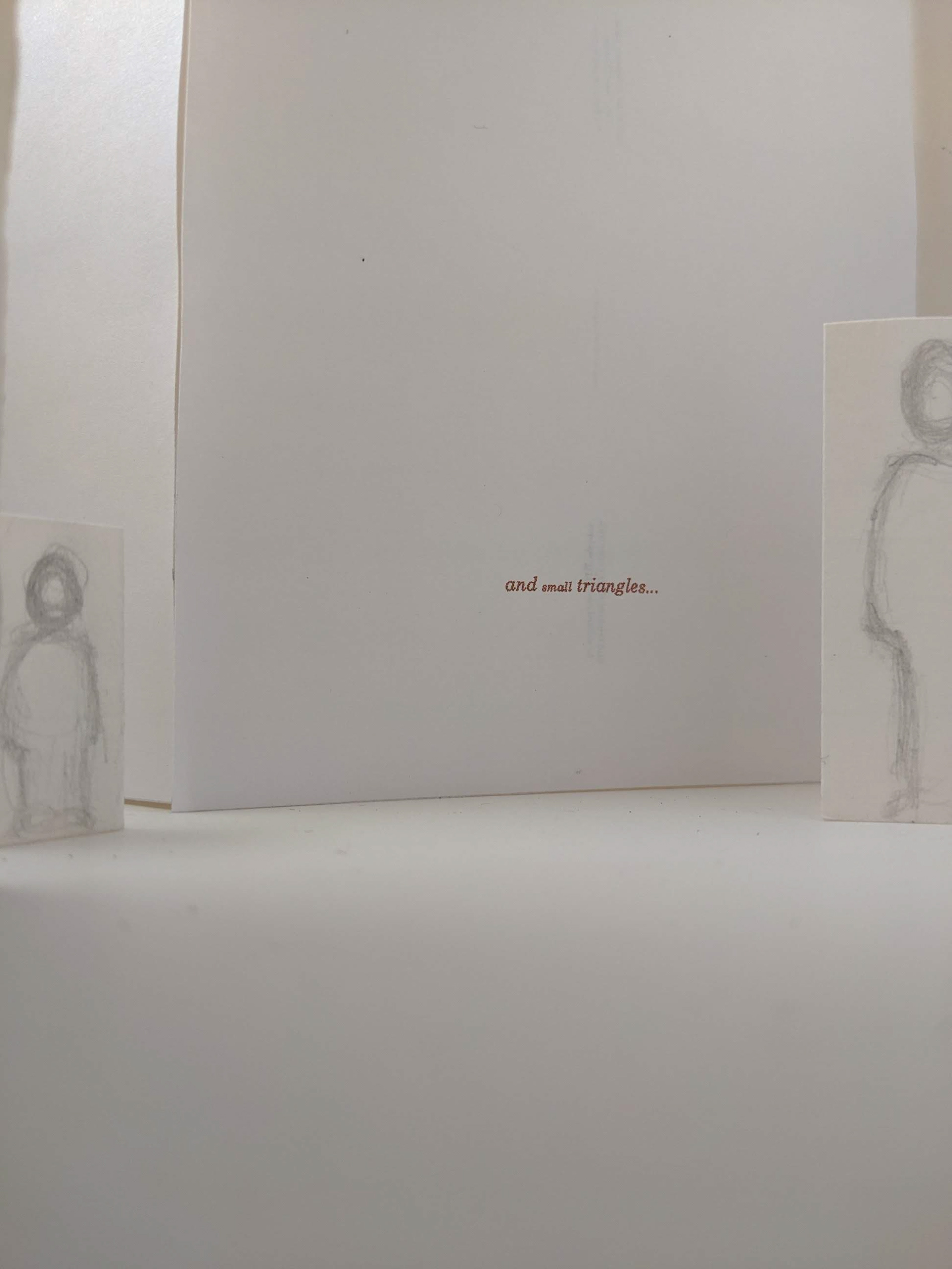
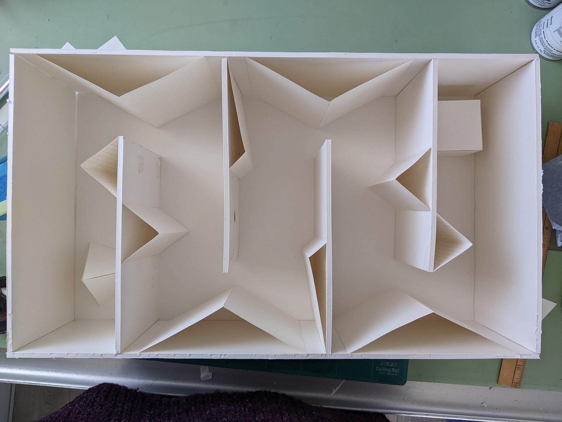
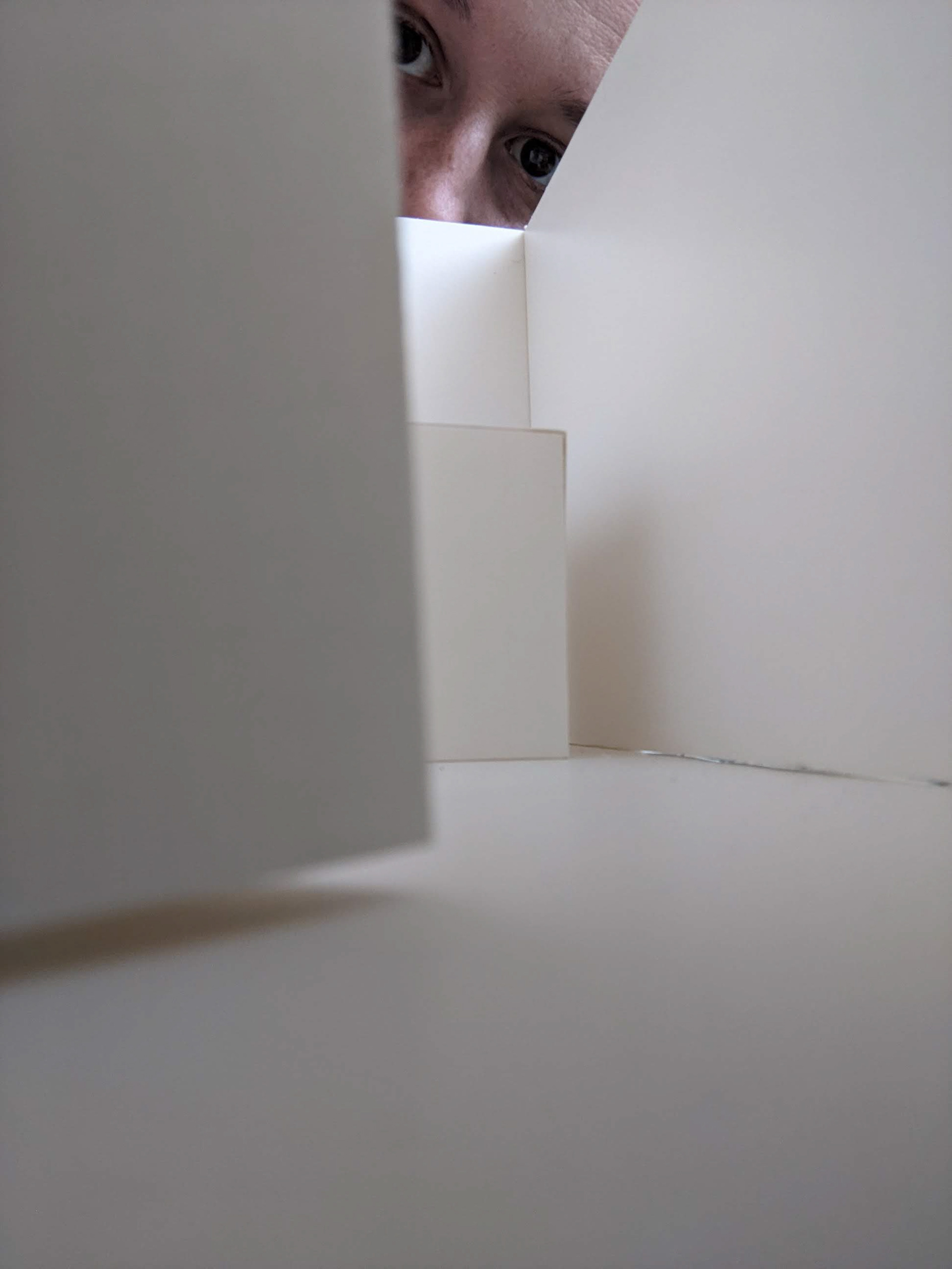
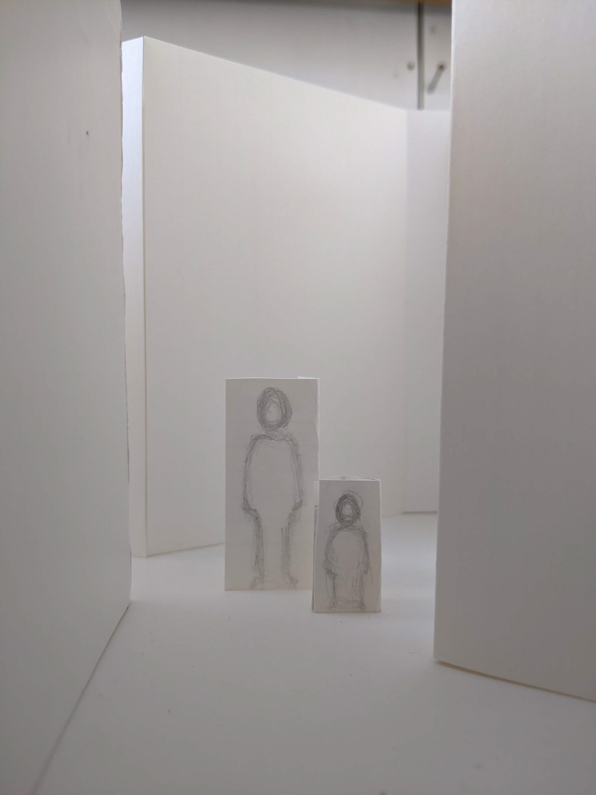
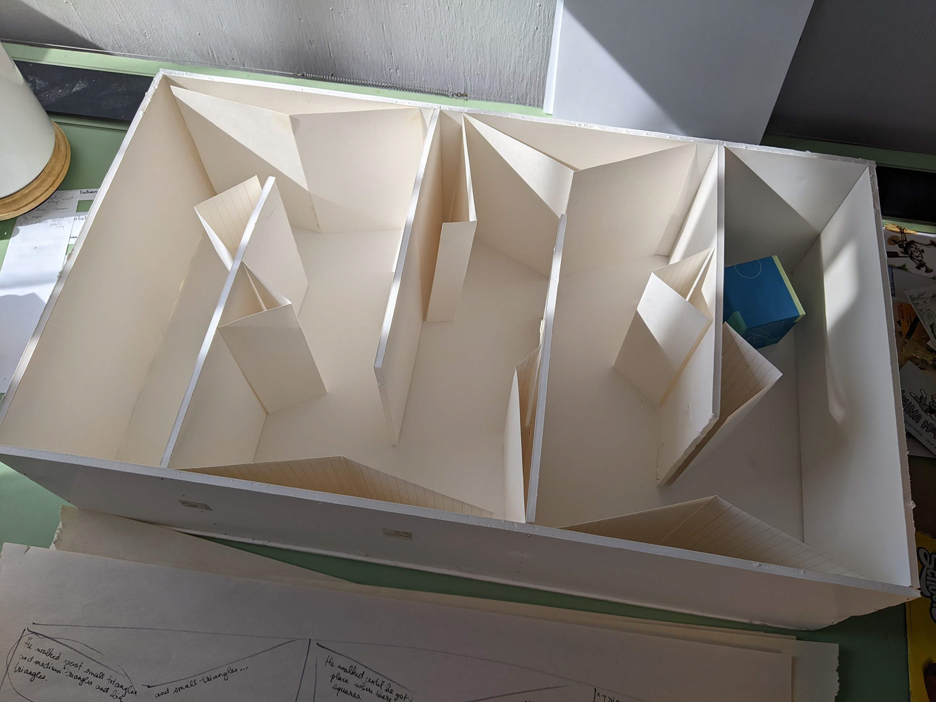
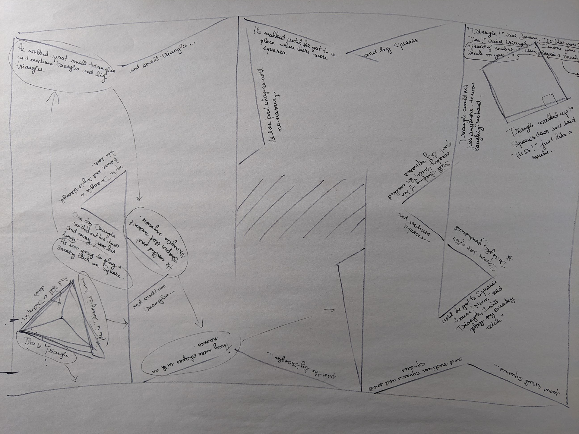
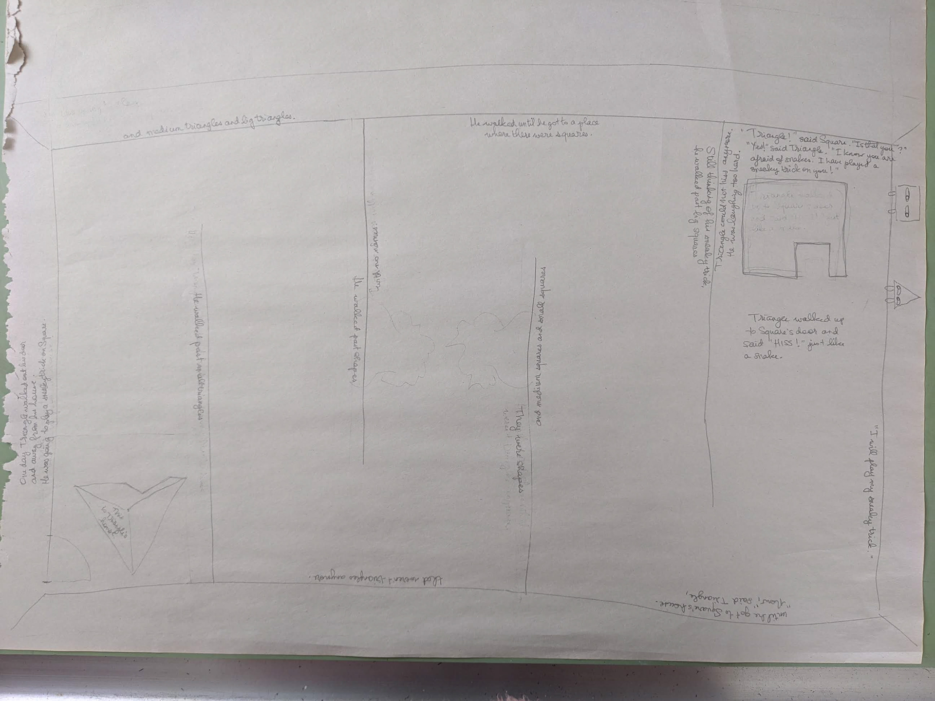
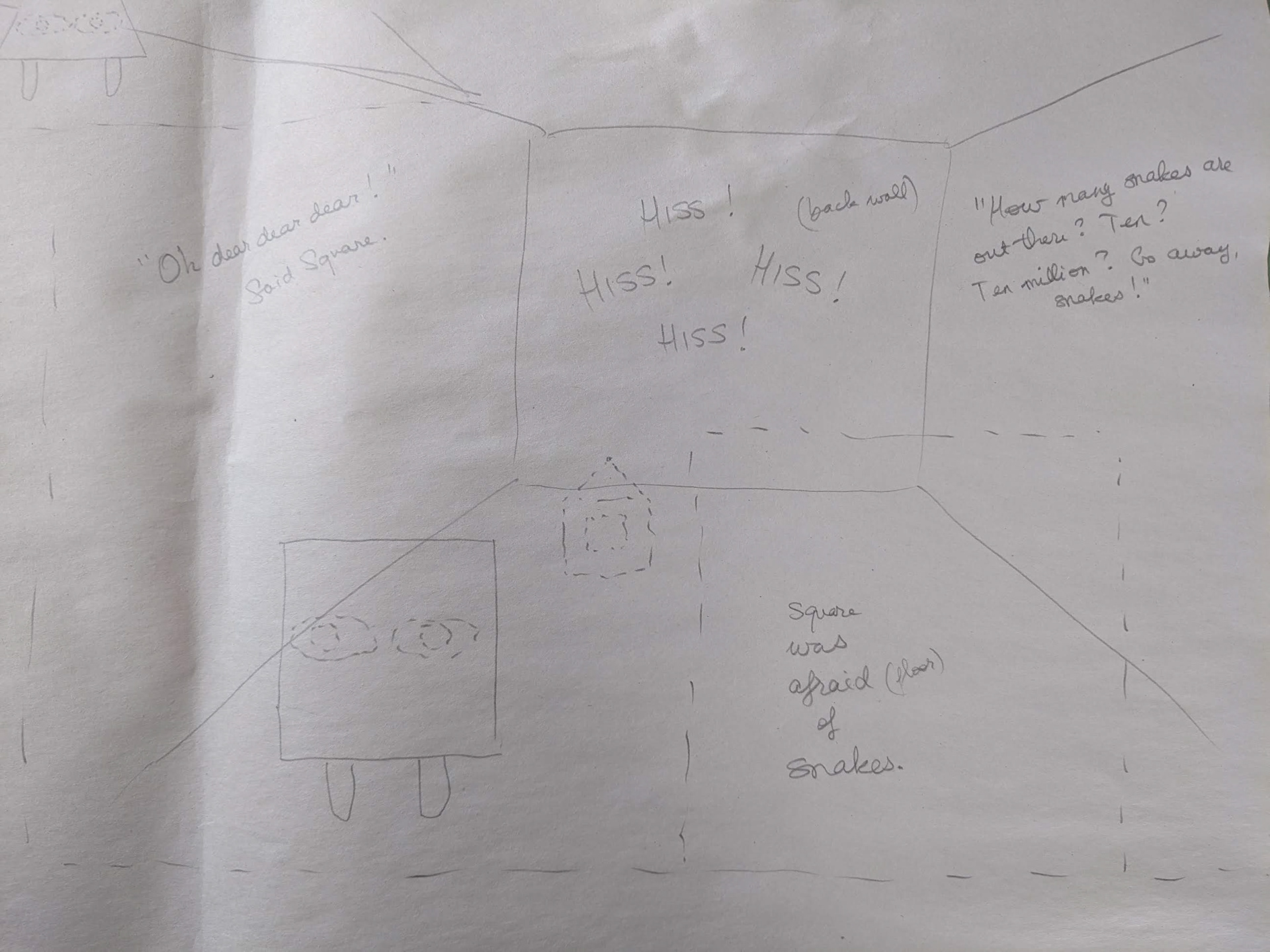
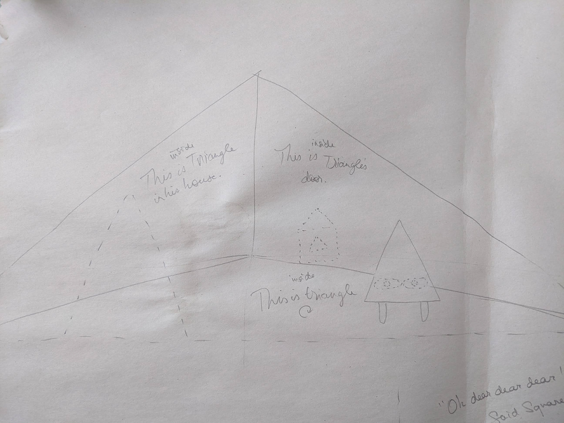
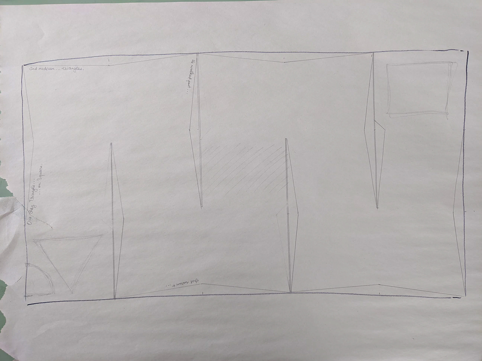
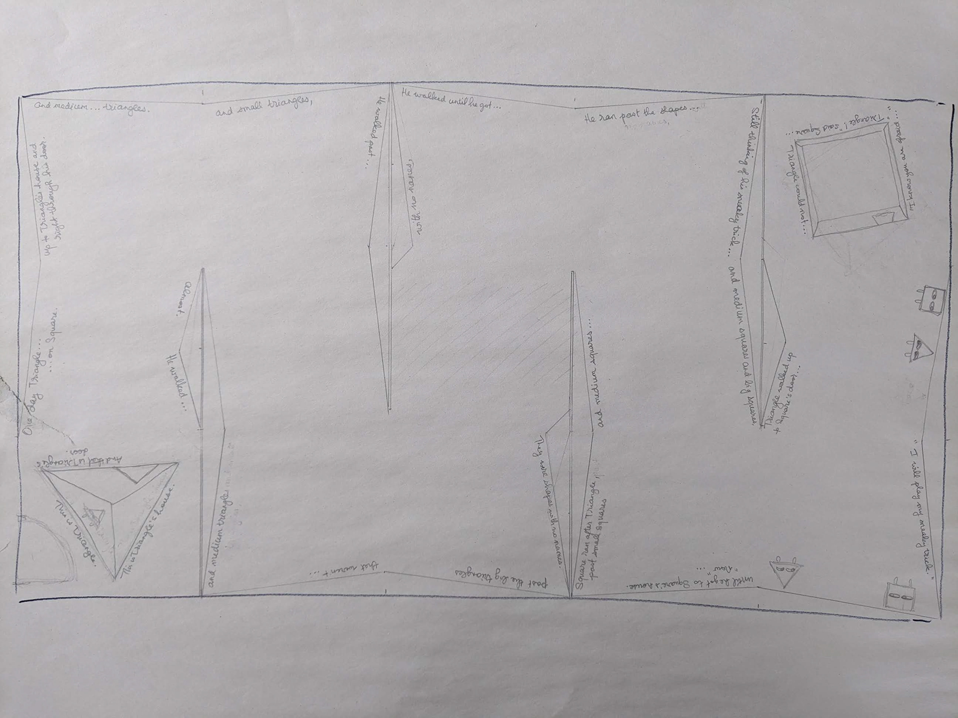
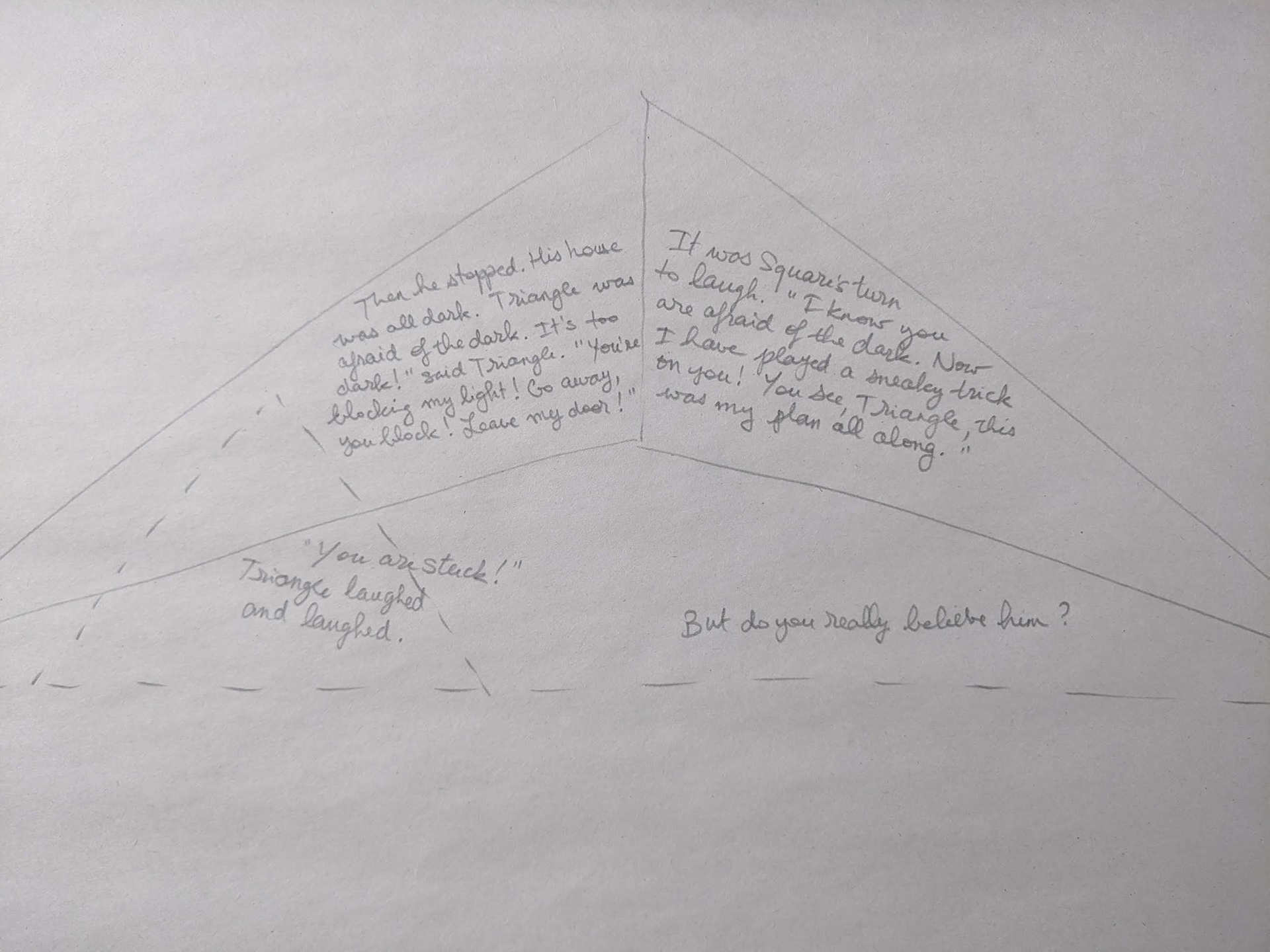
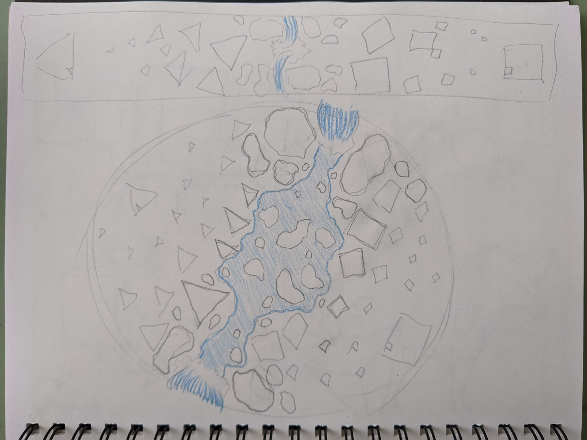
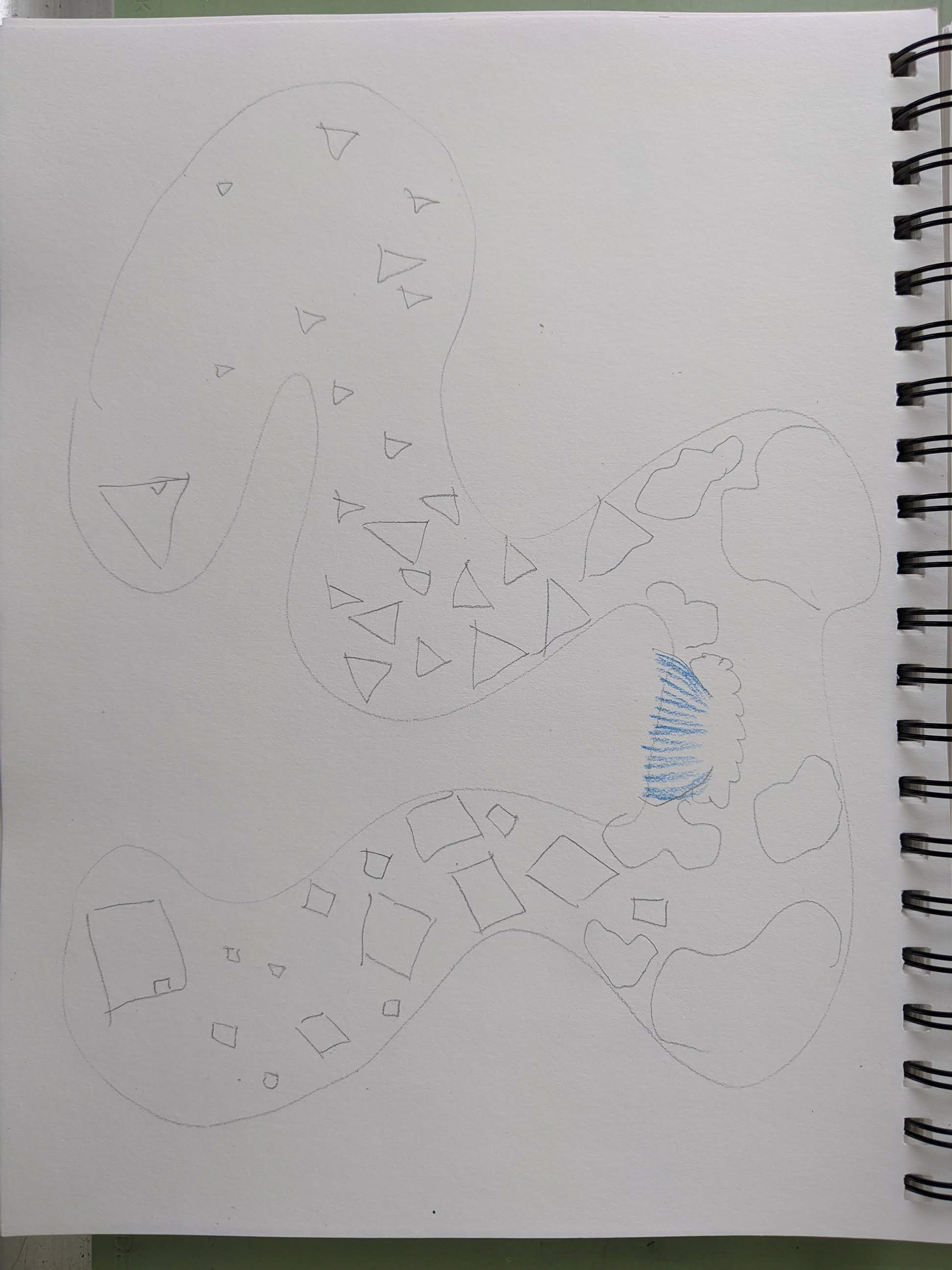
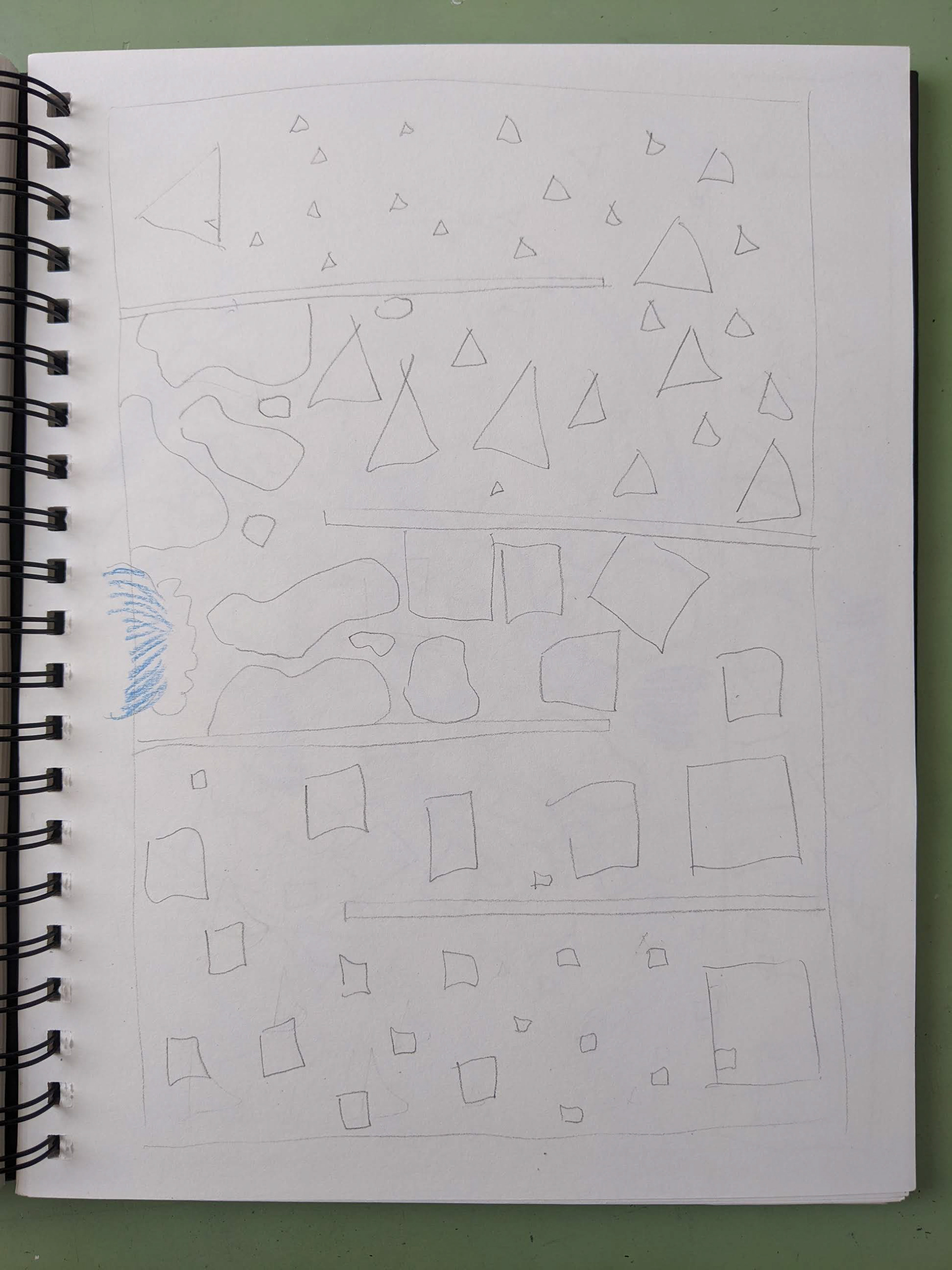
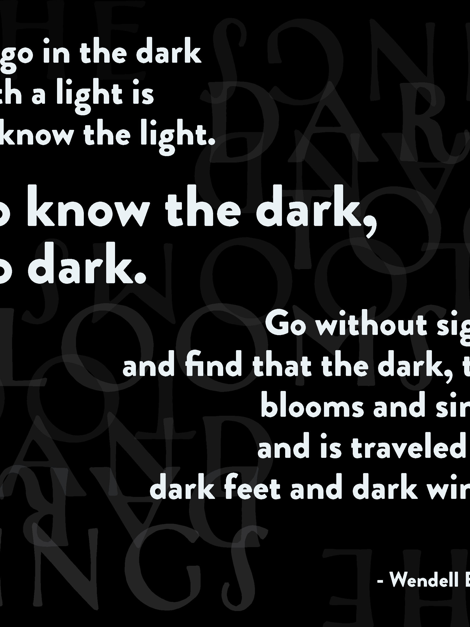
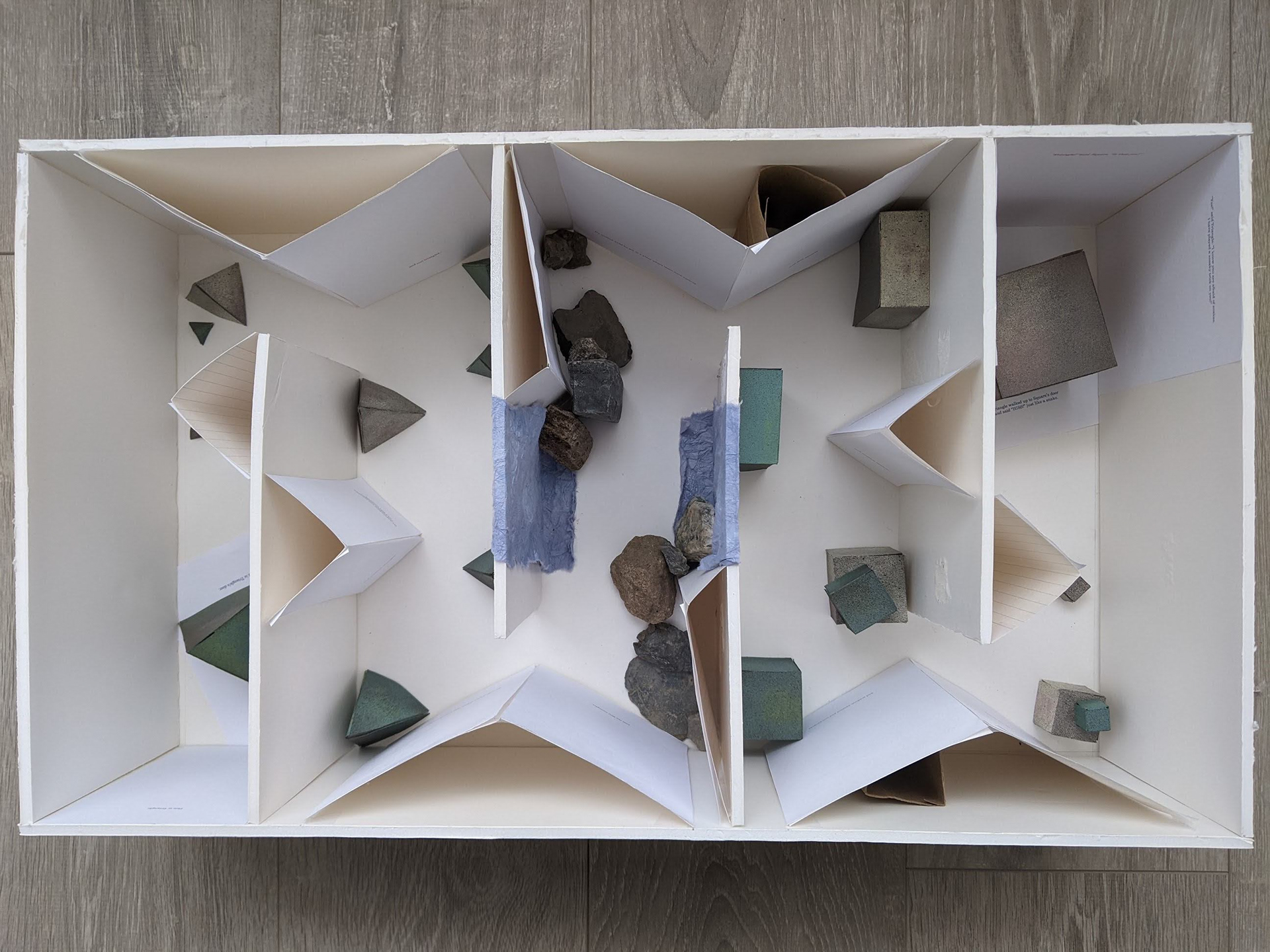
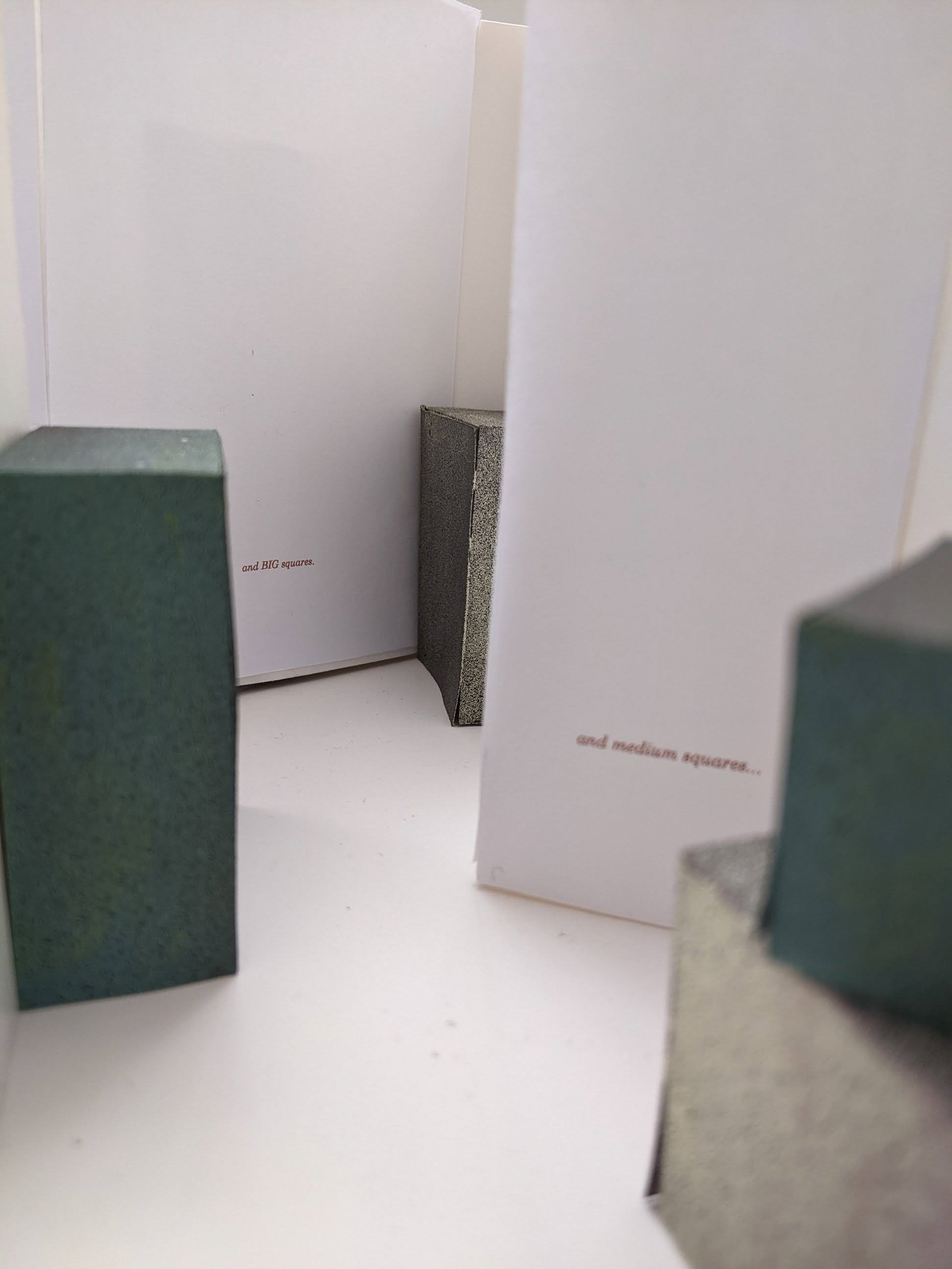
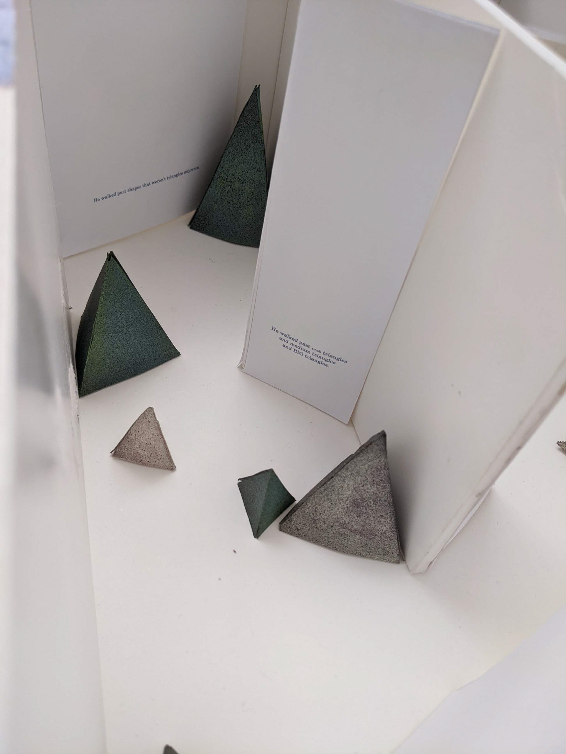
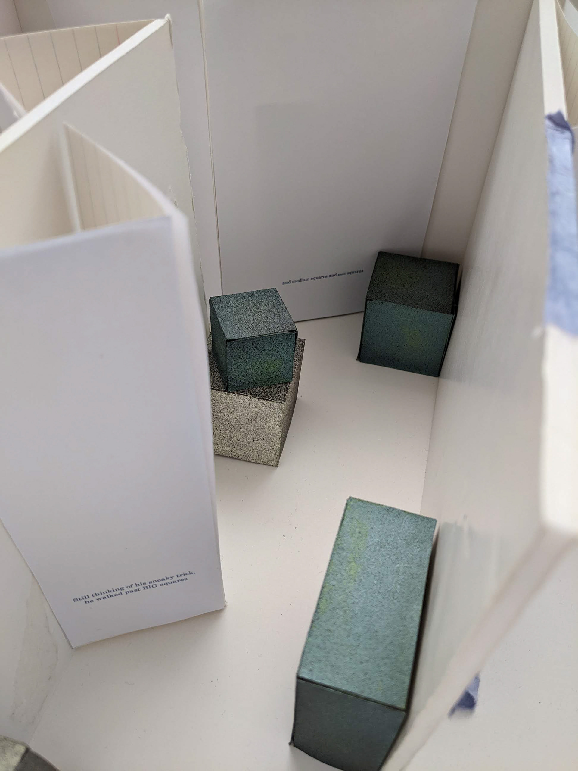
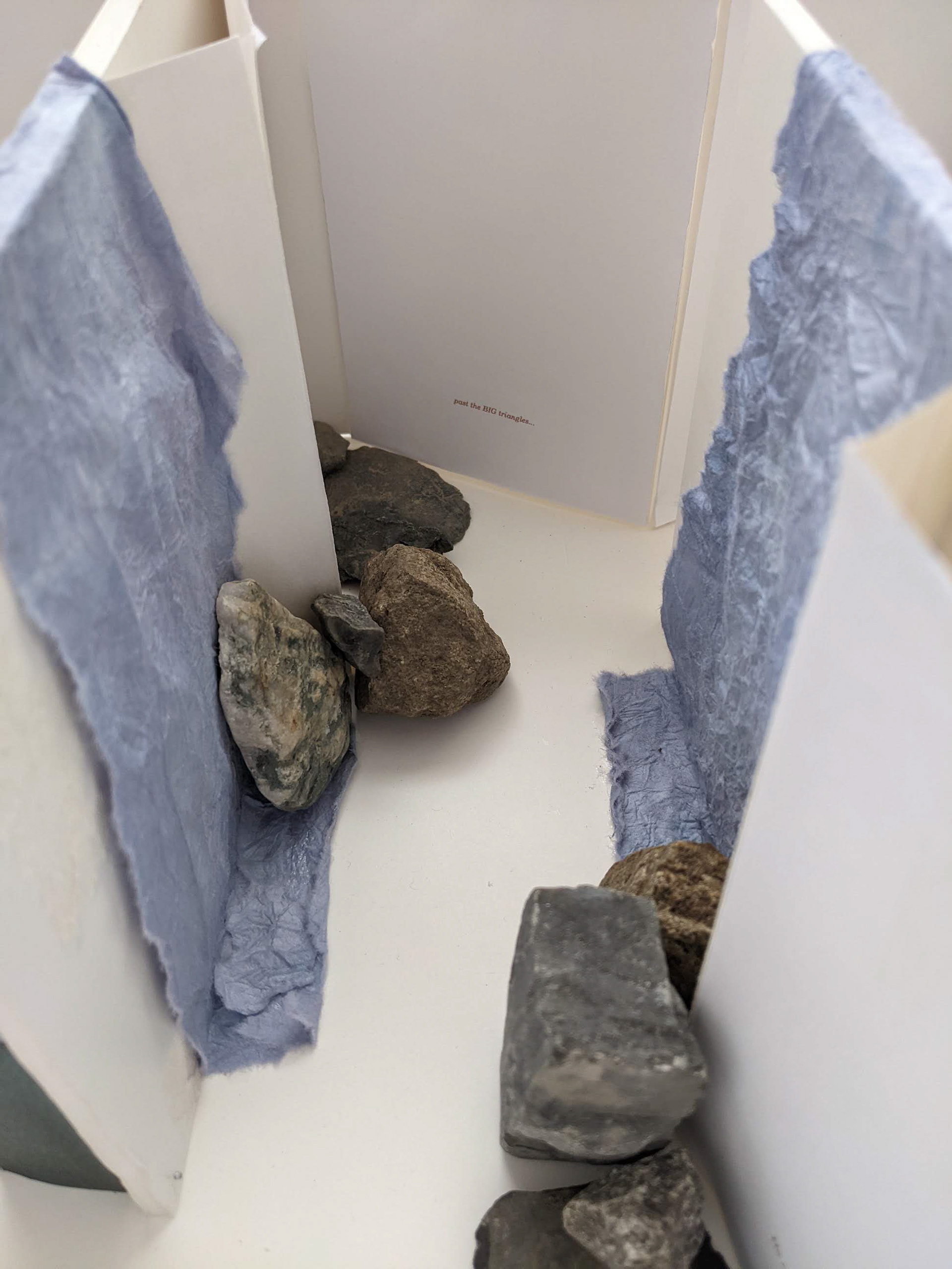
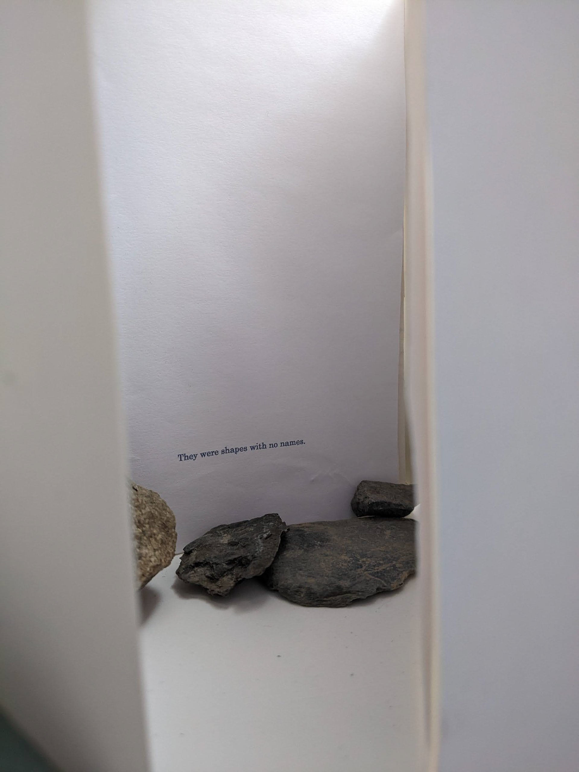
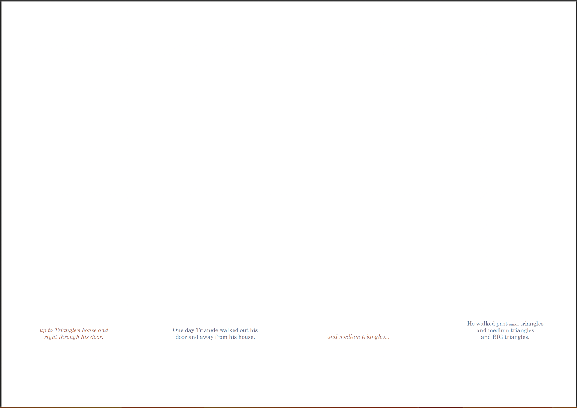
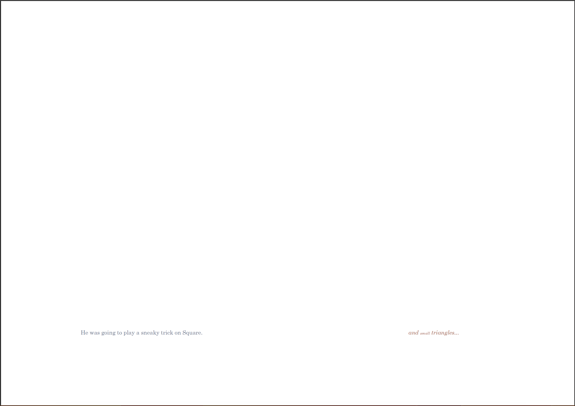
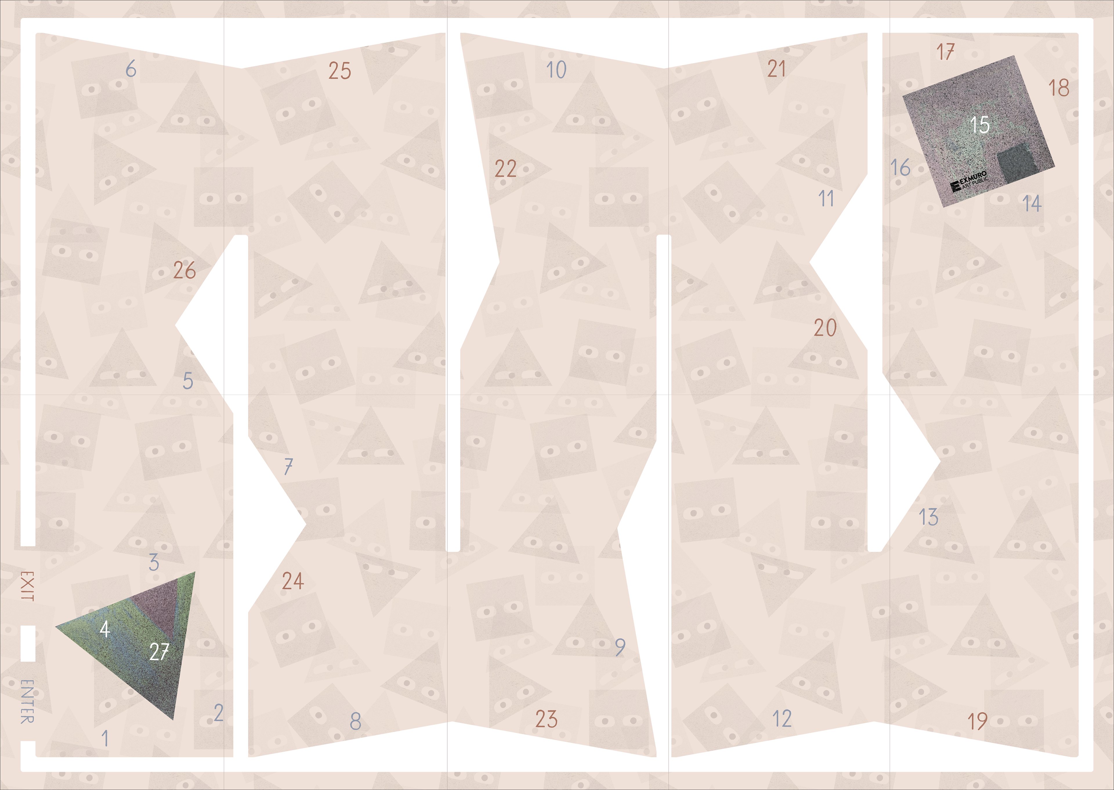
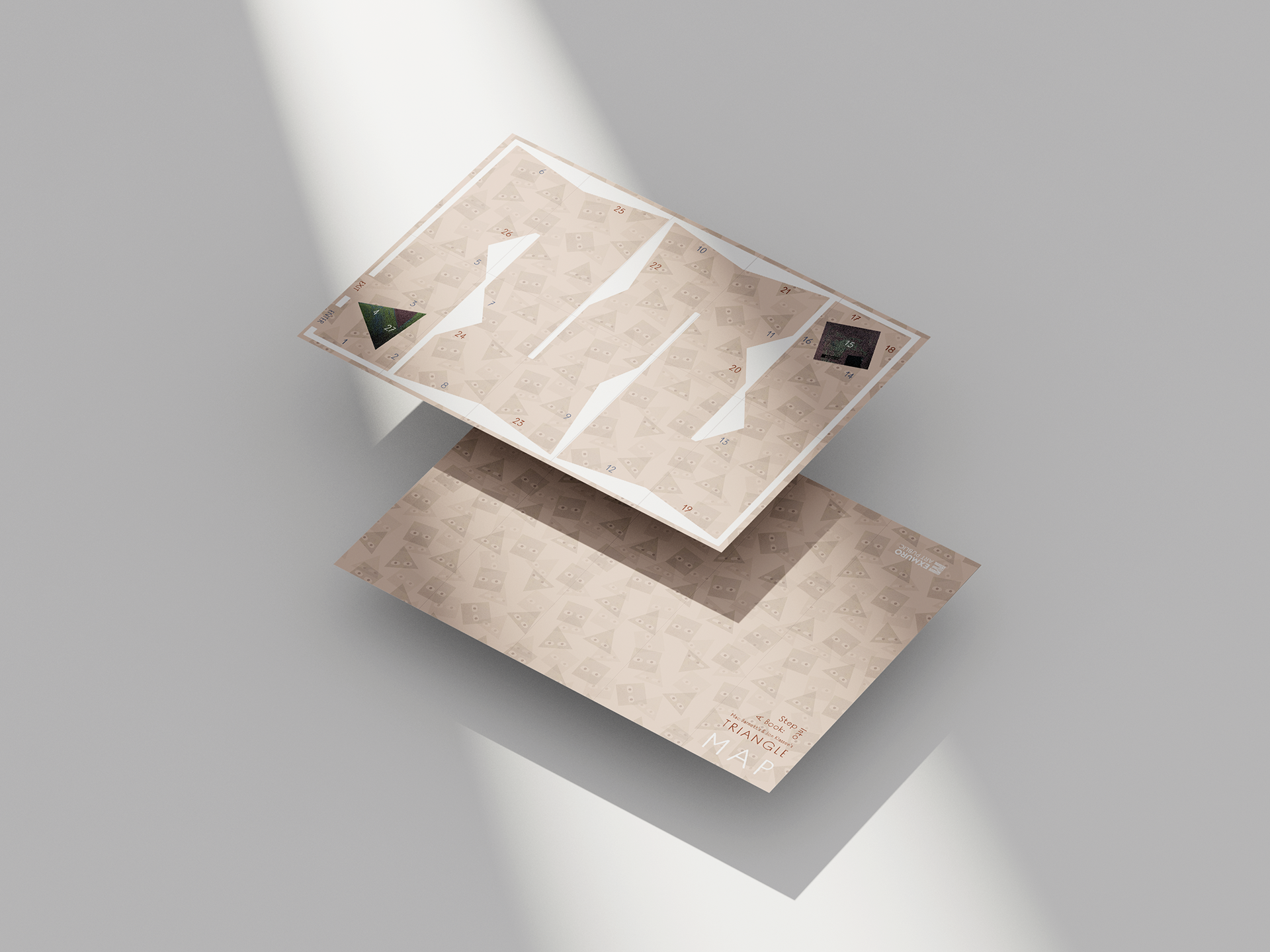
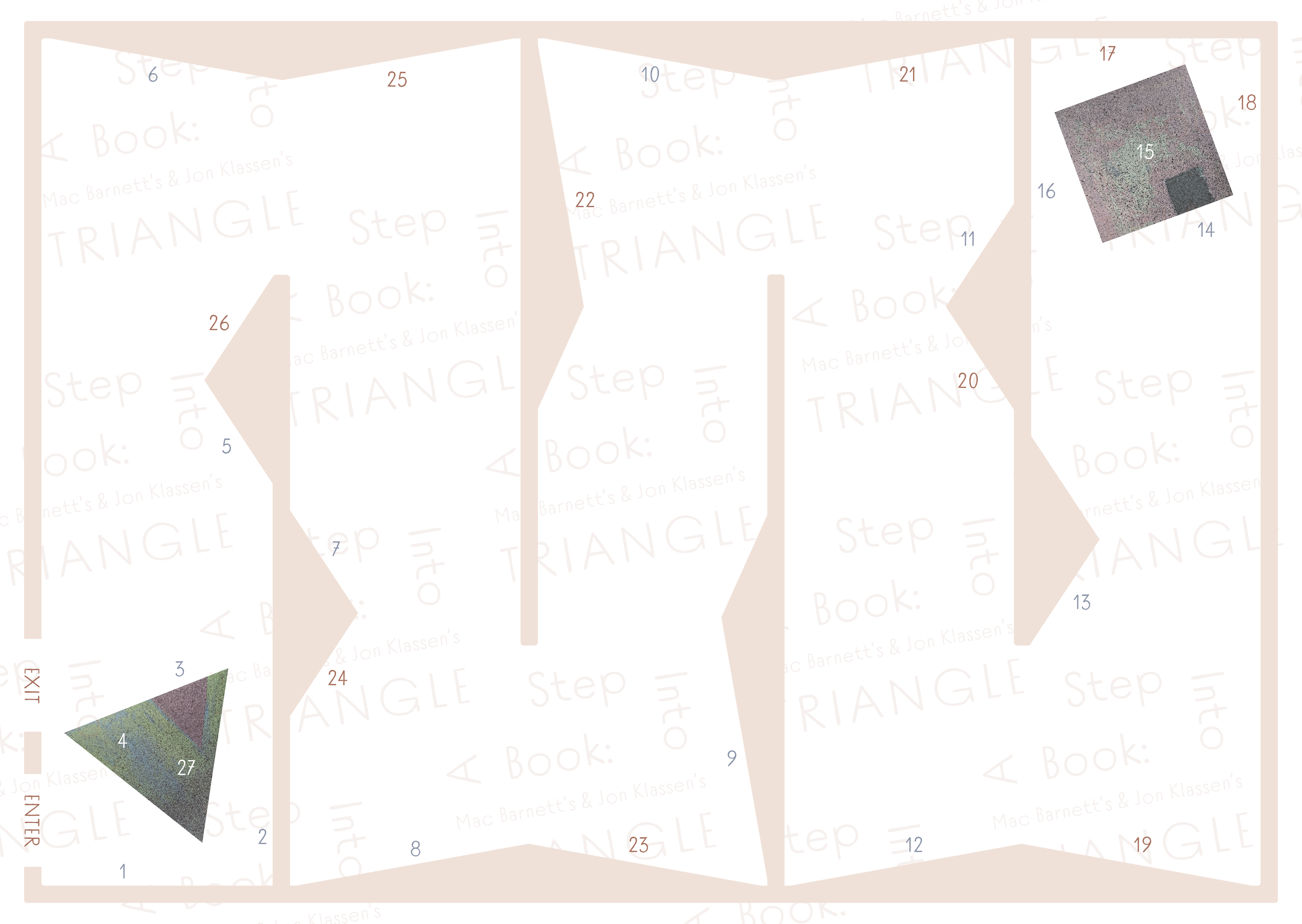
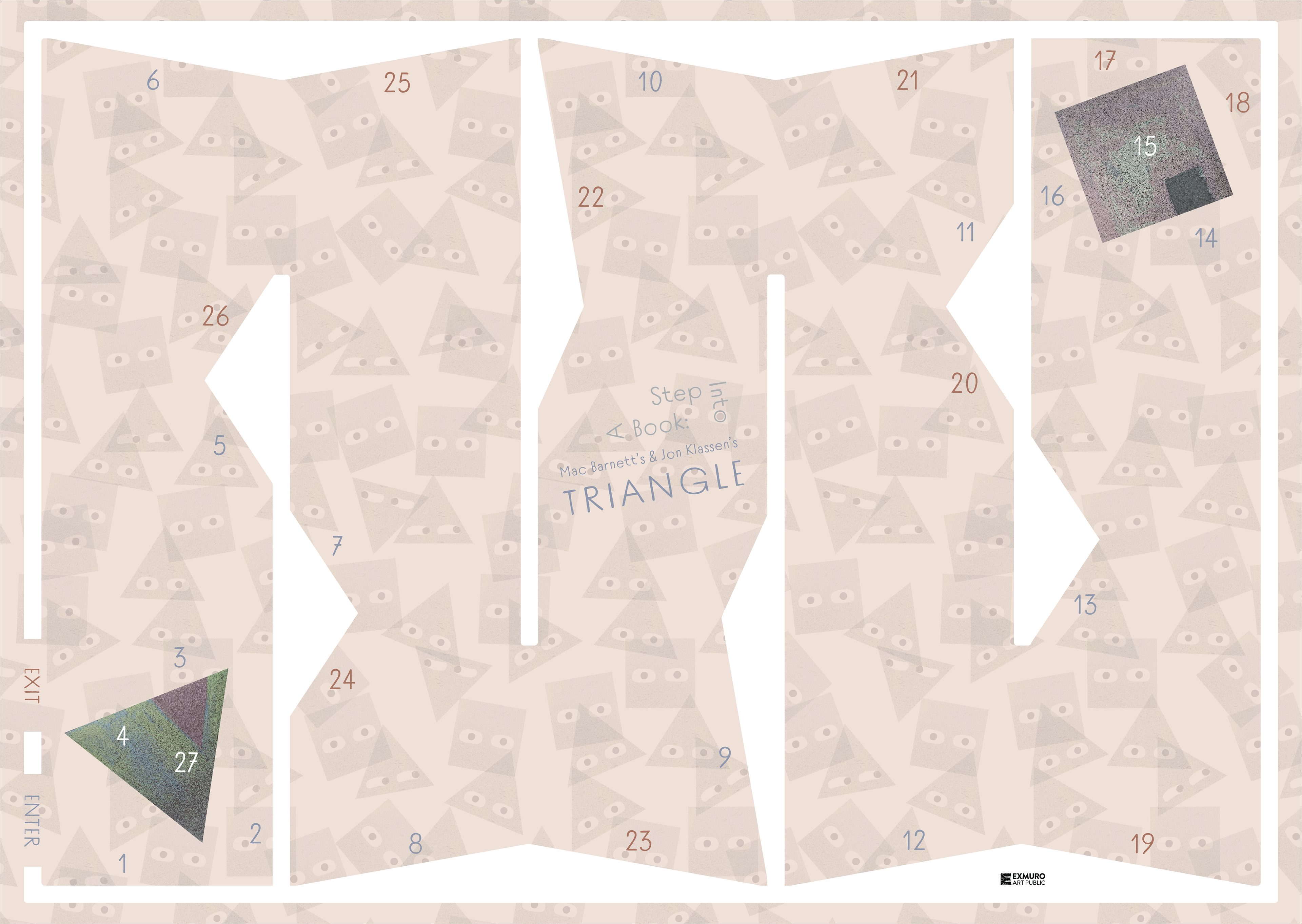
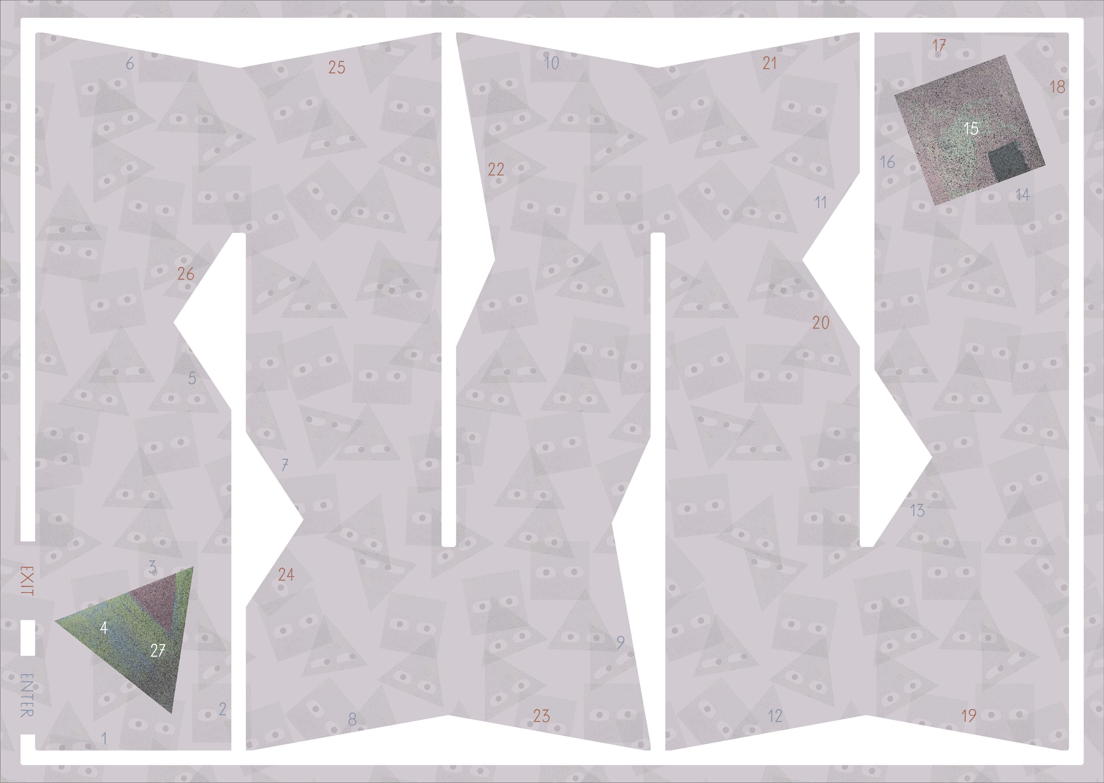
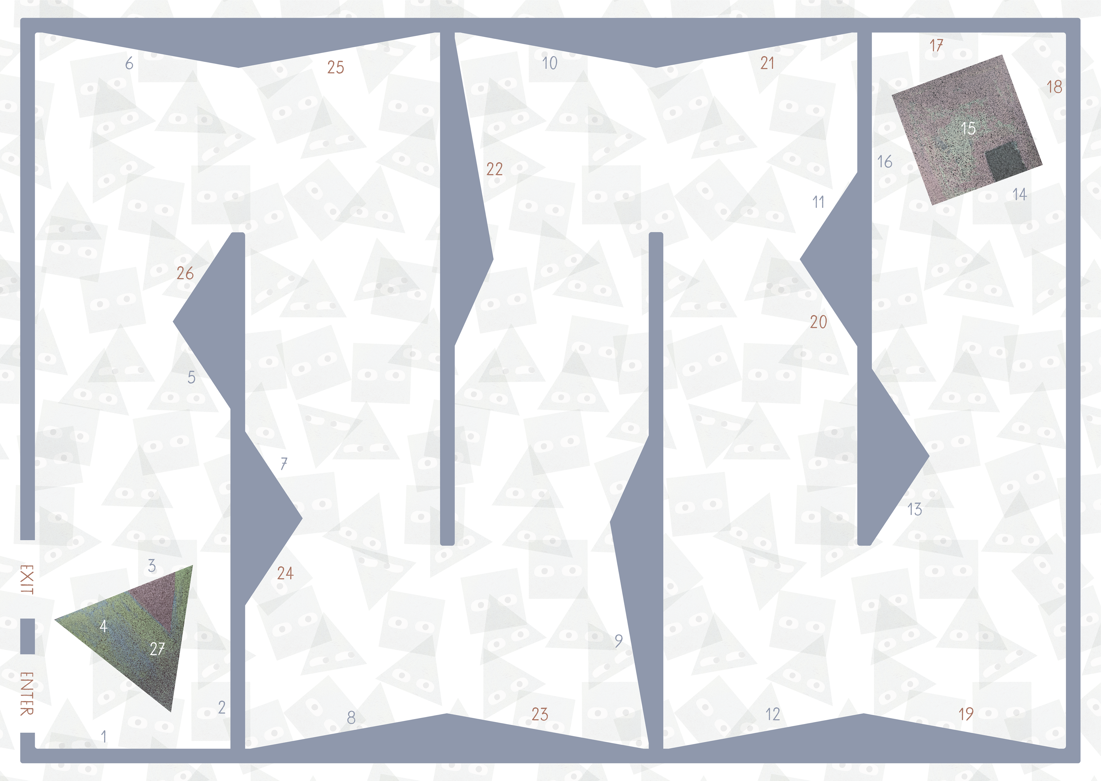
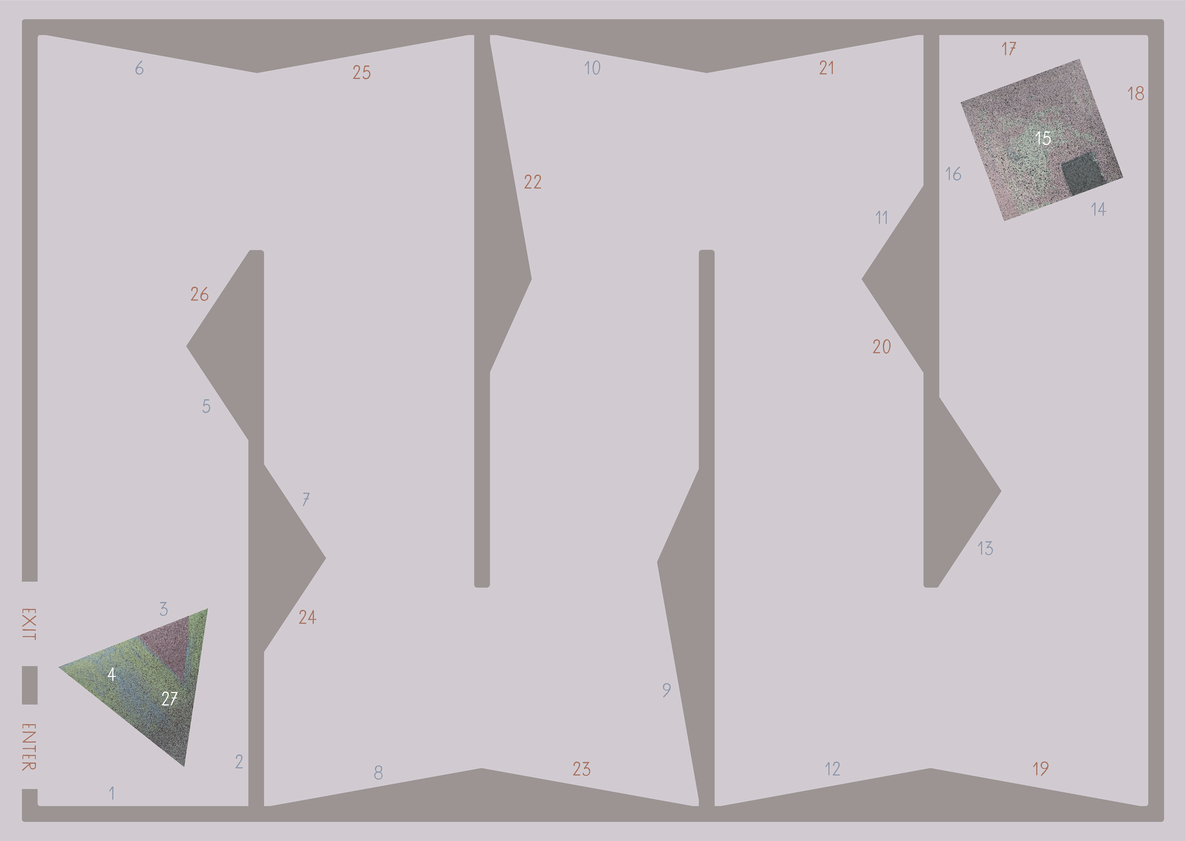
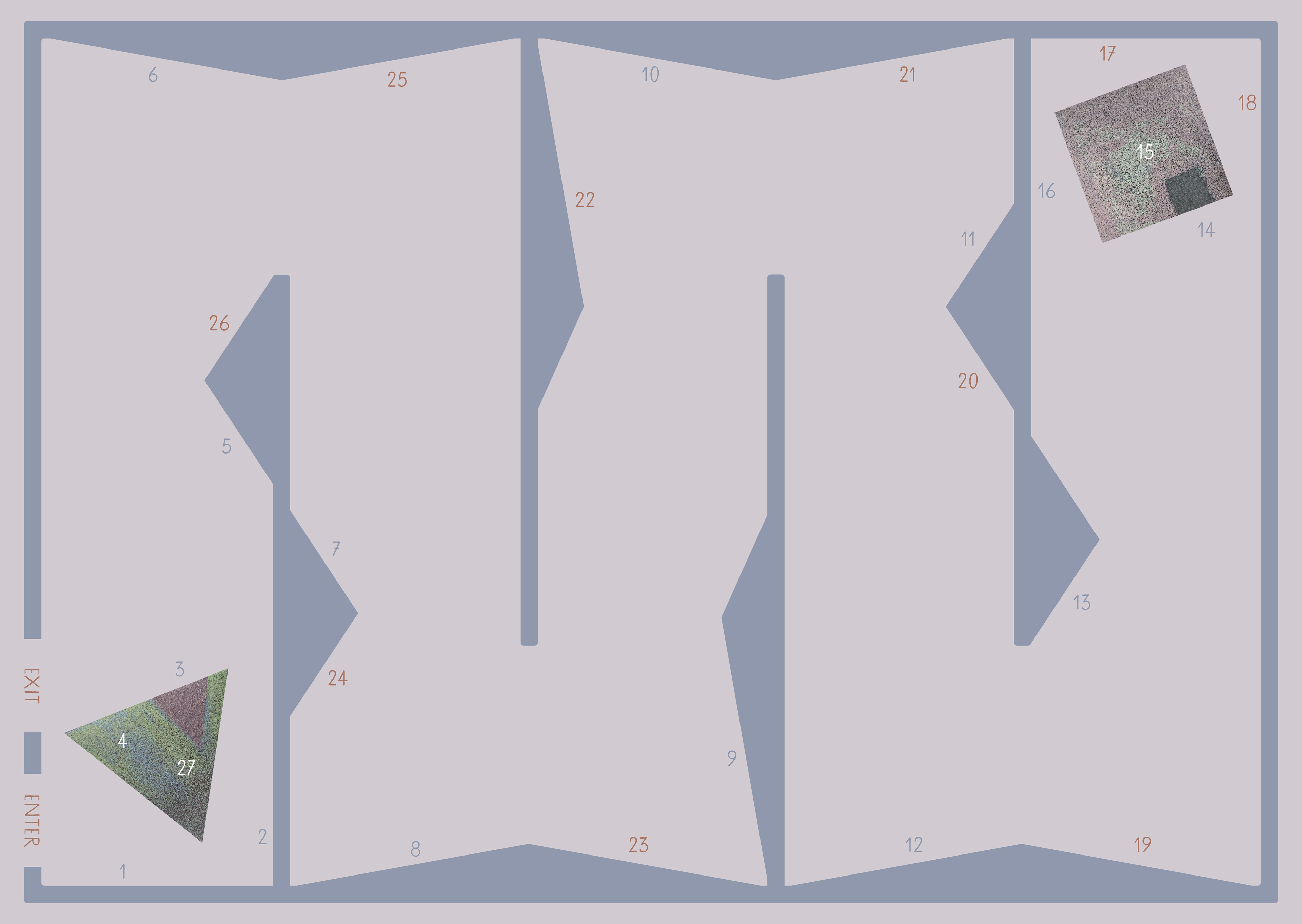
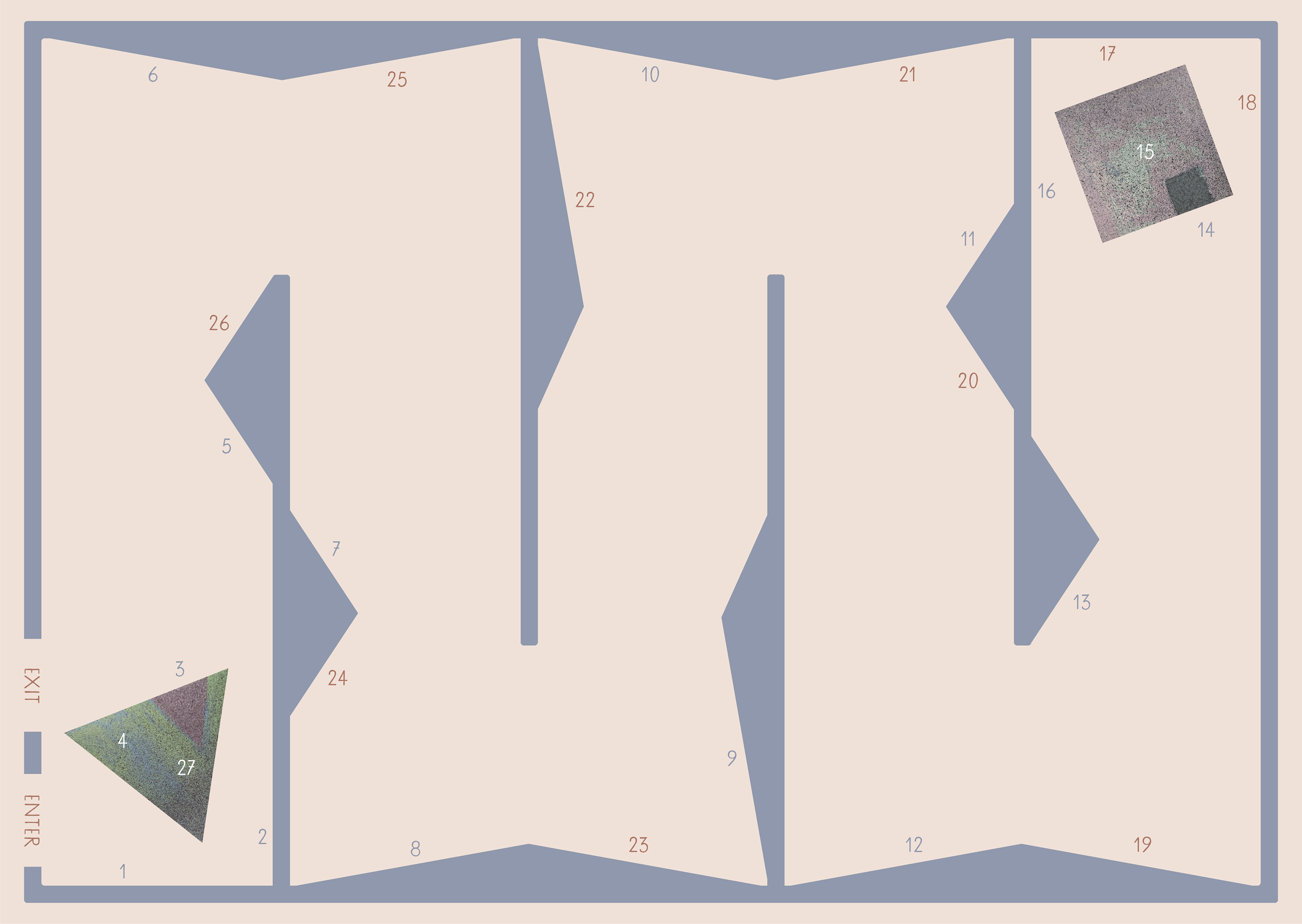
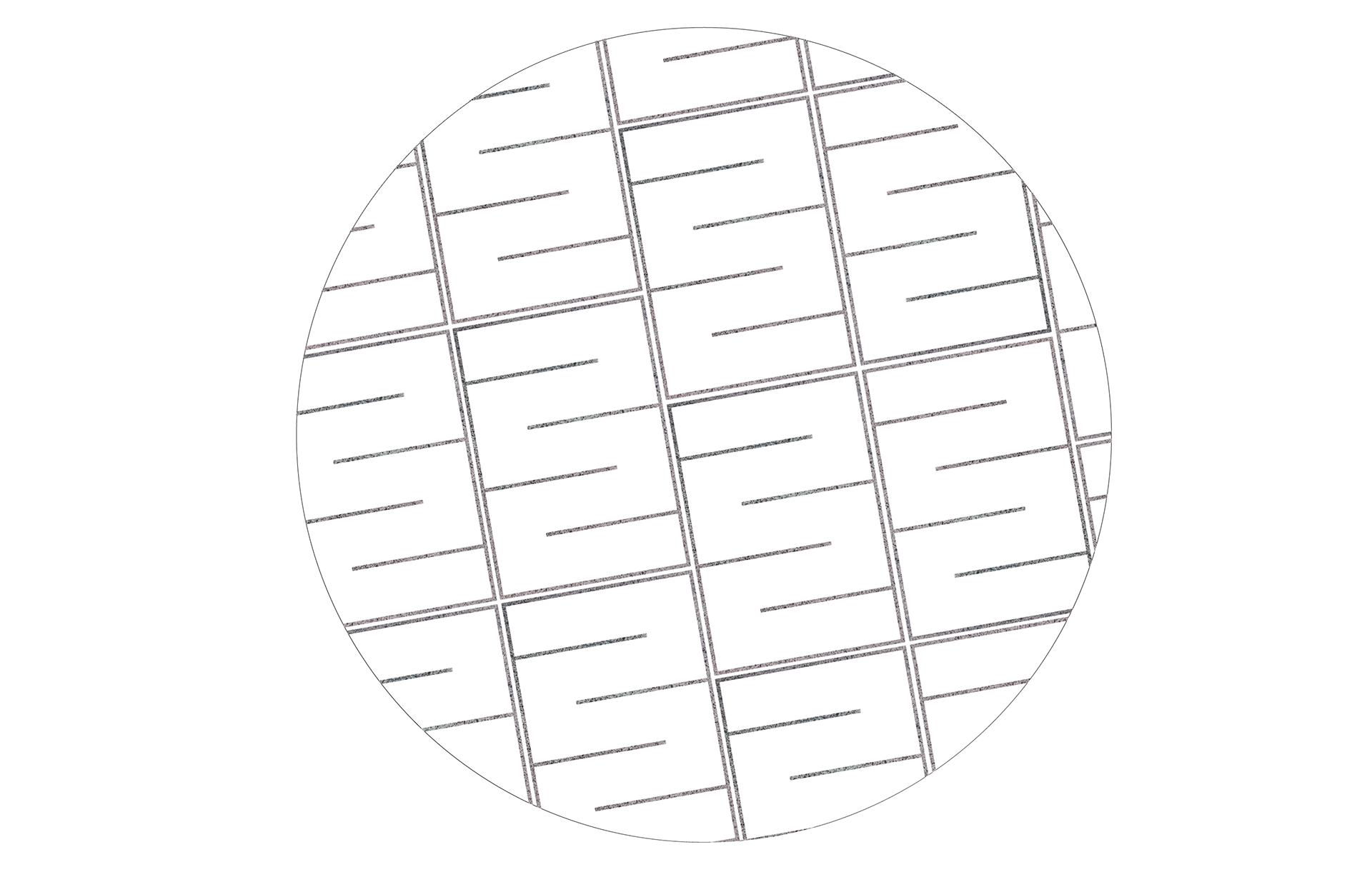
The exhibition is designed in such a way as to invite the visitor to read the picture book story on the walls as they walk through from Triangle's house all the way to Square's house and back. The walls are angled so that a visitor will only see the words they are meant to see for that part of the story. As they walk back, the angled walls reveal the second half of the story. The map utilizes a number system to further aid visitors in their reading and movement.
L'exposition est conçue de manière à inviter le visiteur à lire l'histoire sur les murs, à partir de la maison de Triangle jusqu'à celle de Square, et de retour. Les murs sont placé à un angle pour que le visiteur ne voie que les mots qui lui sont destinés pour cette partie de l'histoire. En revenant sur ses pas, les murs à angles révèlent la seconde partie de l'histoire. Le plan utilise un système de numérotation pour faciliter la lecture et les déplacements.
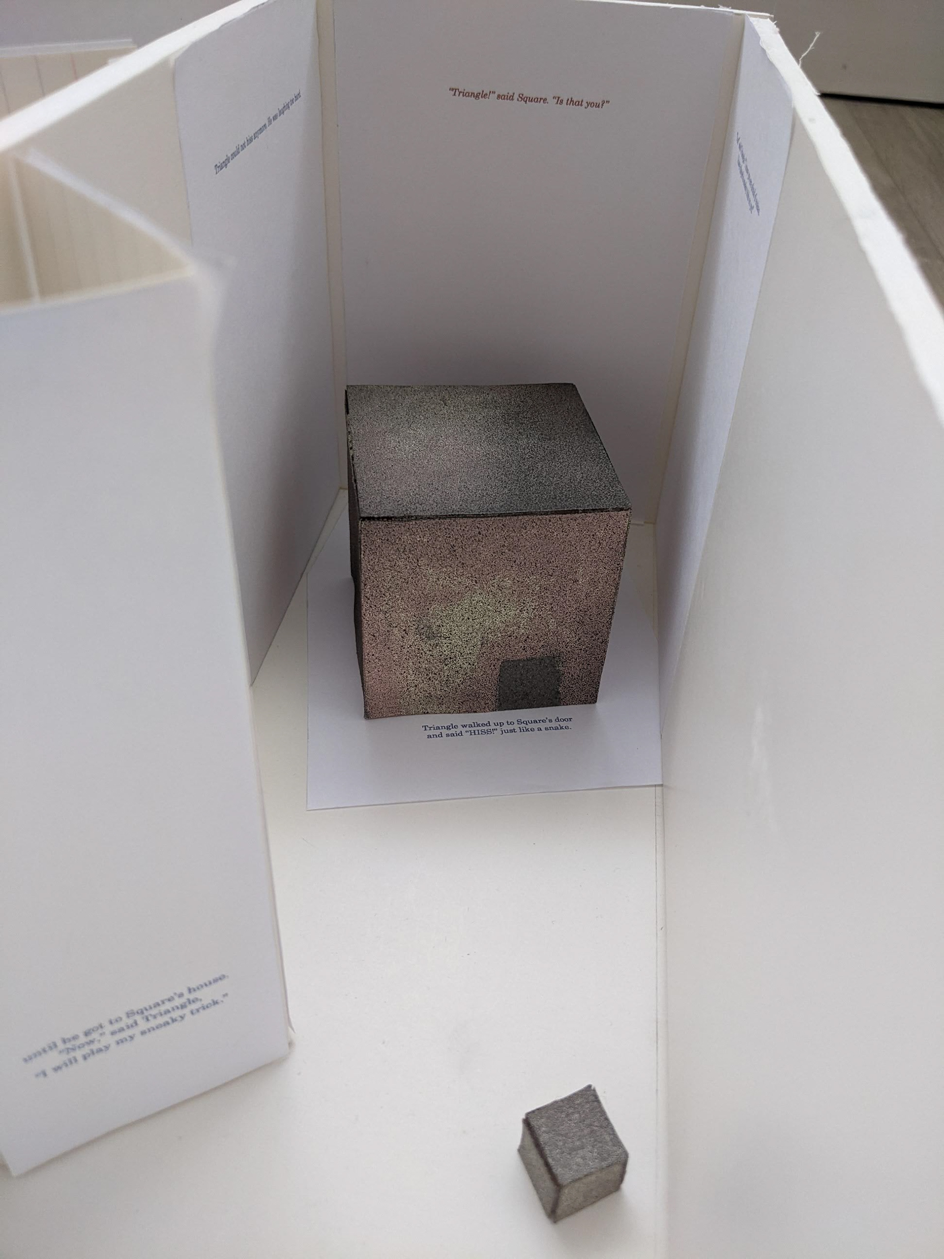
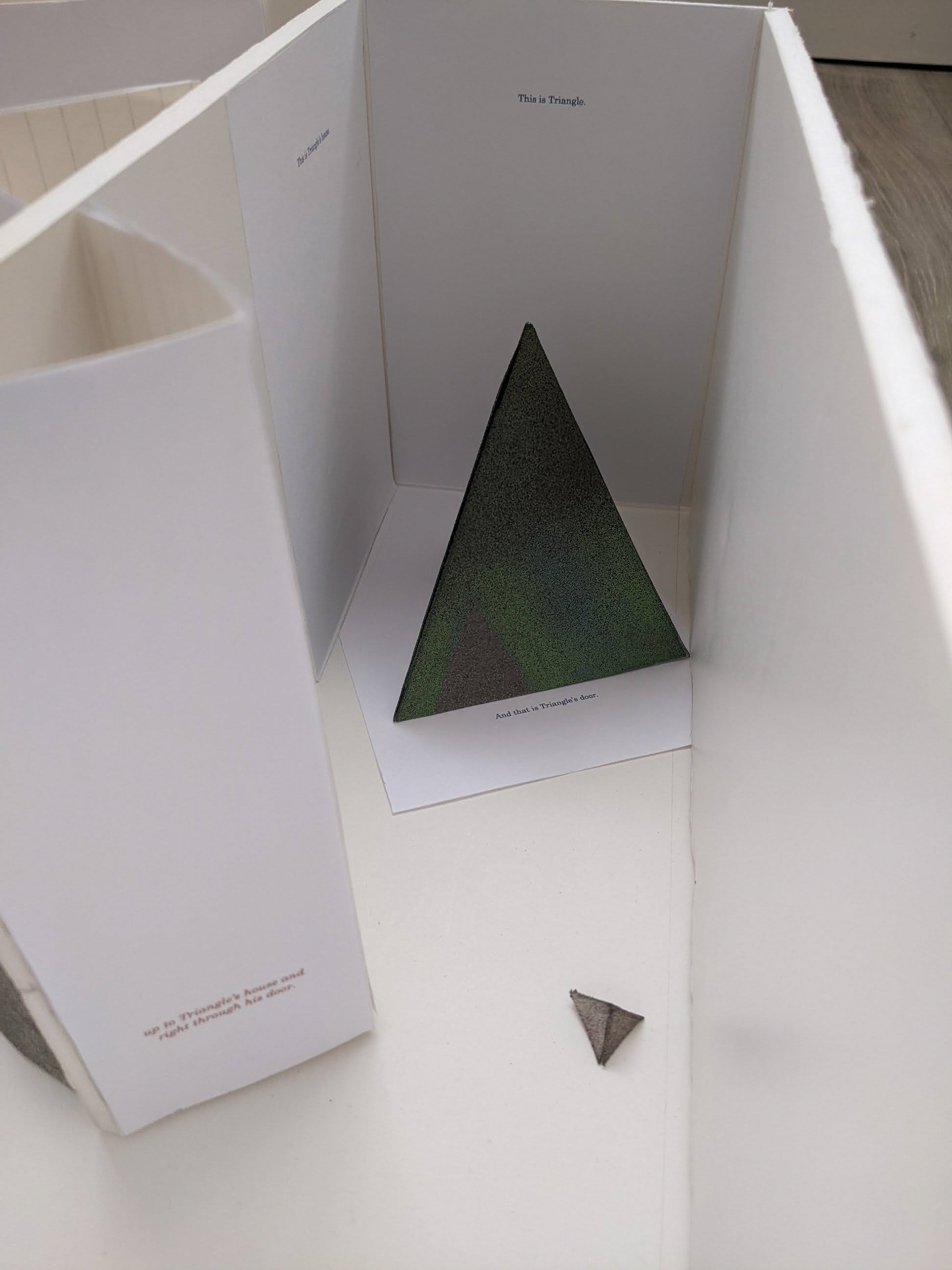

The typographic design of the museum exhibition is adaptable to a real-life exhibition space. The typeface is inspired by the typeface used in the book, New Century Schoolbook. The text should be low on the wall to invite children to read it easily.
La typographie de l'exposition muséale est adaptable à un espace d'exposition réel. La police s'inspire de celle dans le livre qui est, New Century Schoolbook. Le texte doit être placé bas sur le mur pour faciliter la lecture par les enfants.
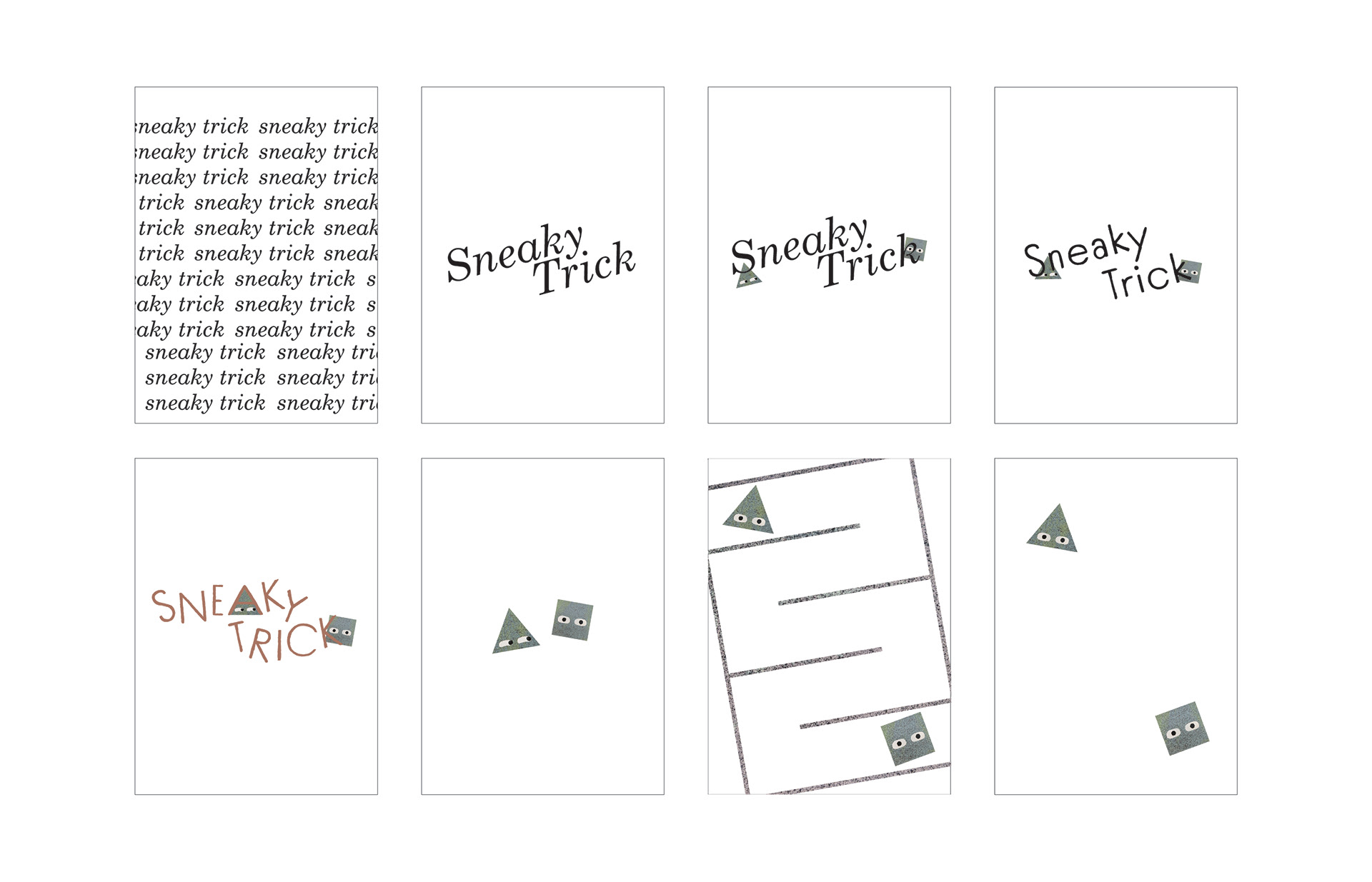
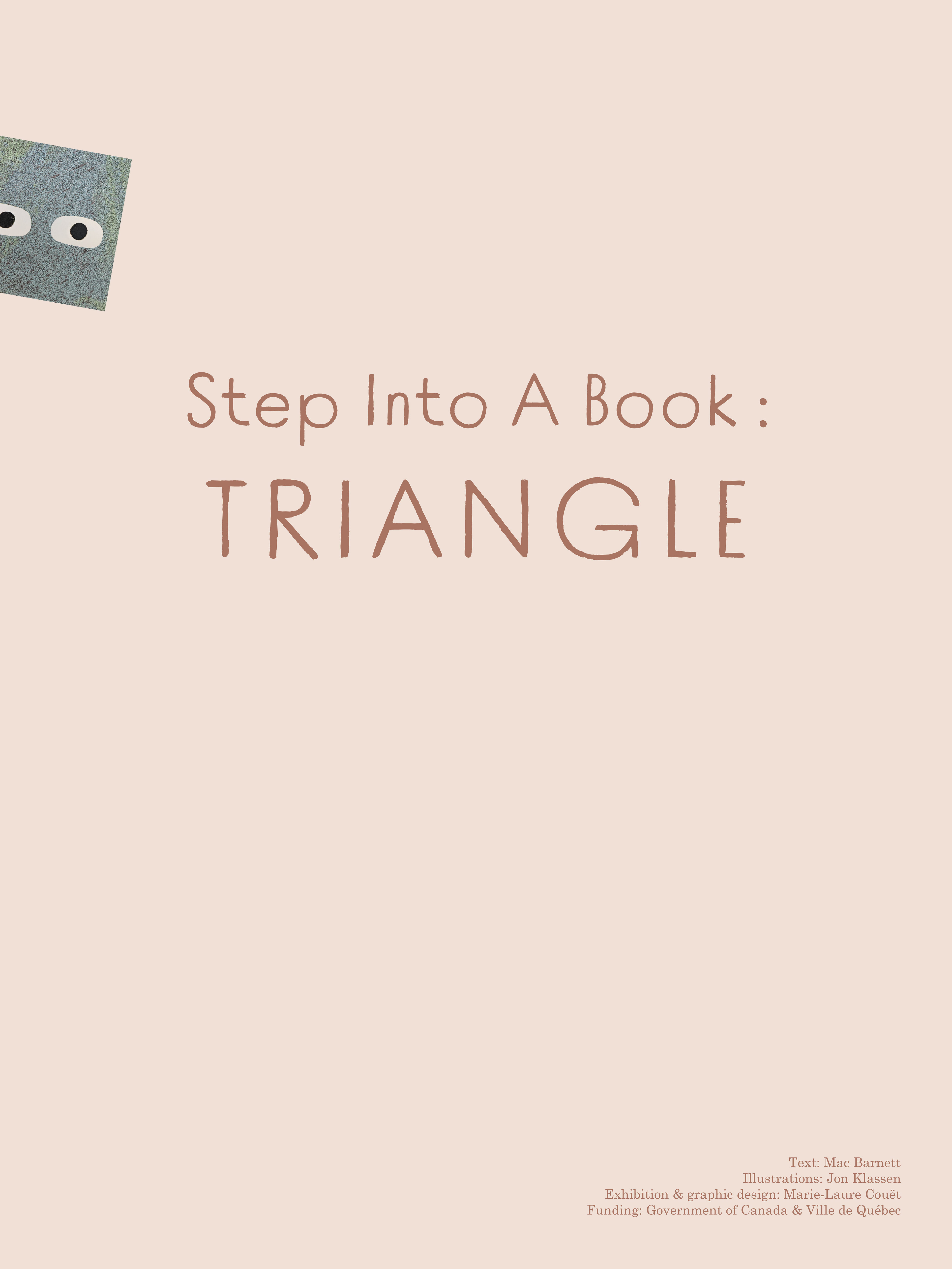
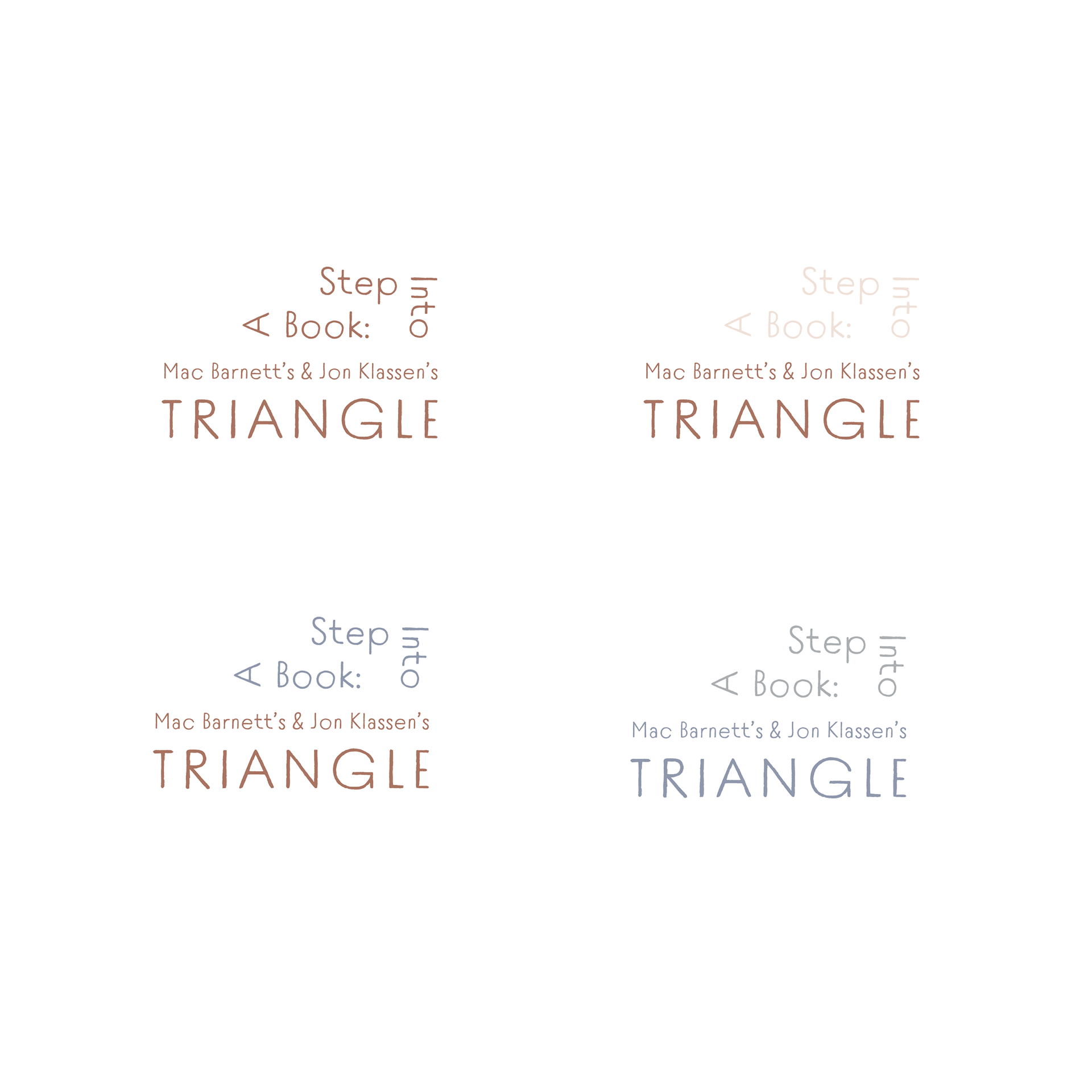
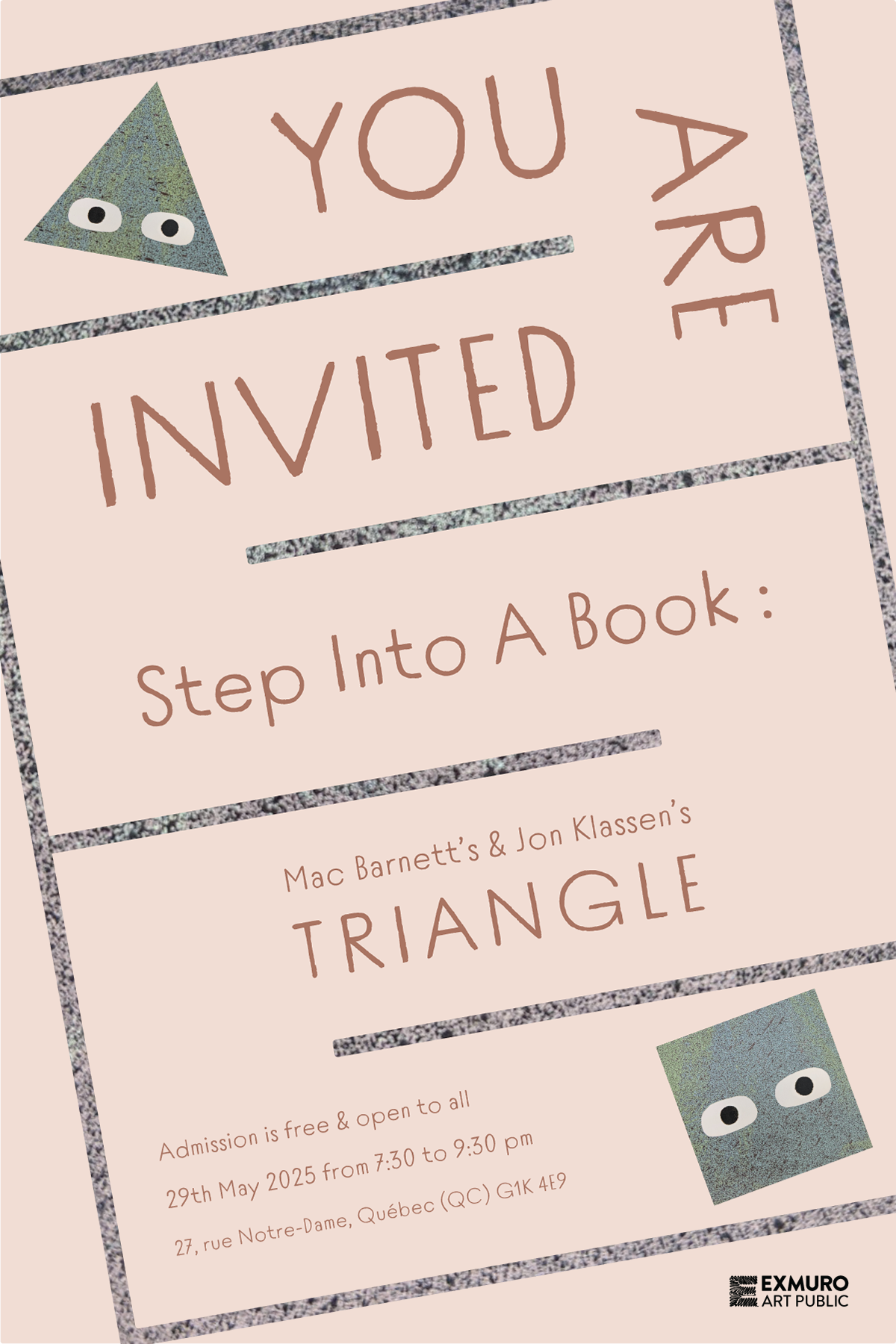
The introductory signage for the entrance of the museum exhibition utilizes Century Schoolbook for the body text and Tomarik Introvert for the header, which is inspired by the hand-lettered-look of the type on the book's spine.
La signalétique d'introduction à l'entrée de l'exposition utilise Century Schoolbook pour le corps du texte et Tomarik Introvert pour l'en-tête, qui s'inspire de l'aspect manuscrit du type sur le dos du livre.
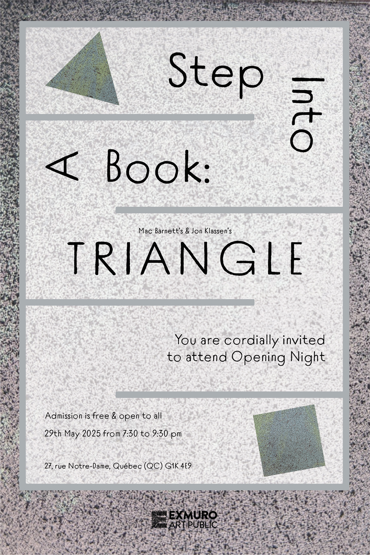
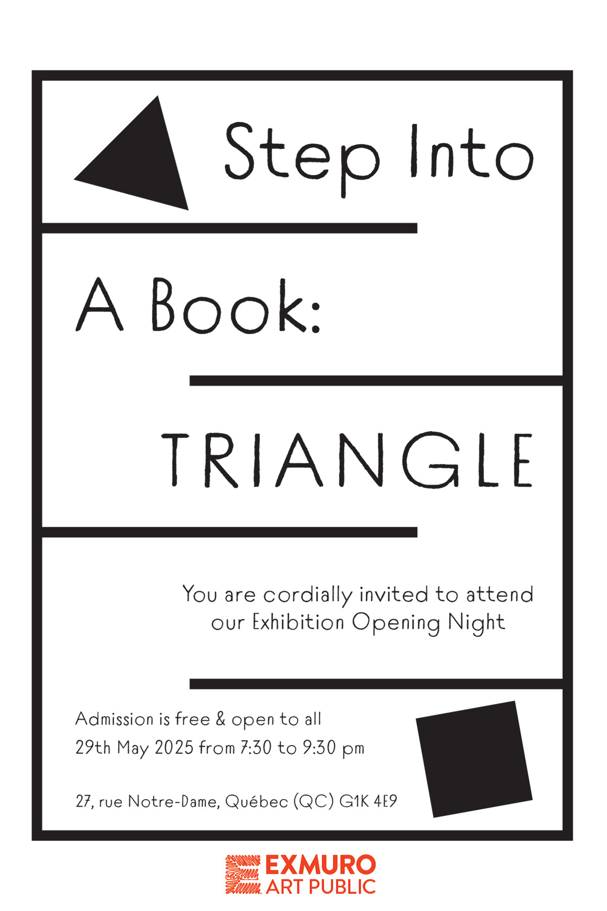
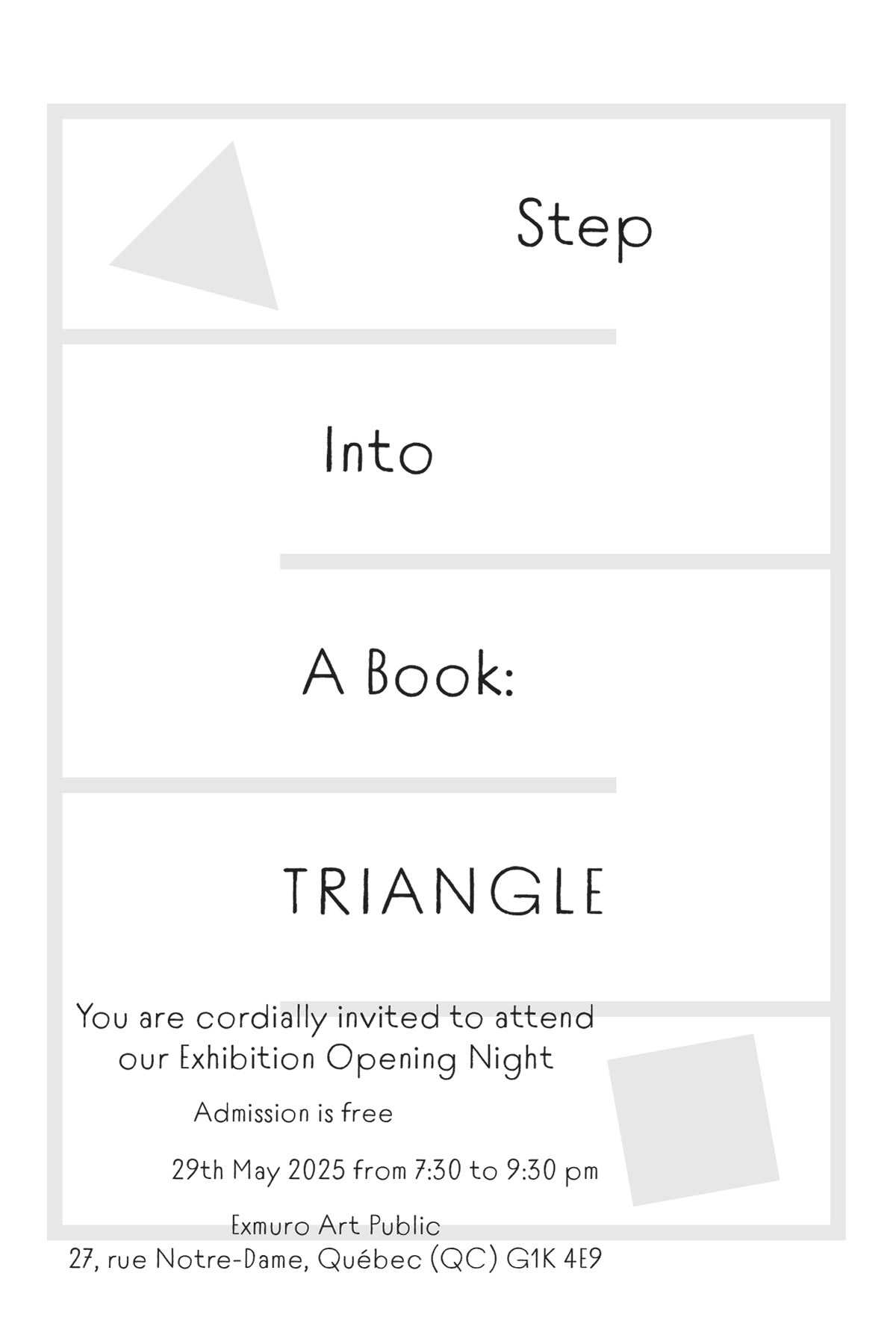
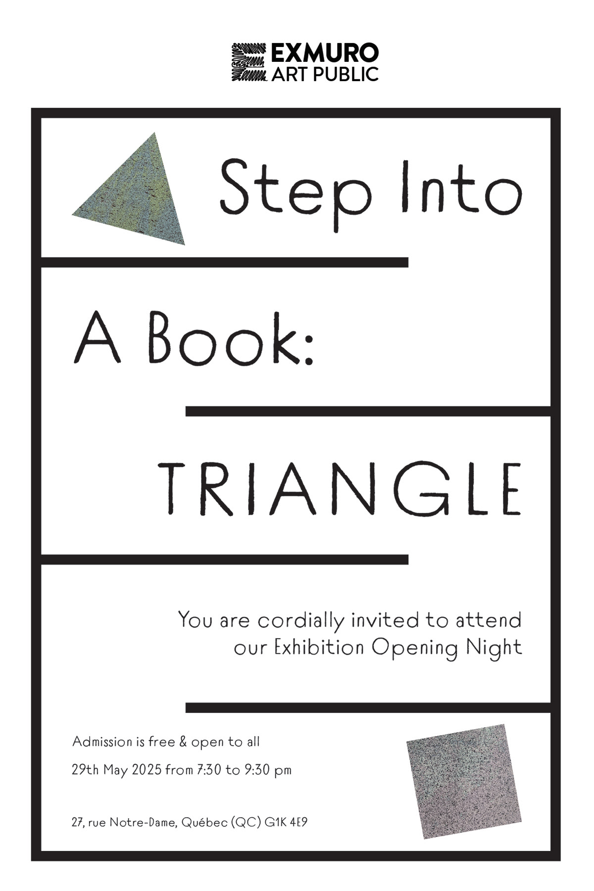
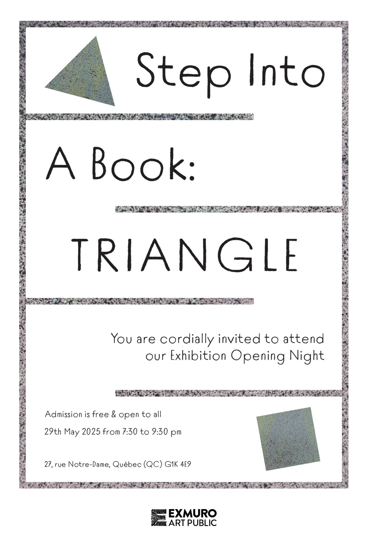
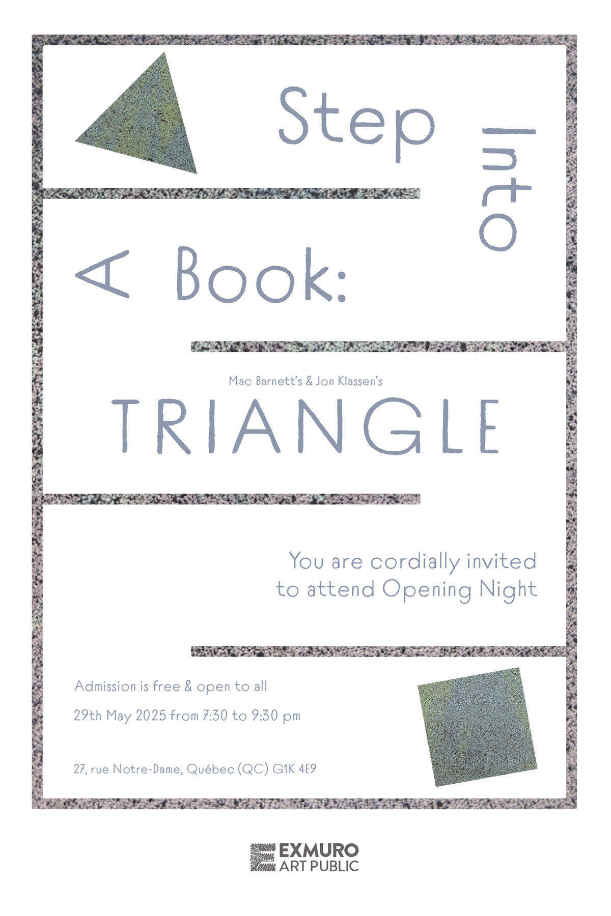
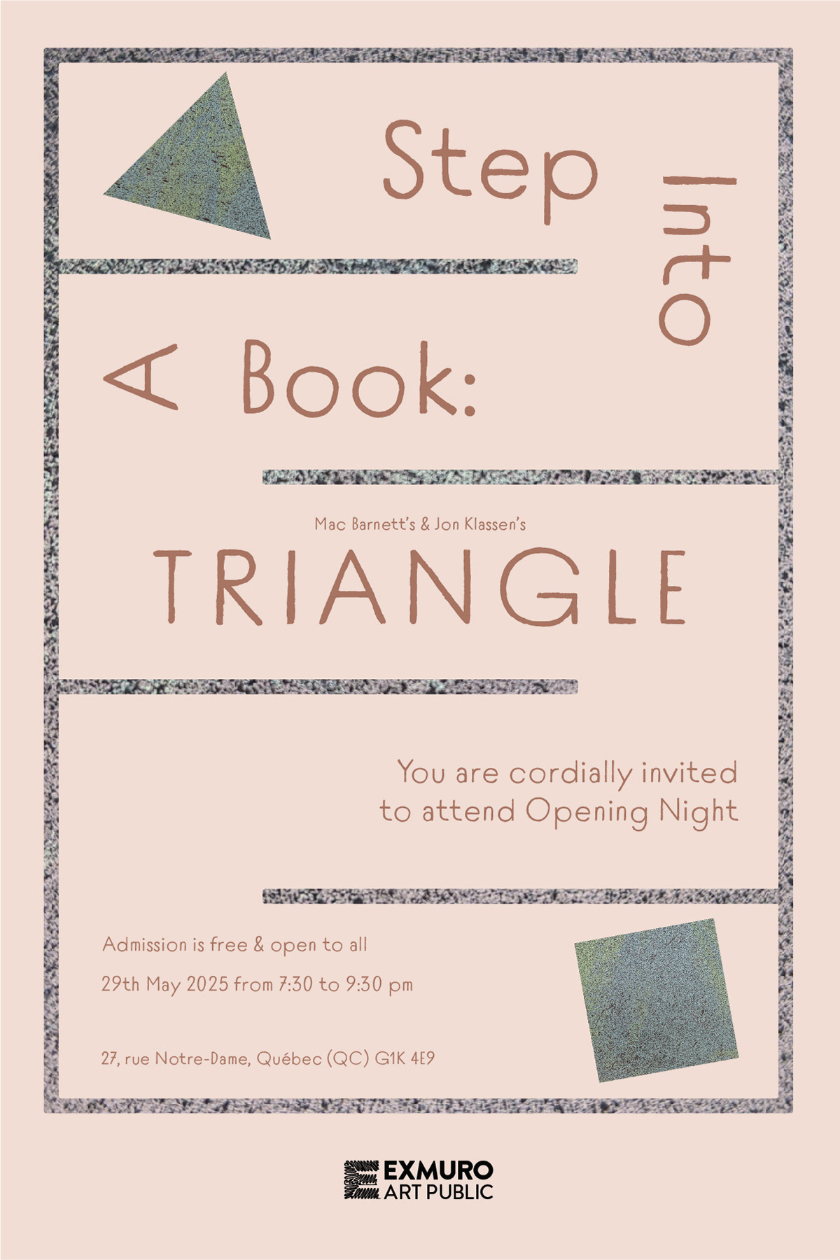
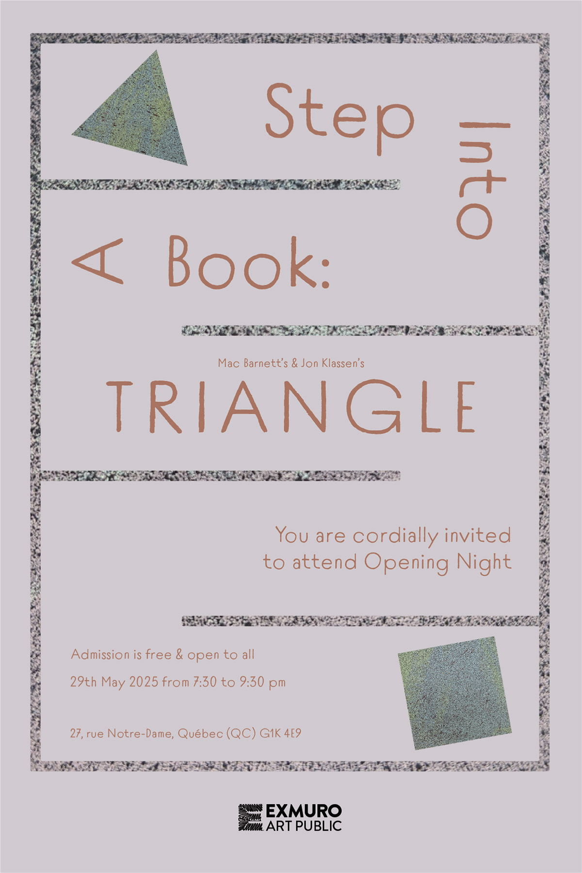
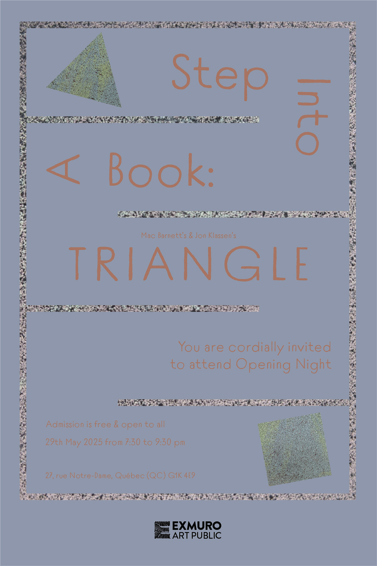
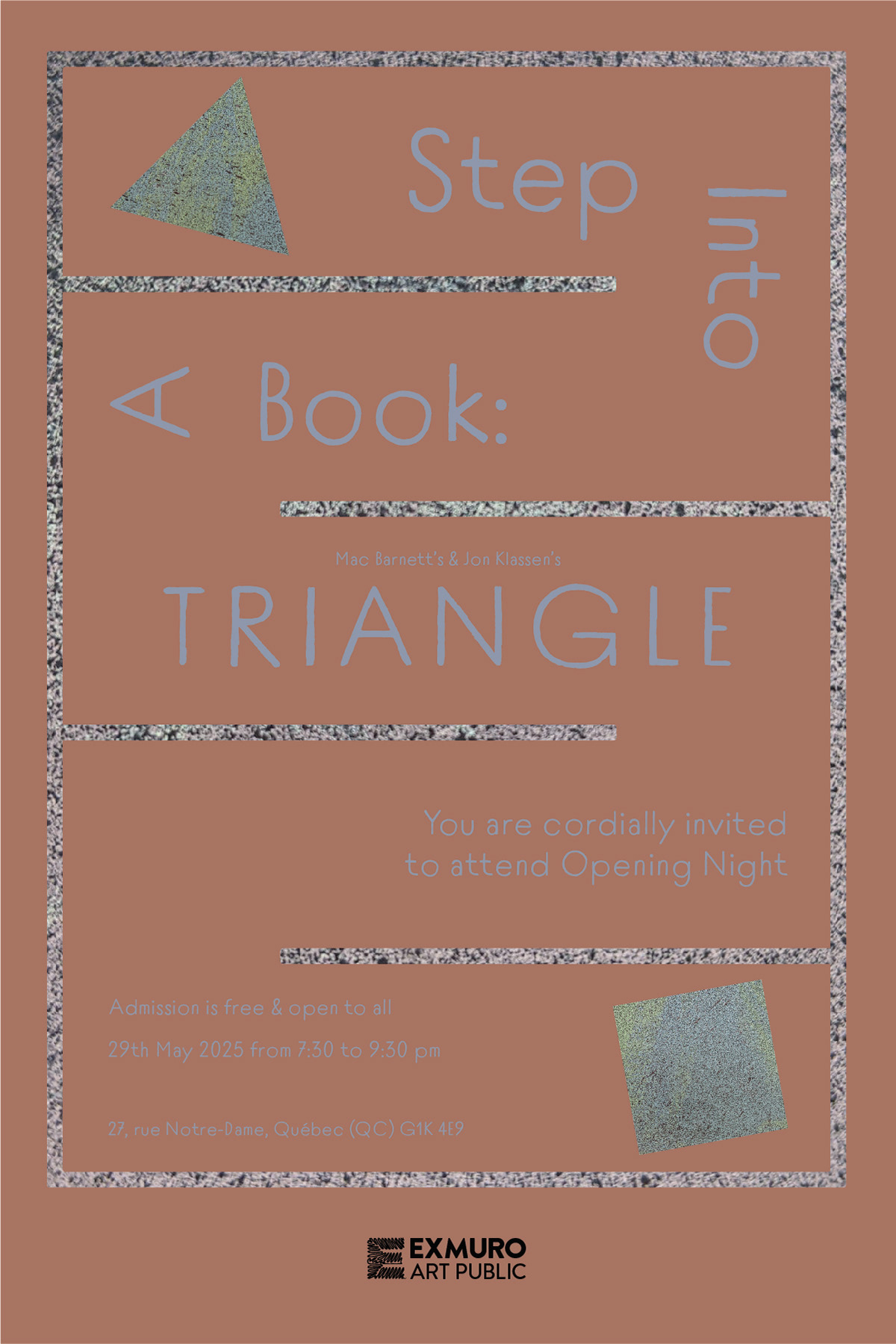
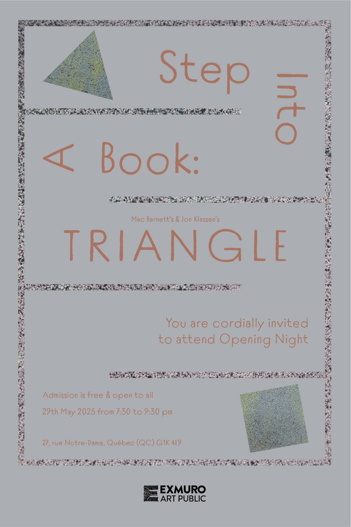
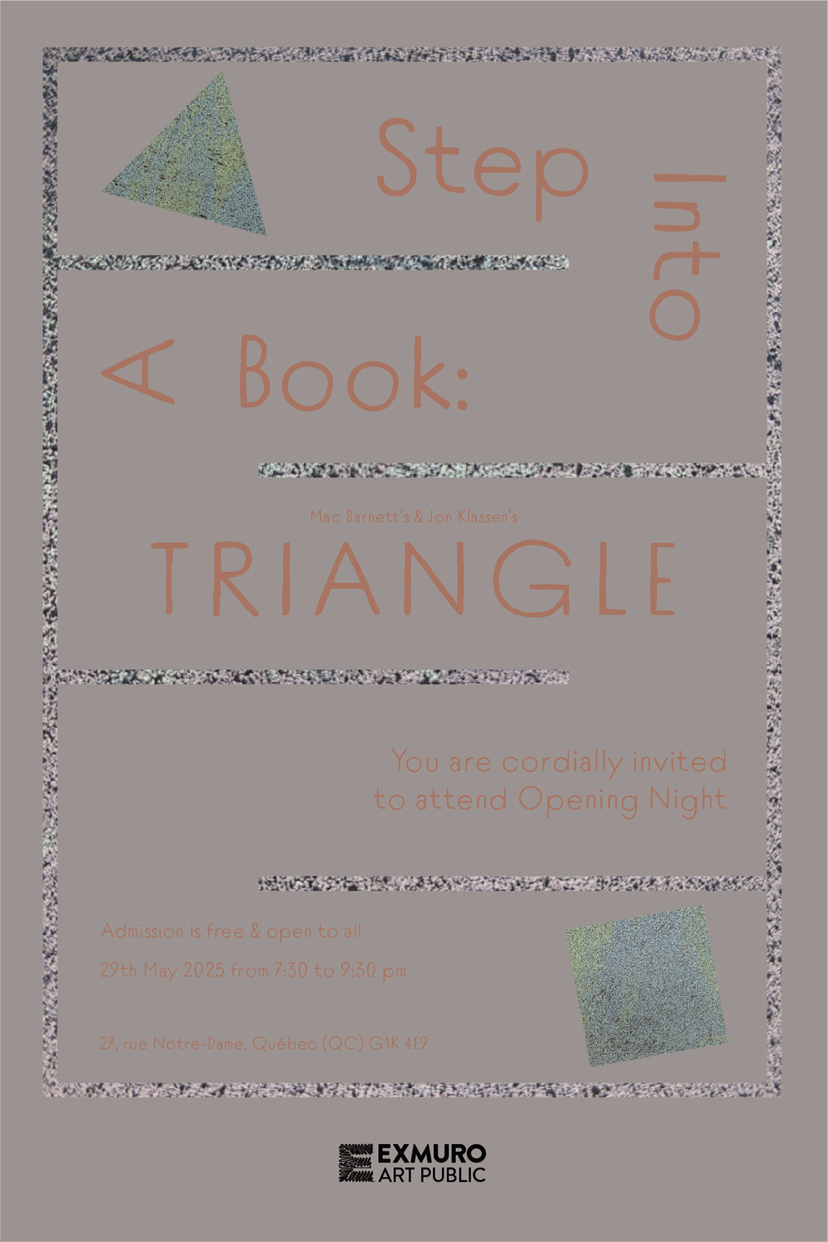
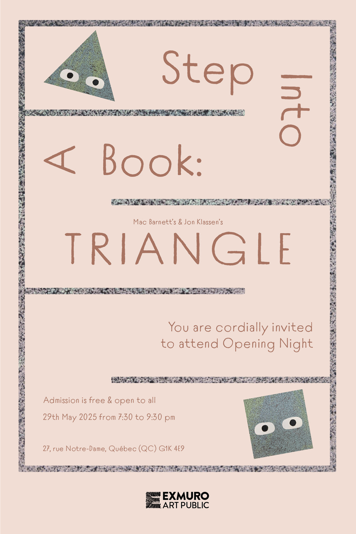
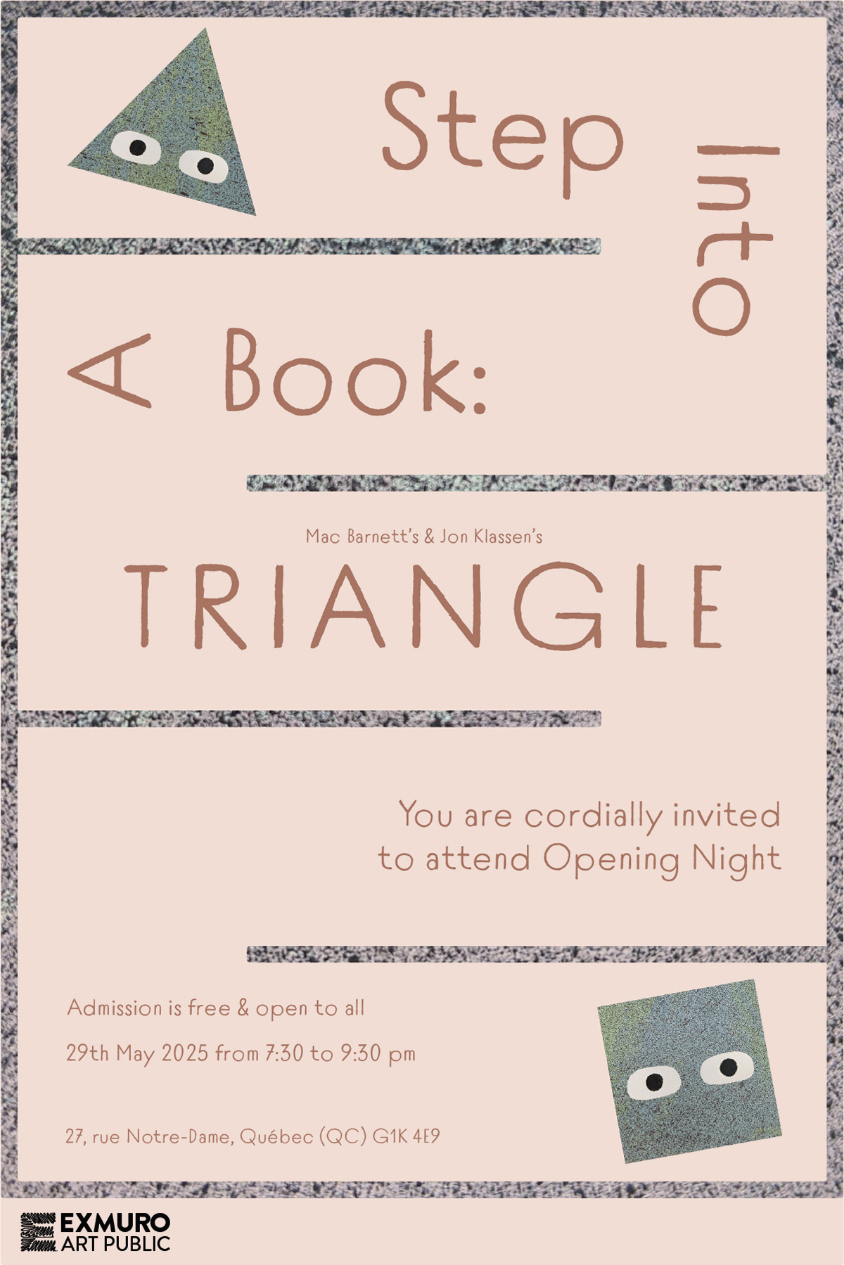
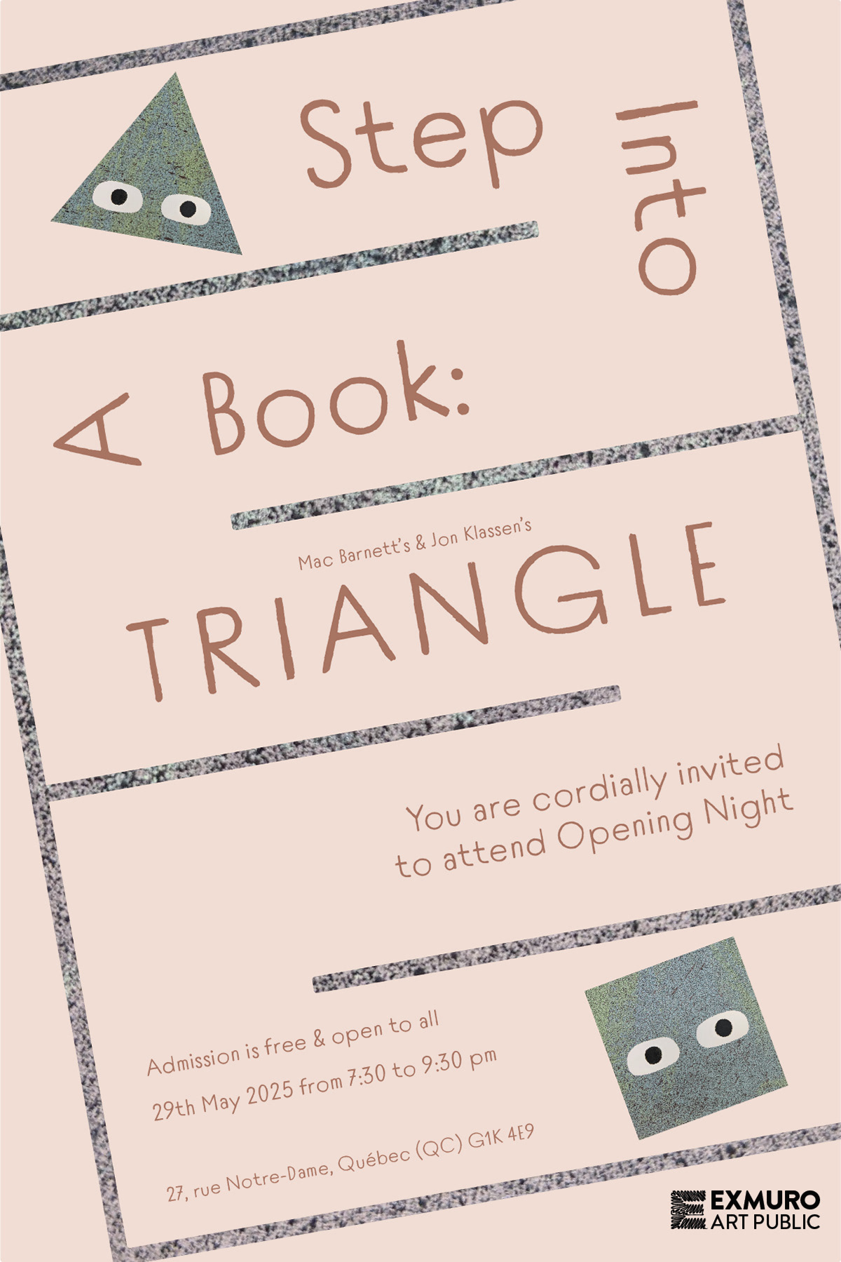
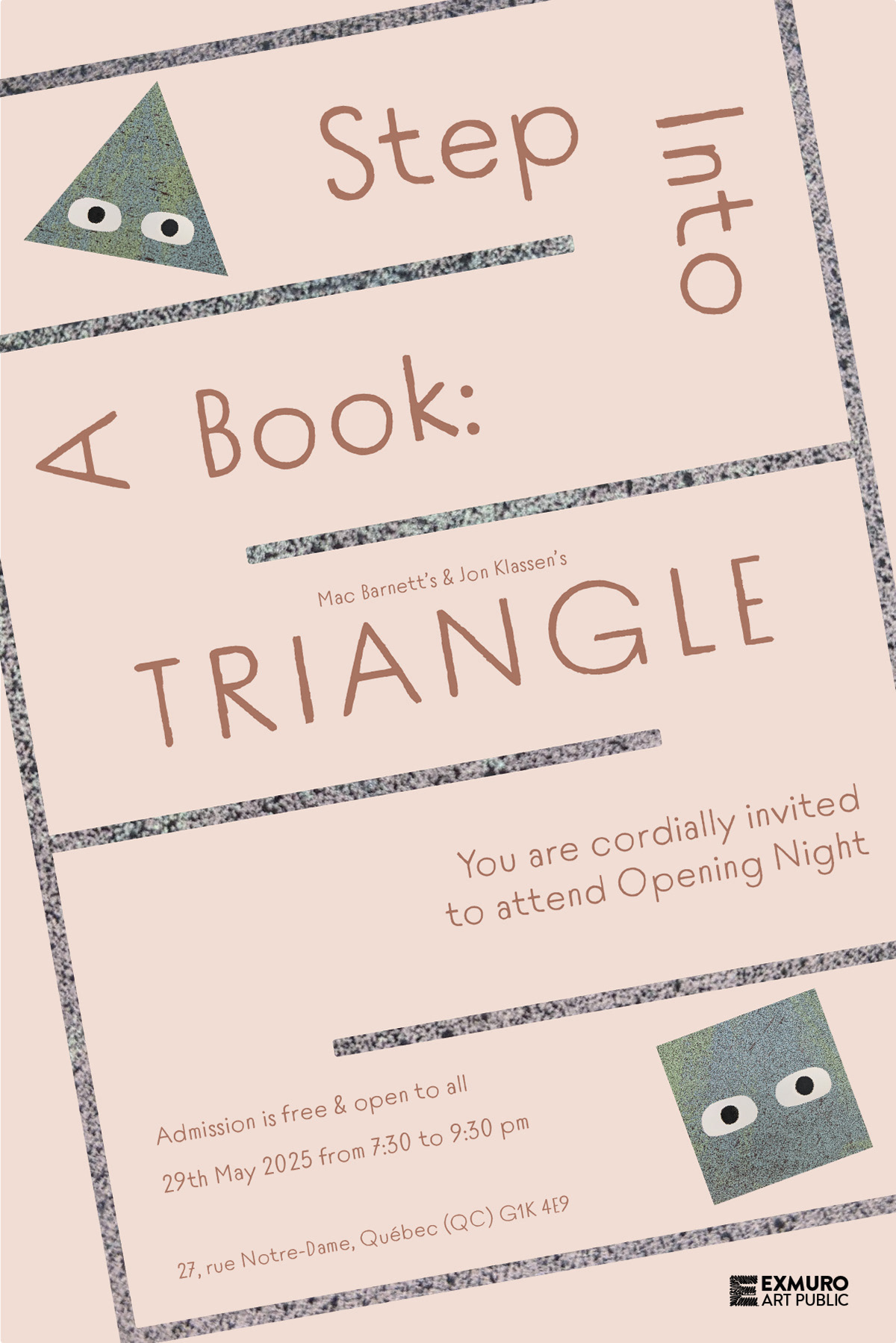
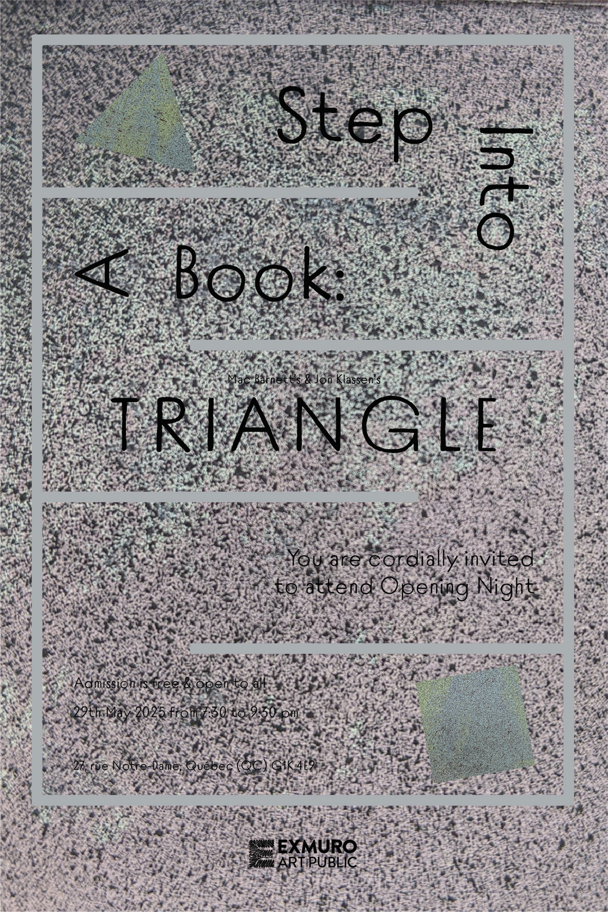
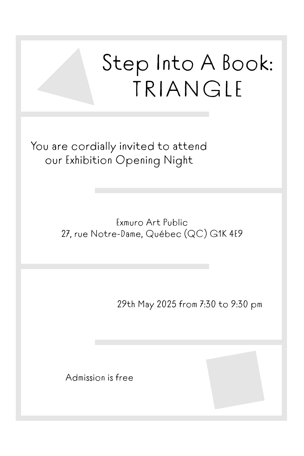
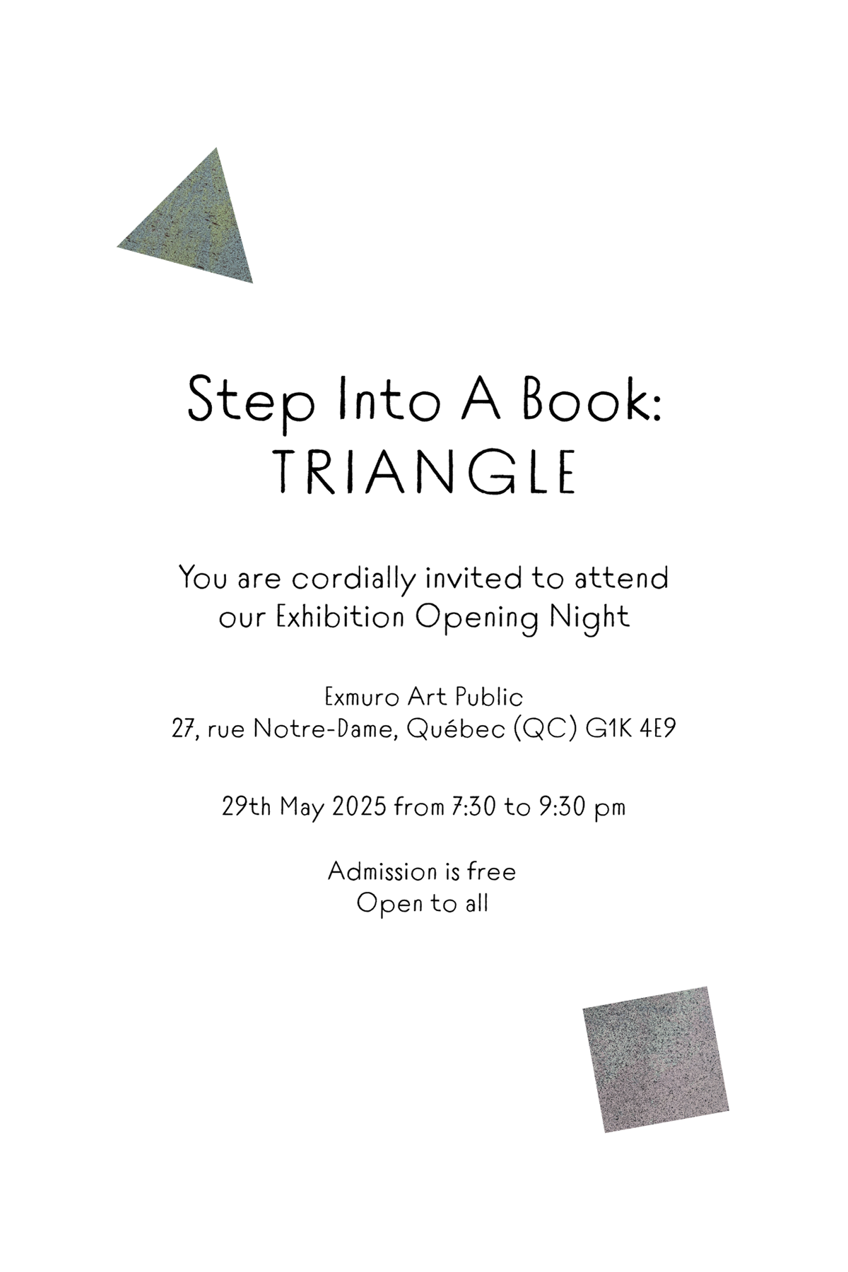
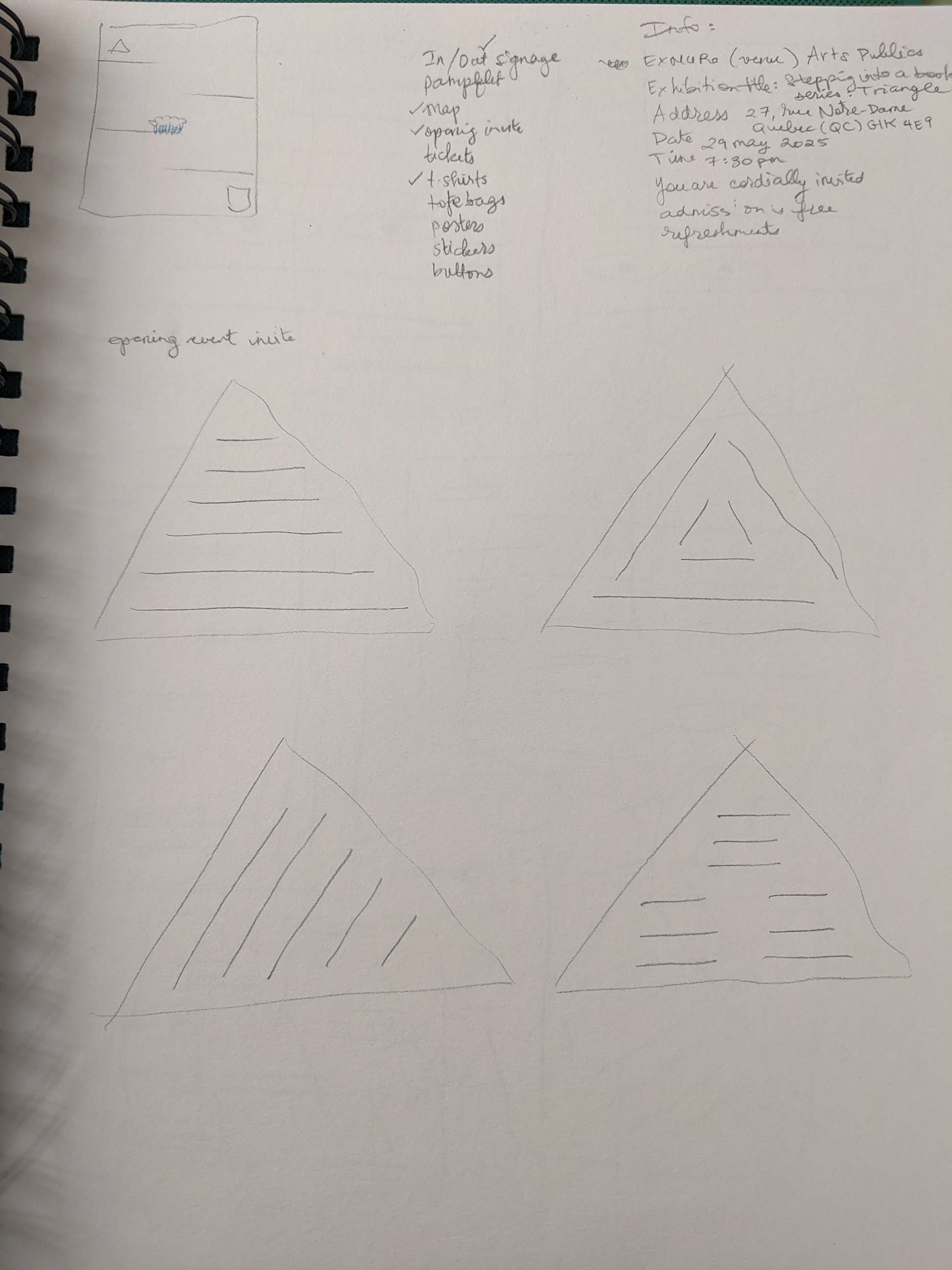
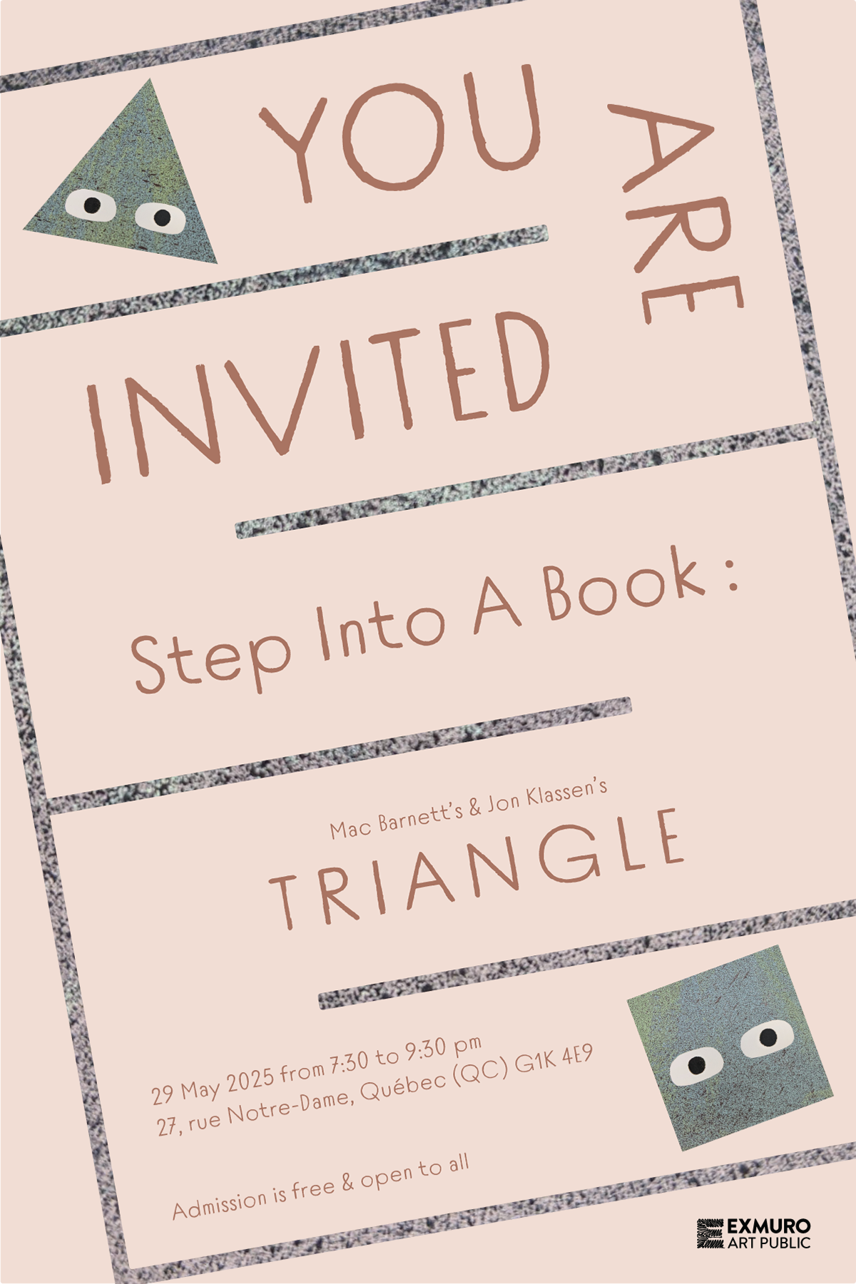
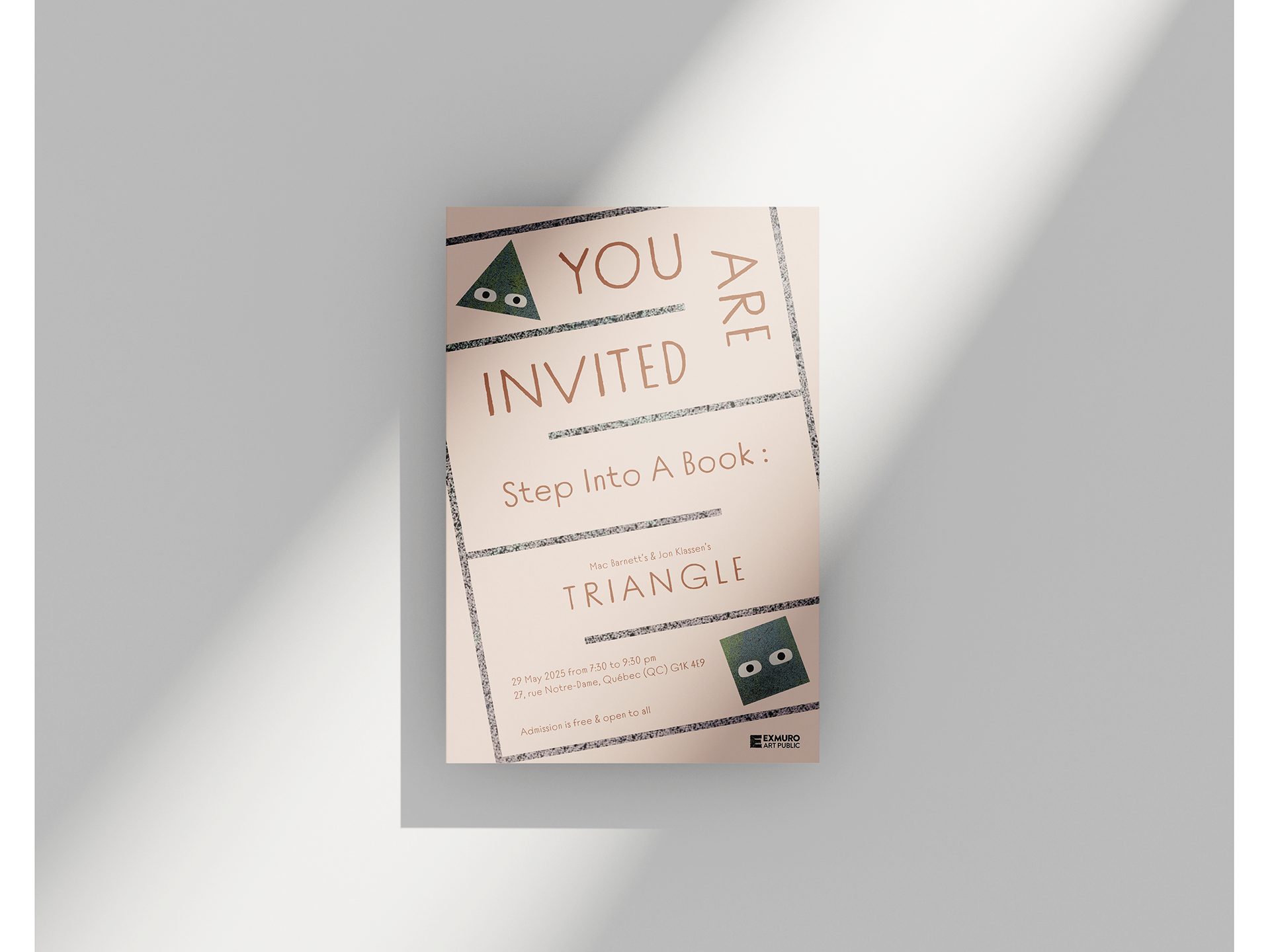
The invitation to the opening night of the exhibition:
L'invitation à la soirée vernissage:
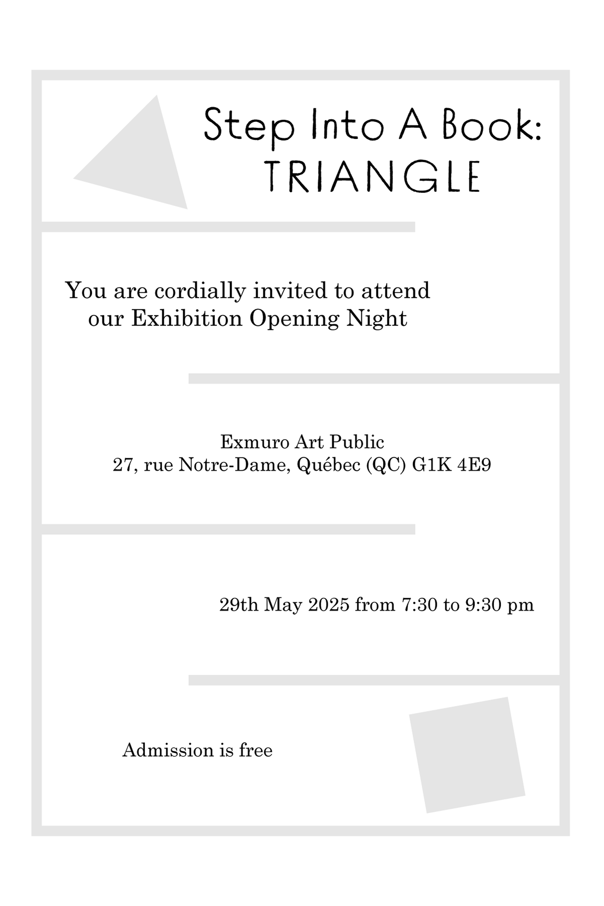
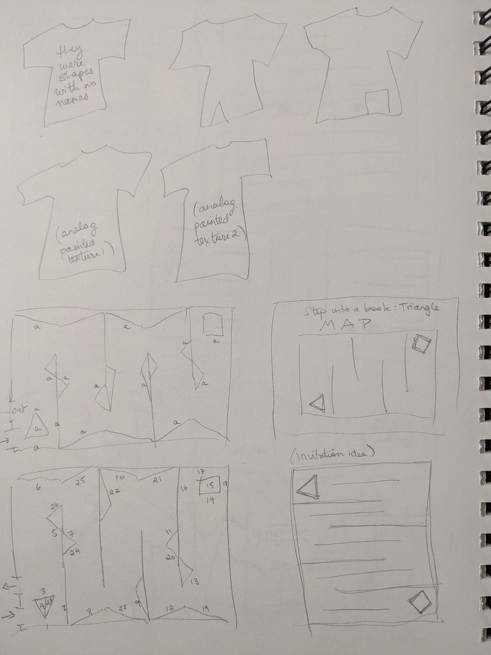
The guide map for visitors of the exhibition:
Le guide des visiteurs de l'exposition :

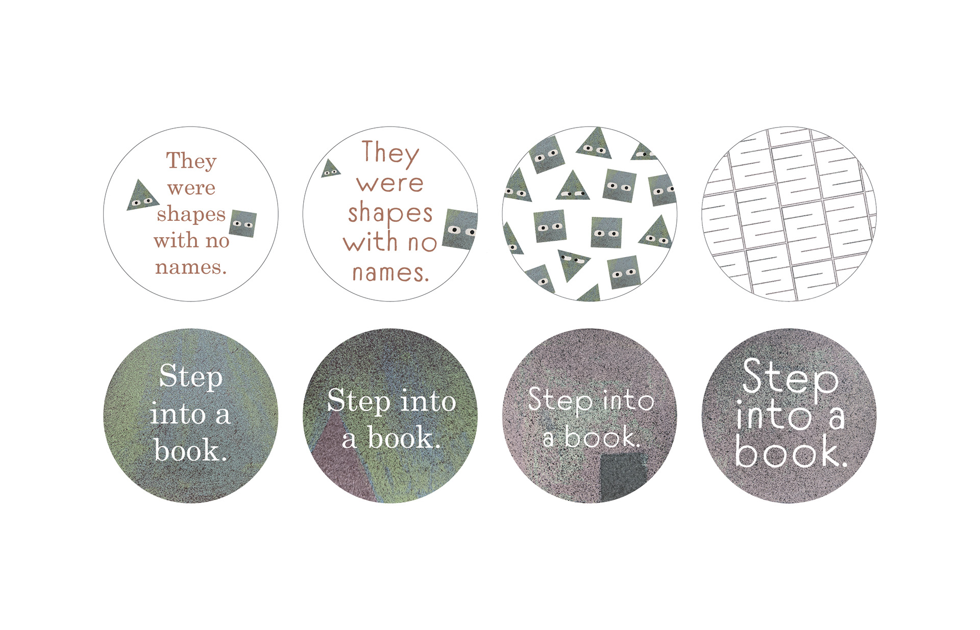
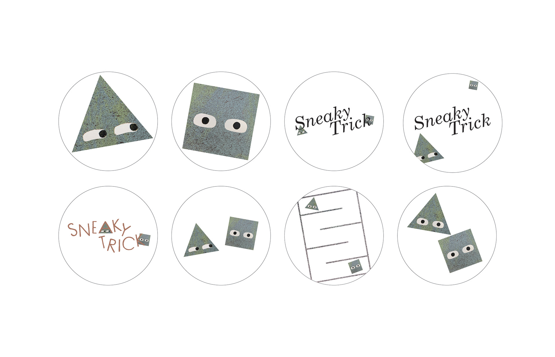
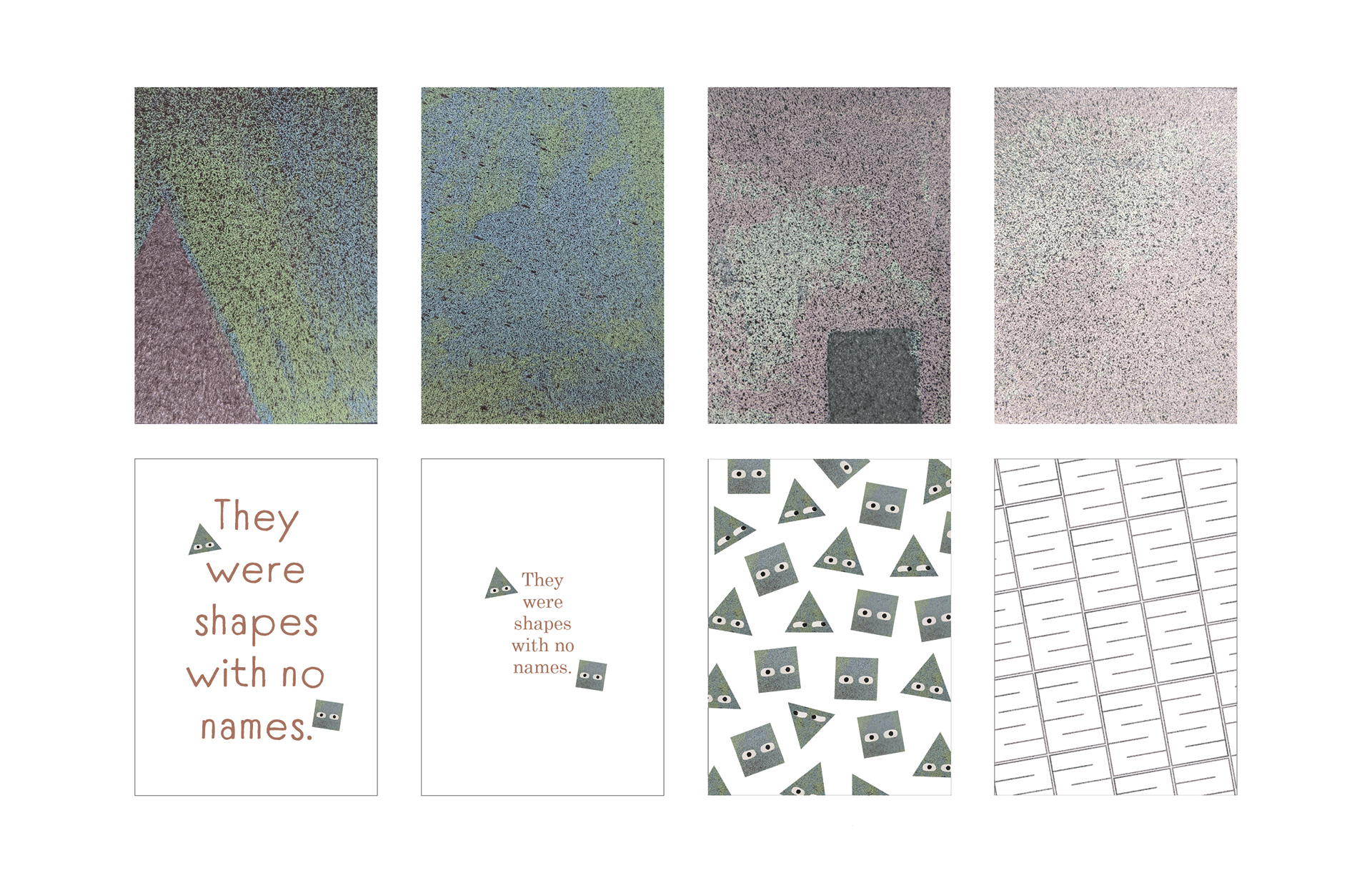
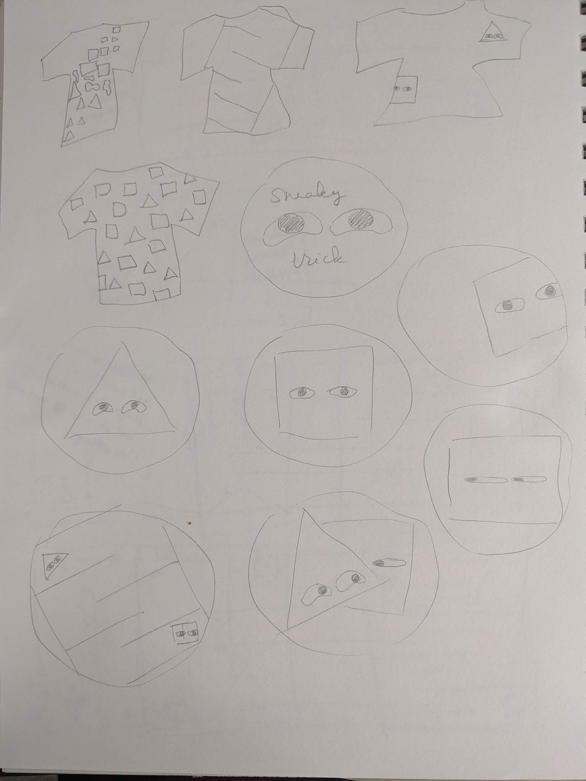
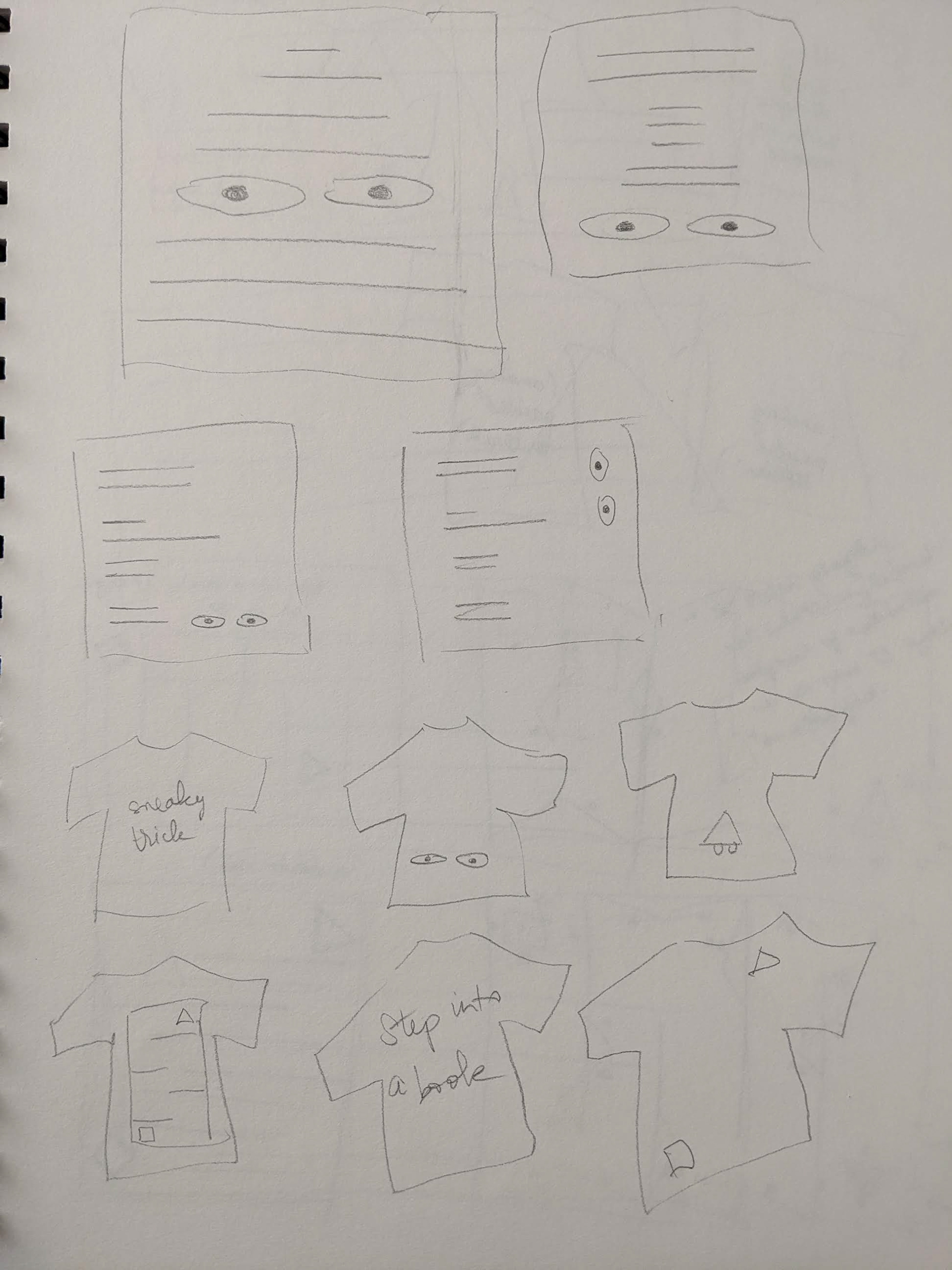
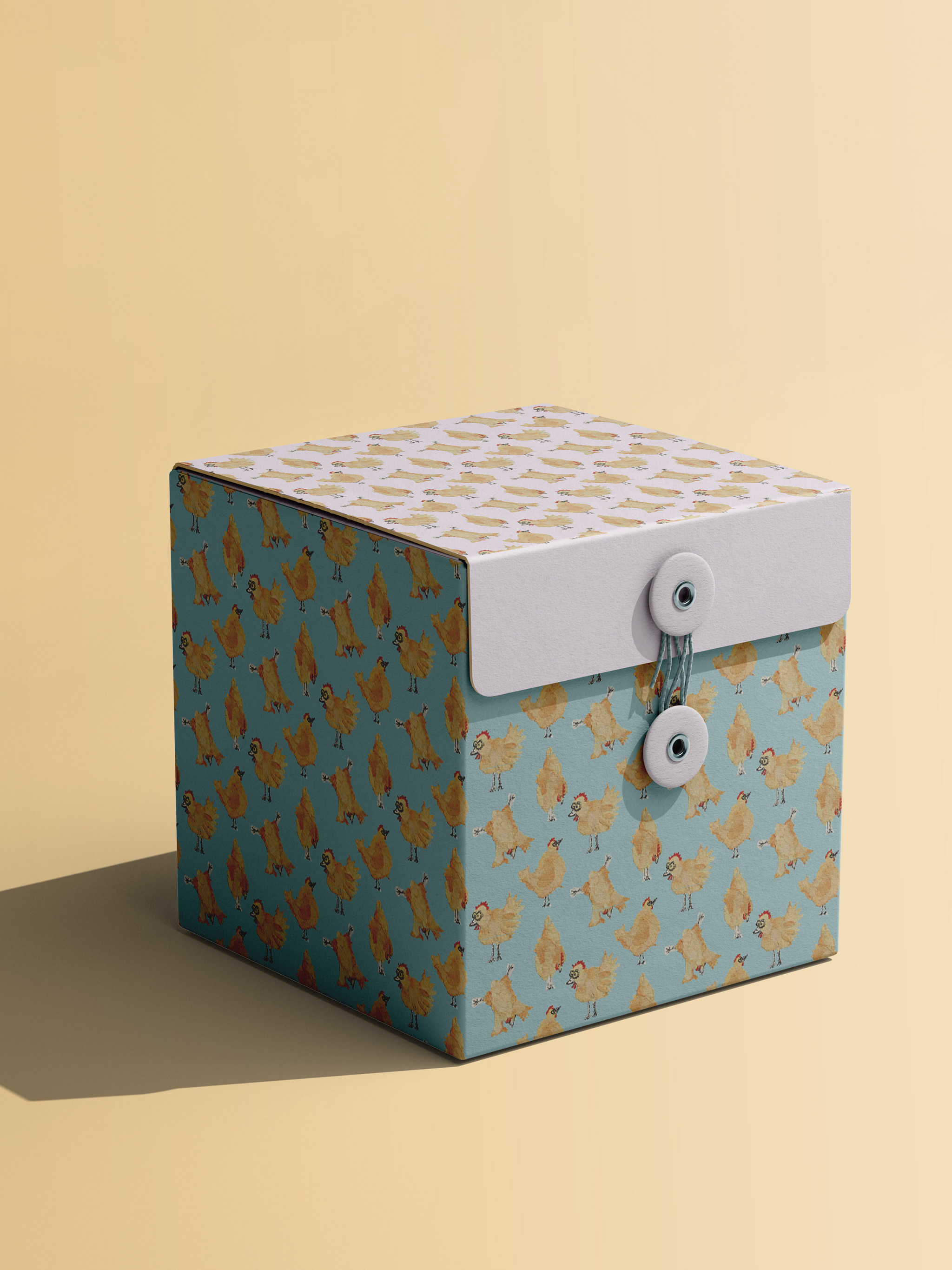
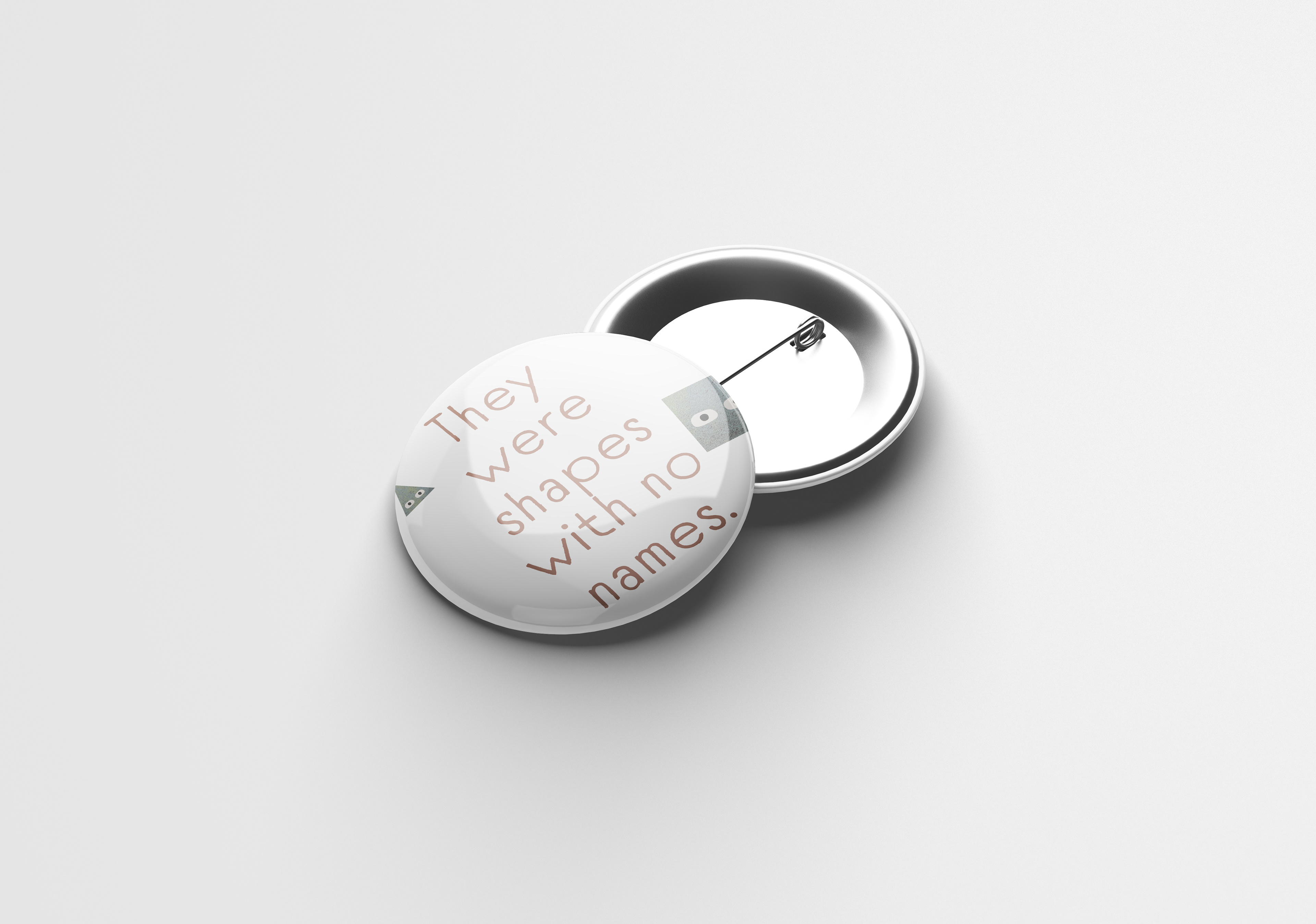
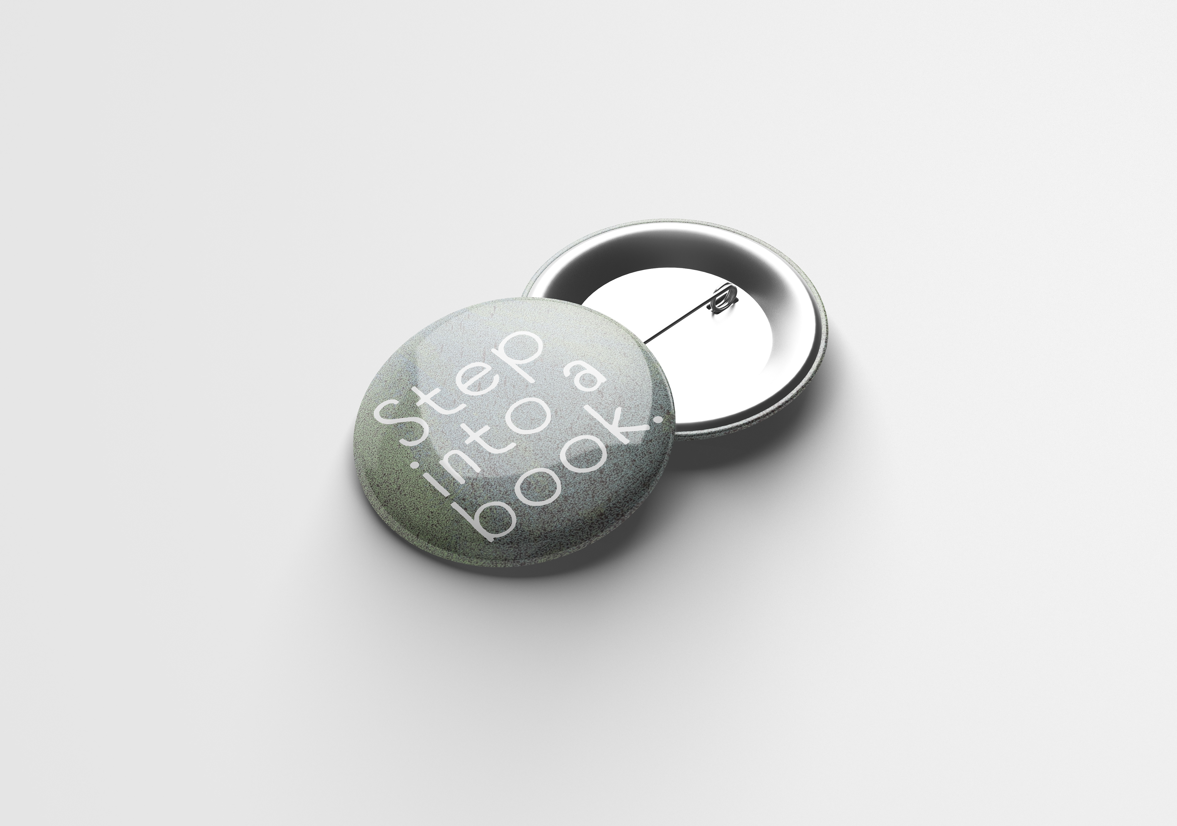
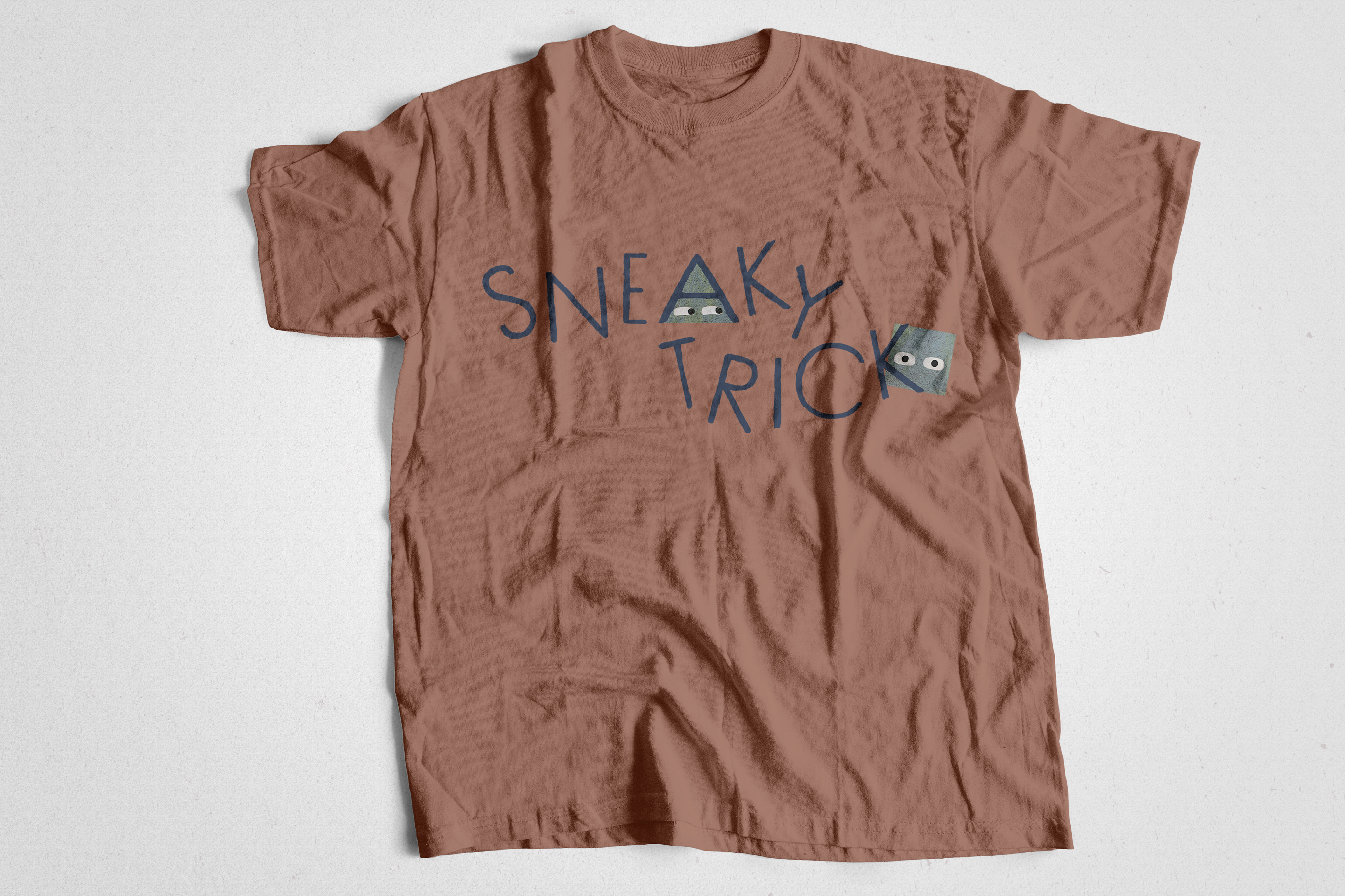
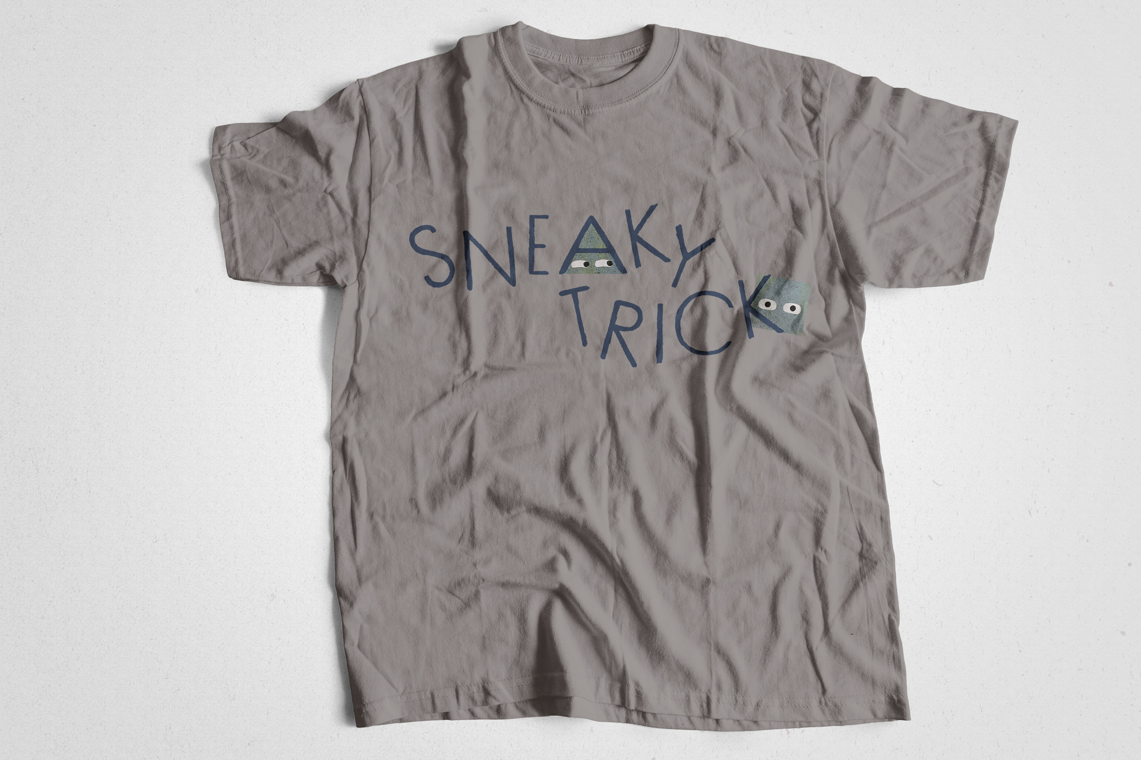
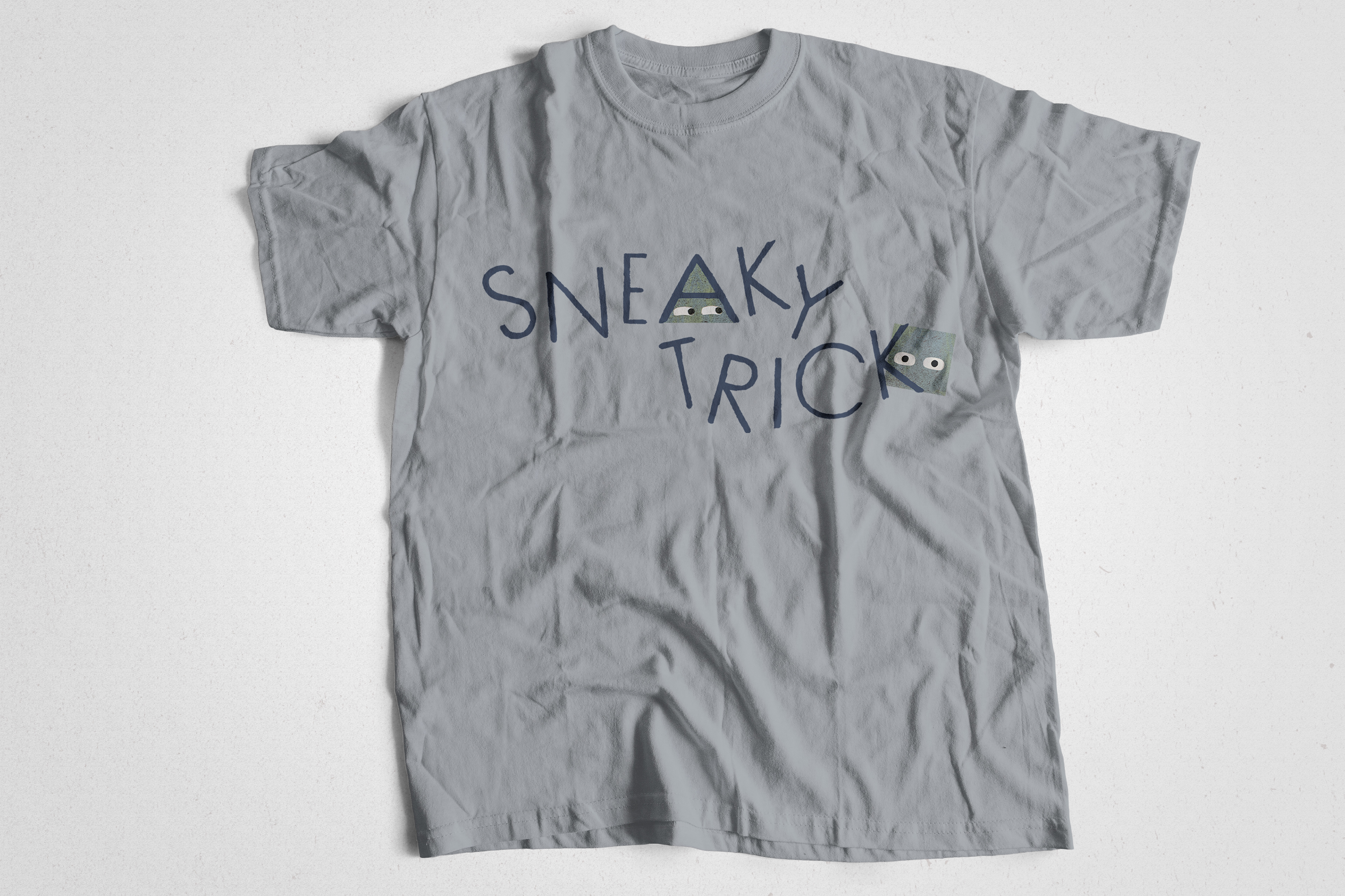
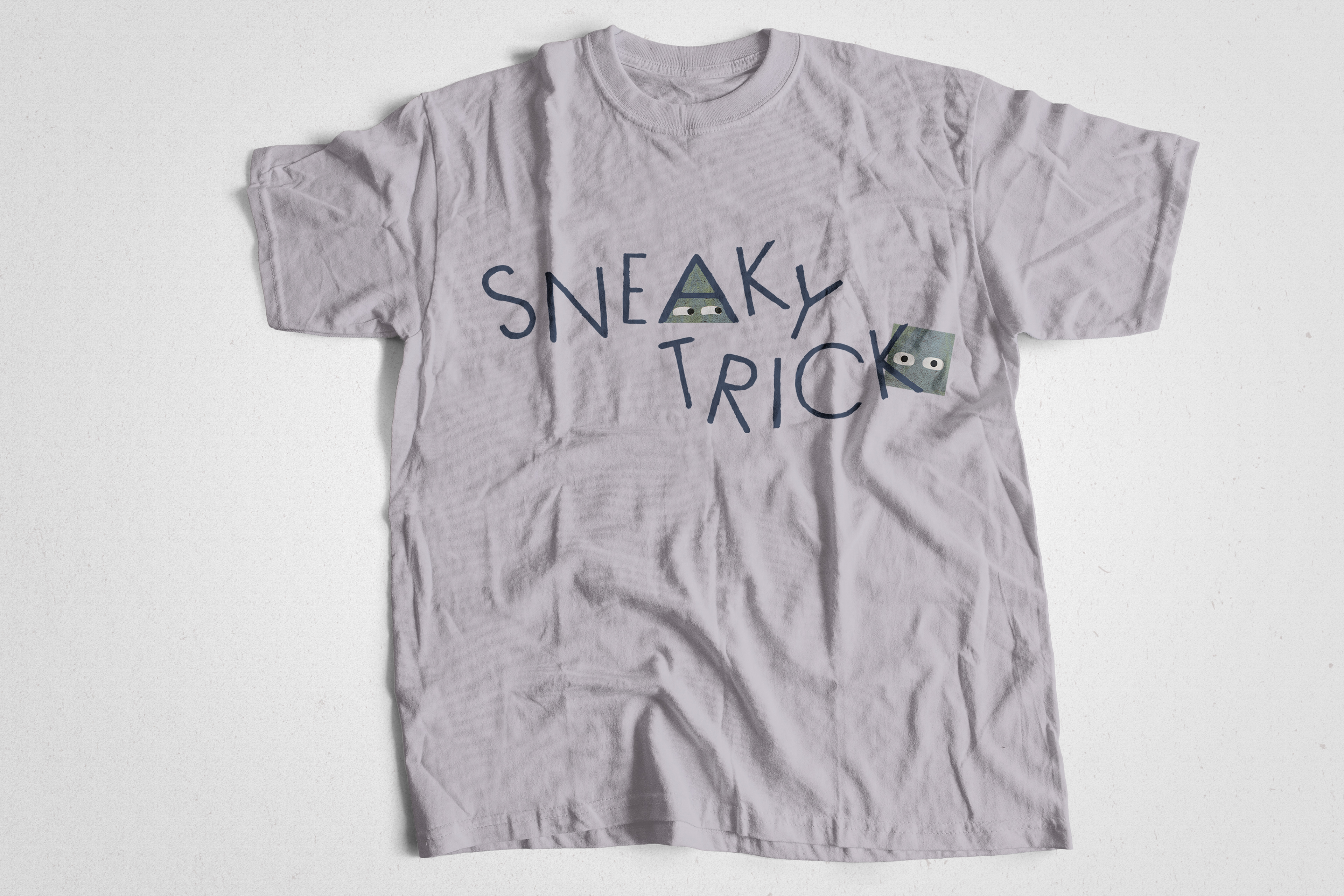
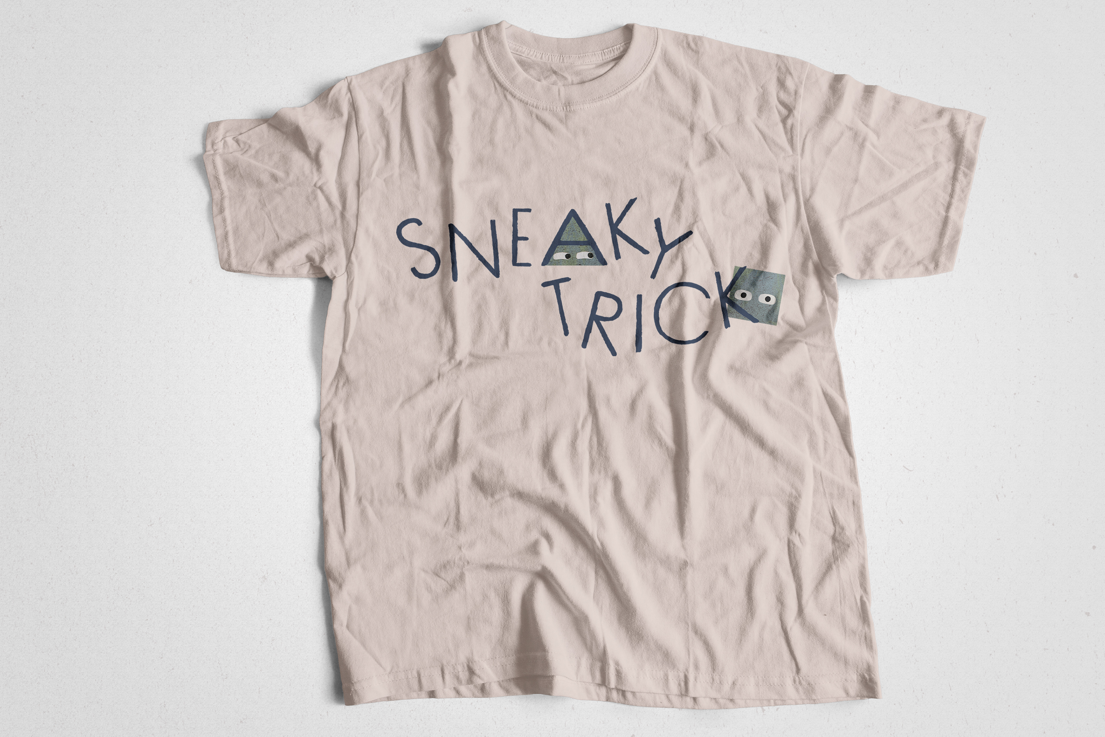
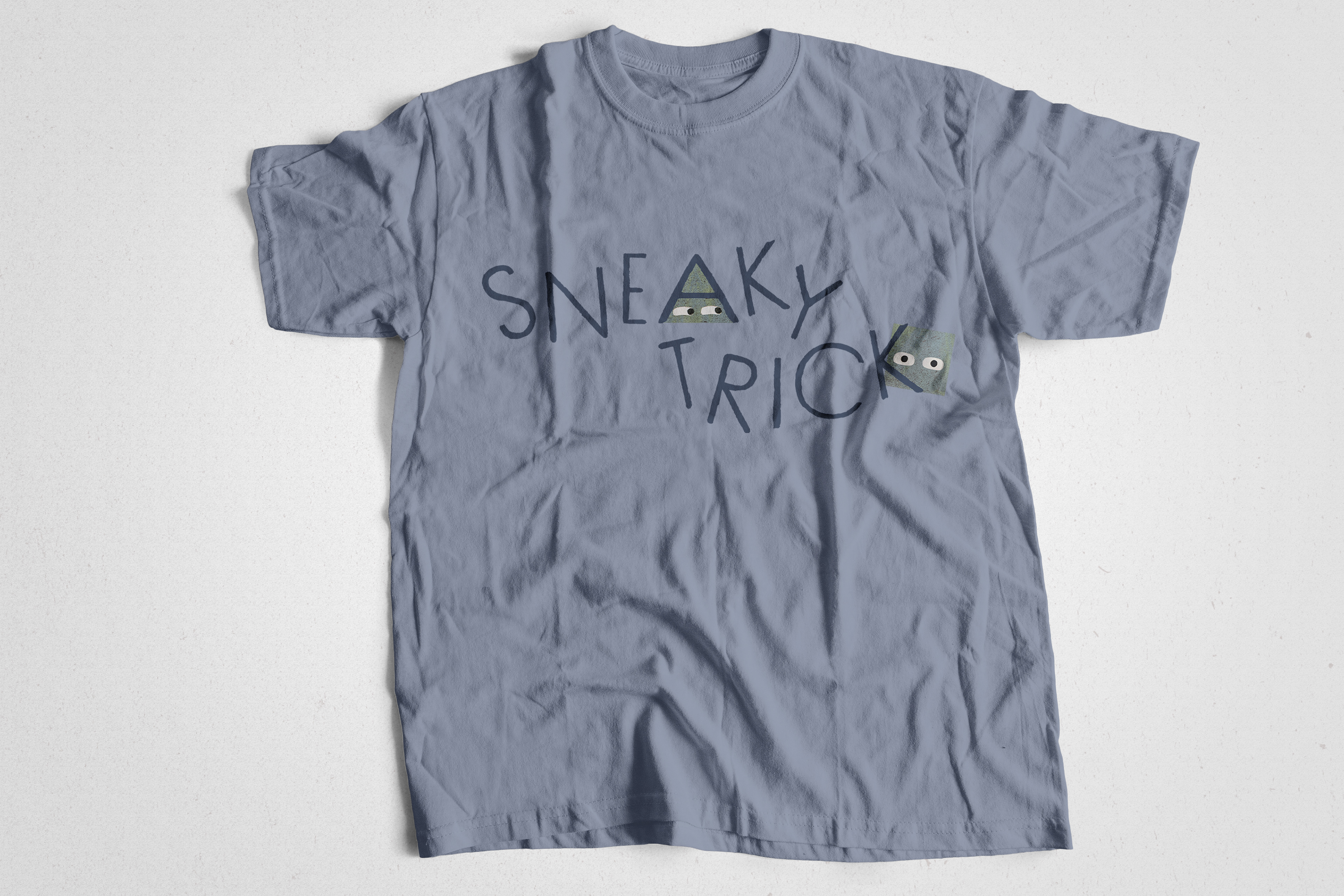
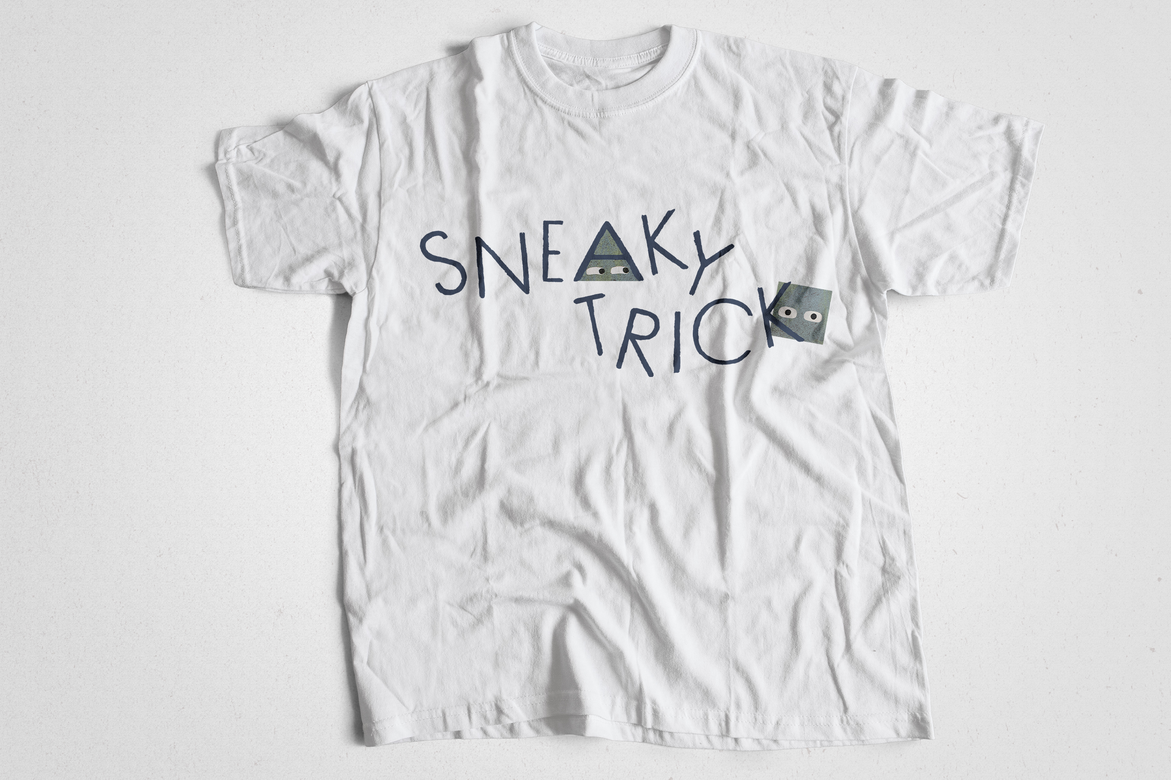
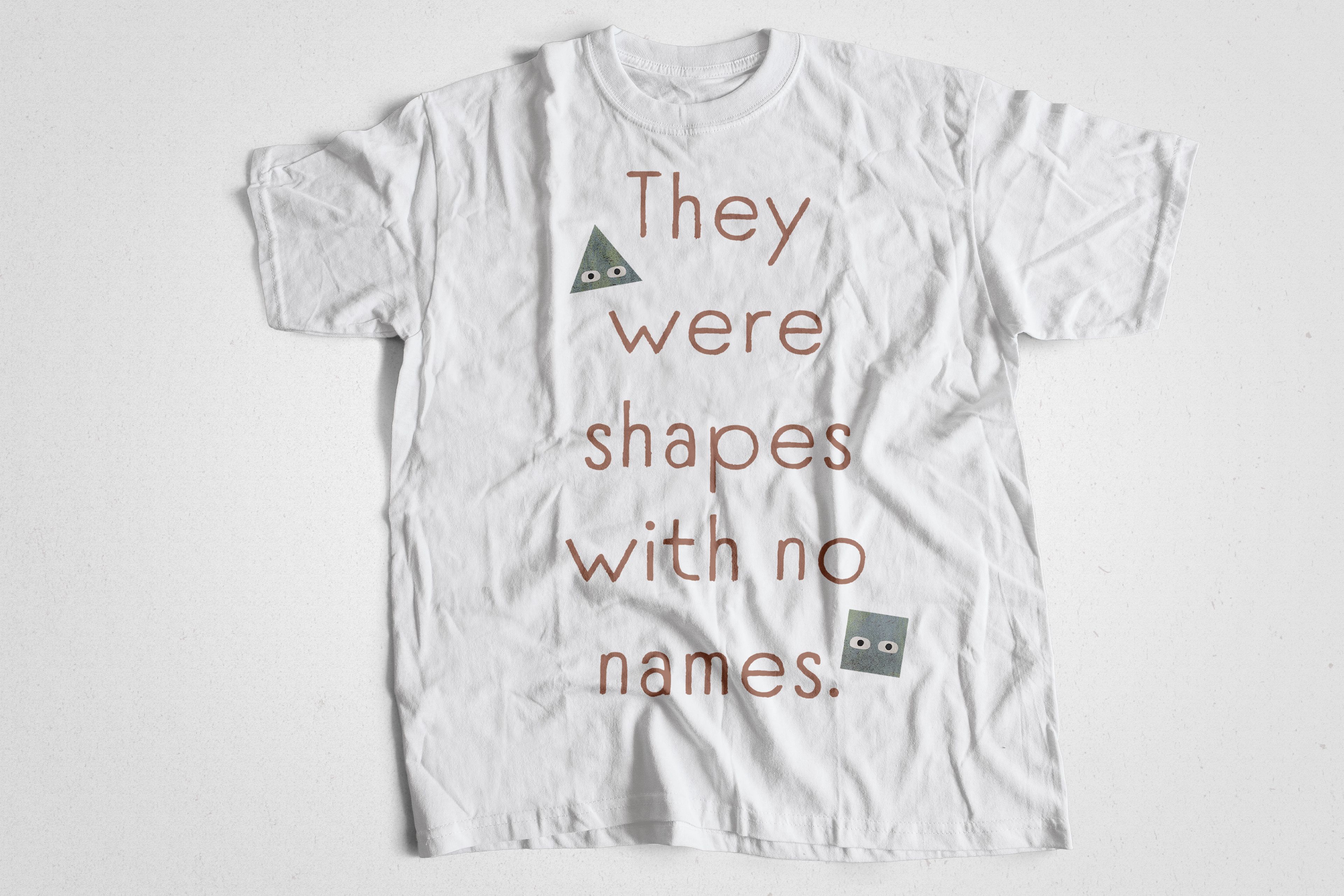
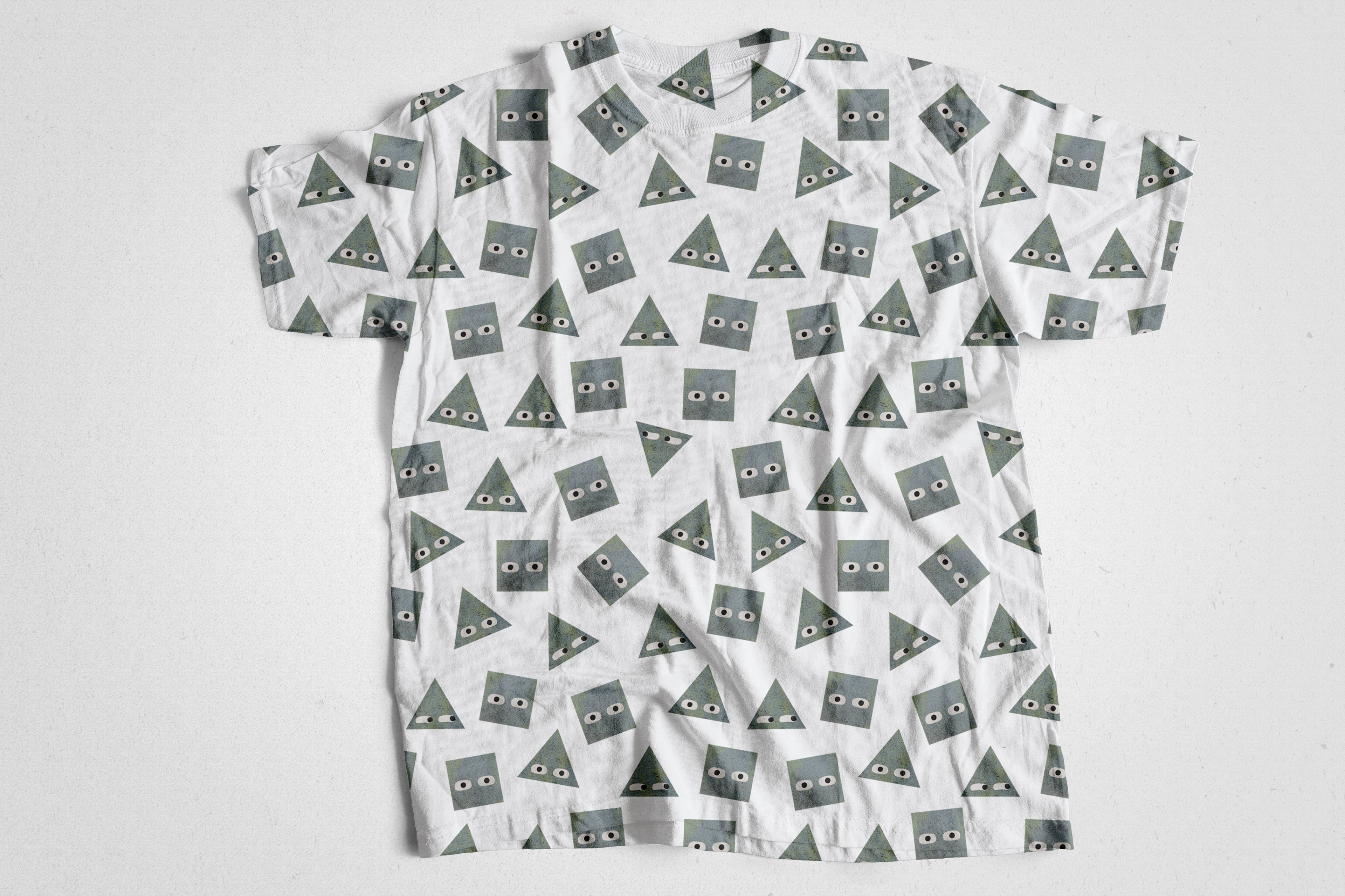
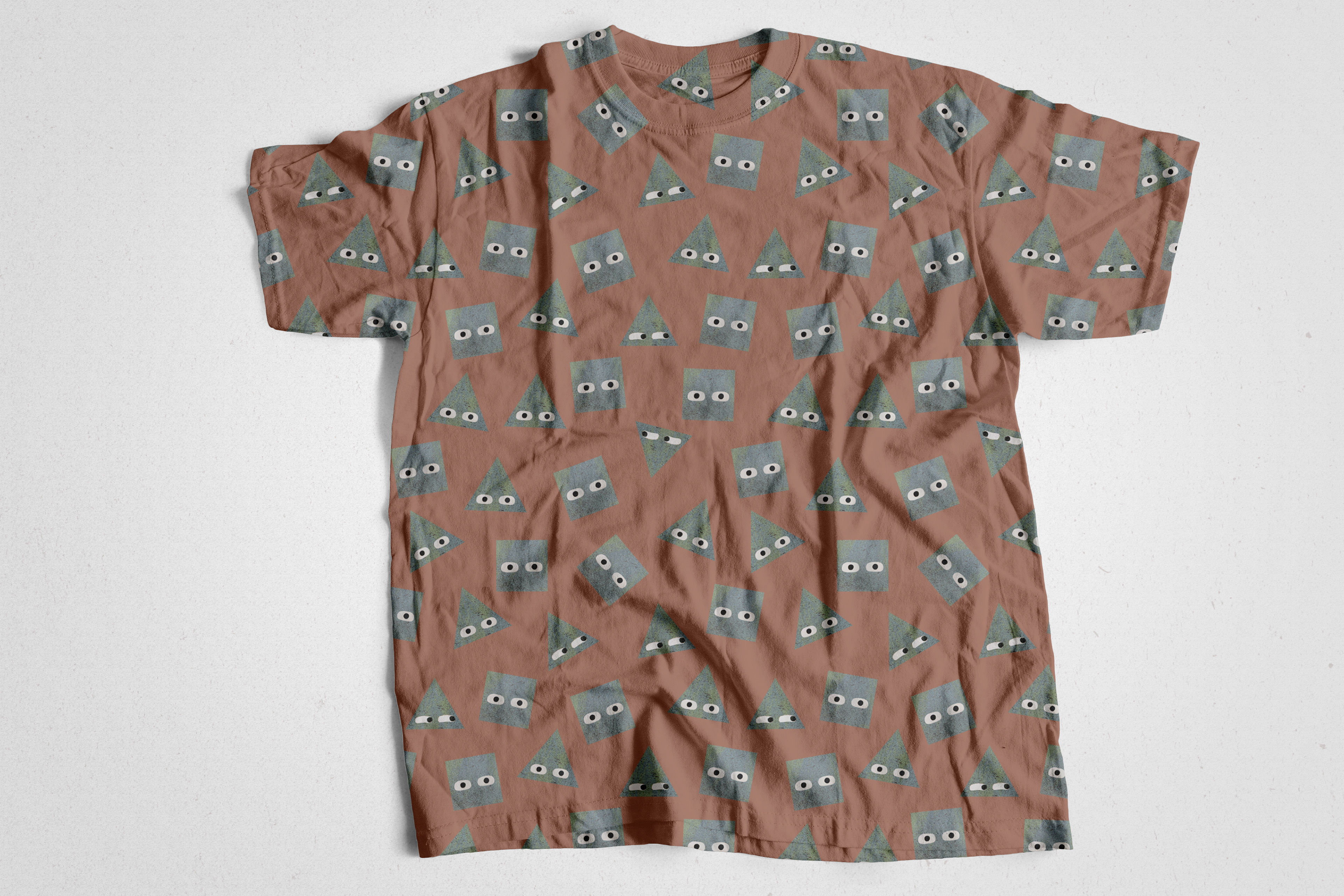
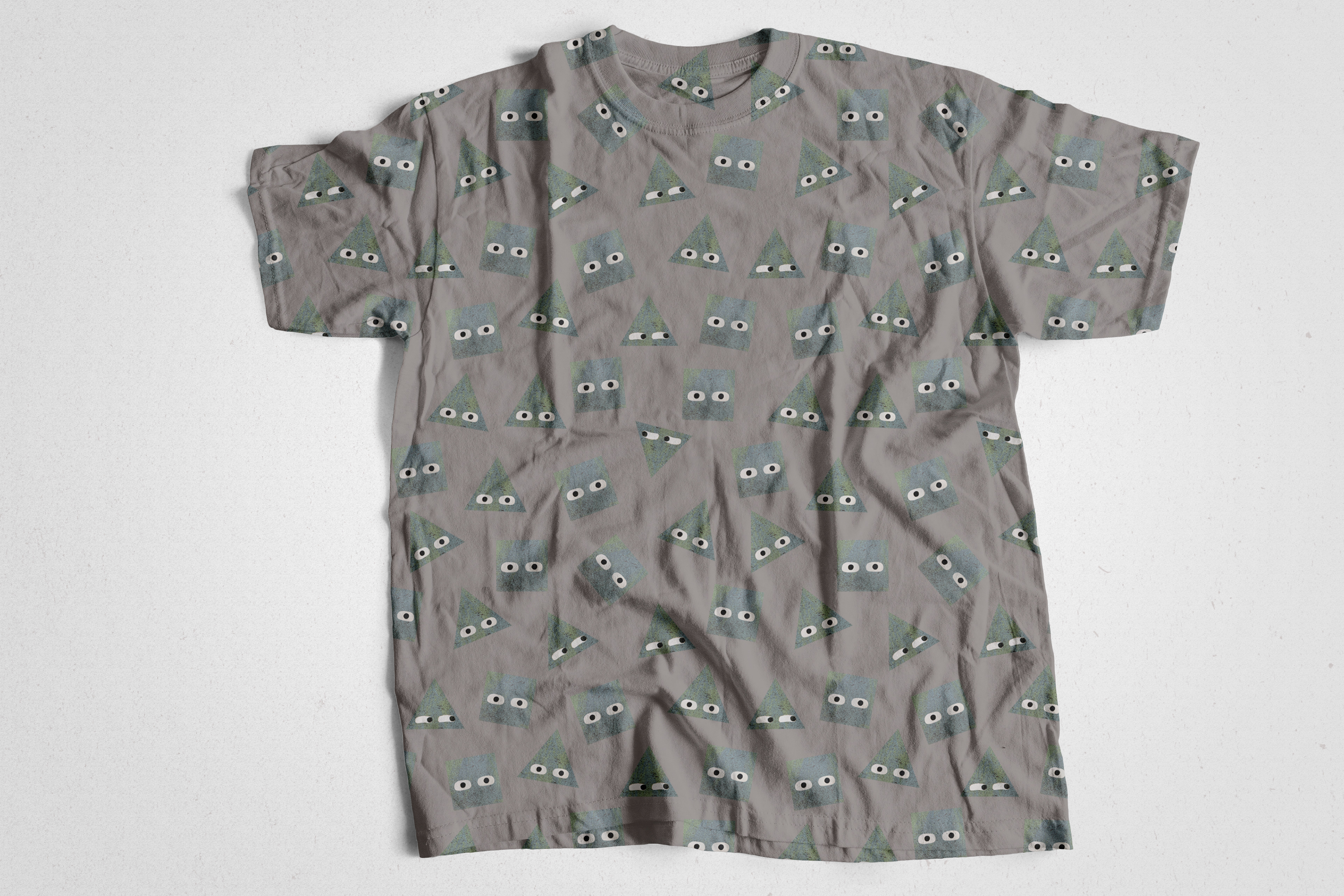
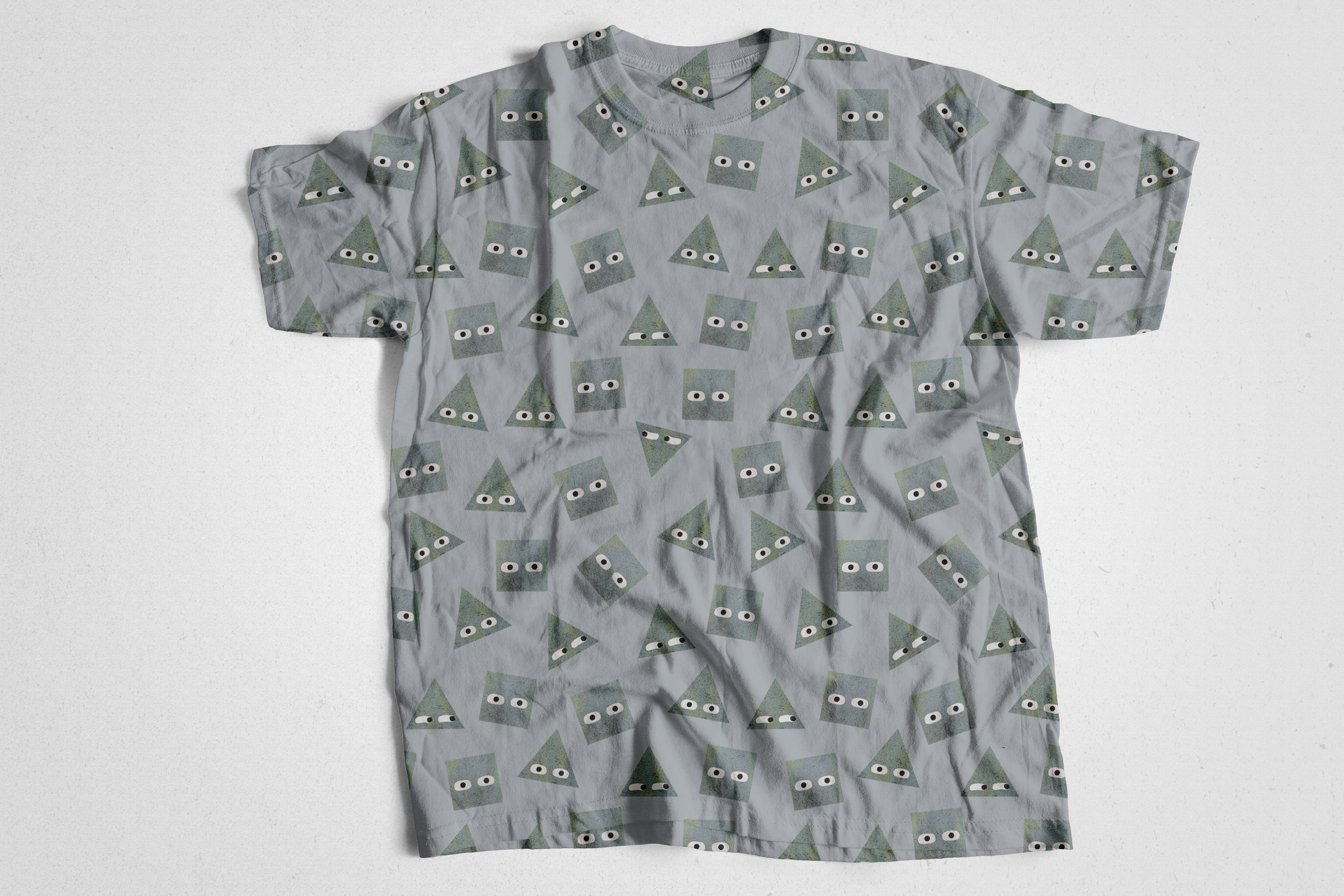
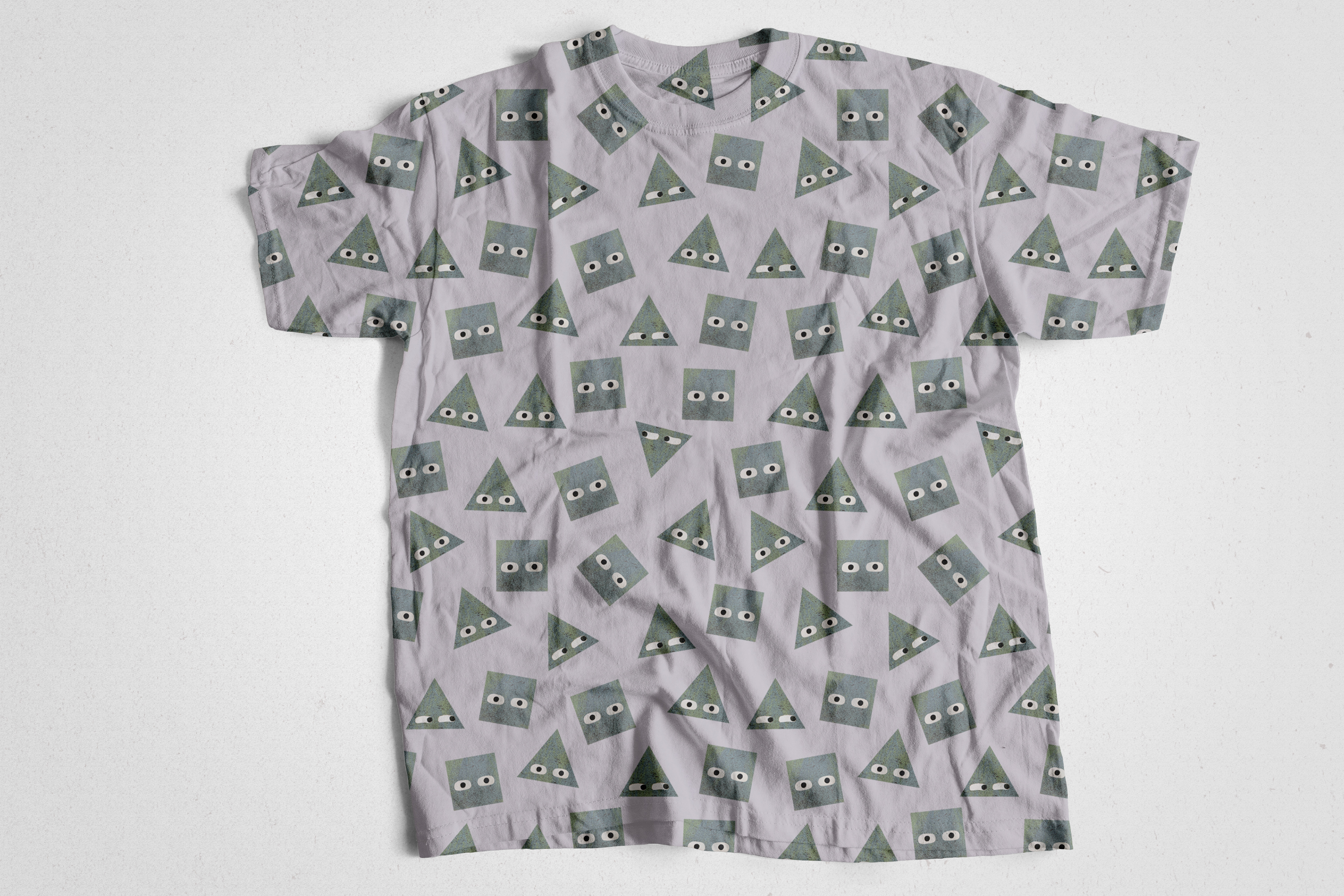
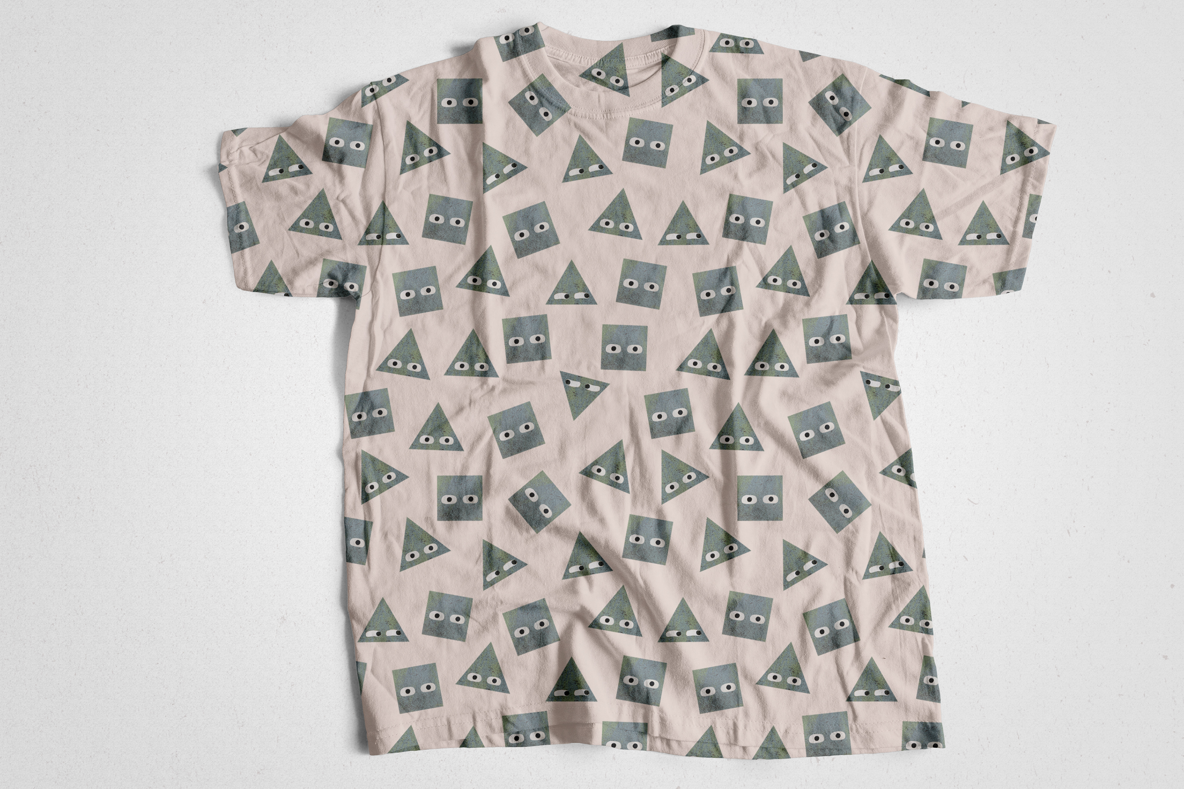
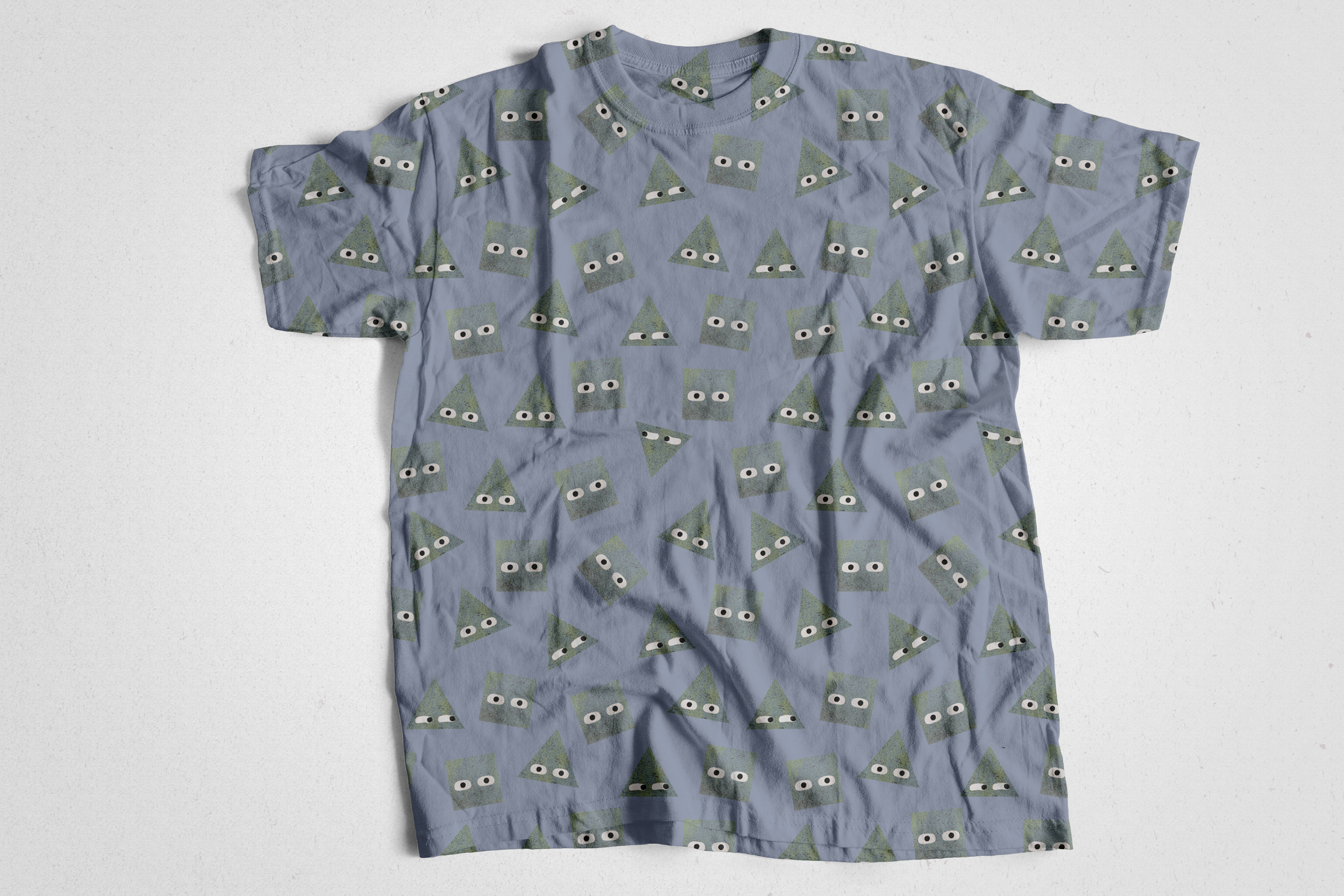
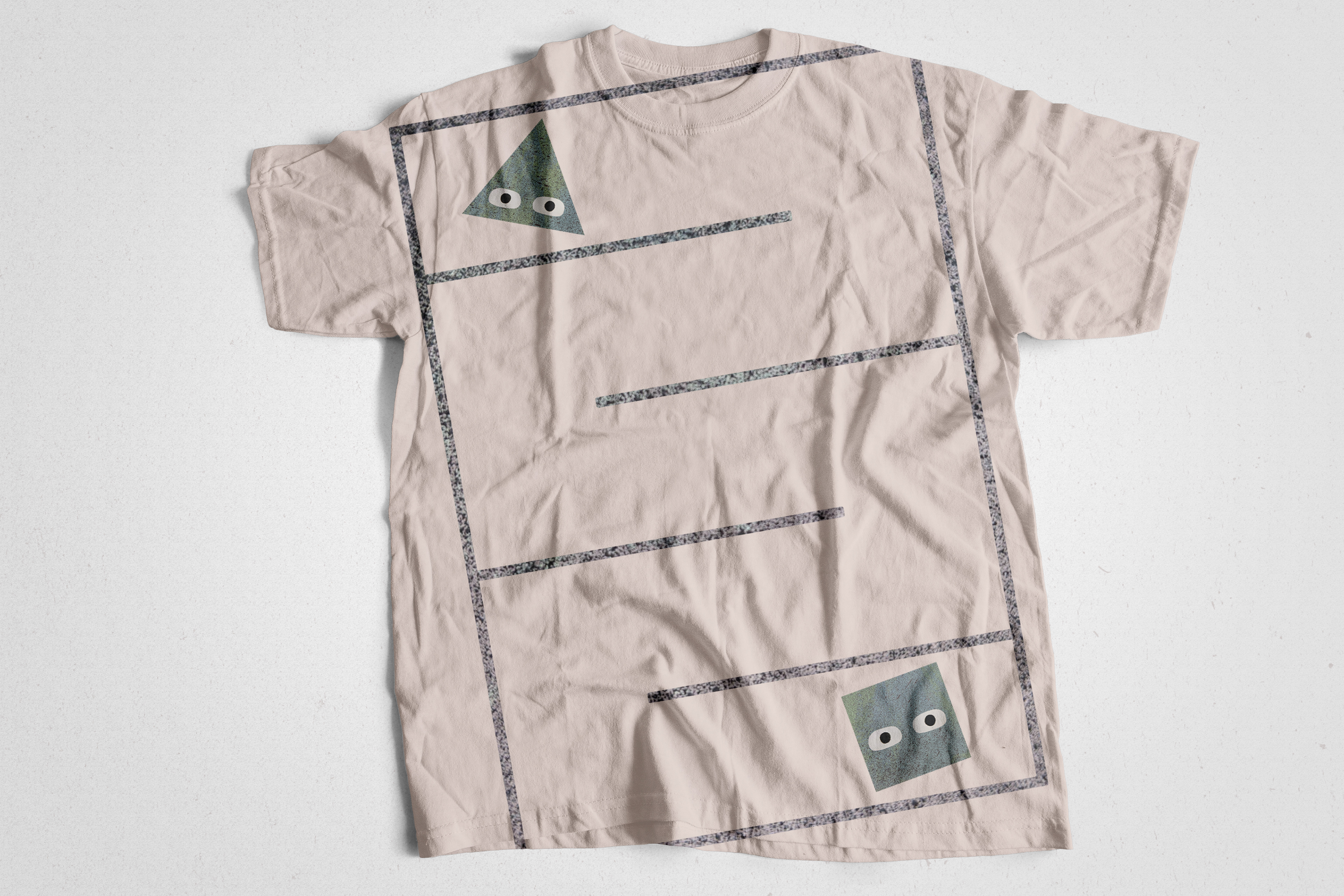
Promotional merchandise was also designed utilizing the concept, the title, the content, and illustrated patterns.
Des produits promotionnels ont également été conçus en utilisant le concept, le titre, le contenu et les motifs illustrés.


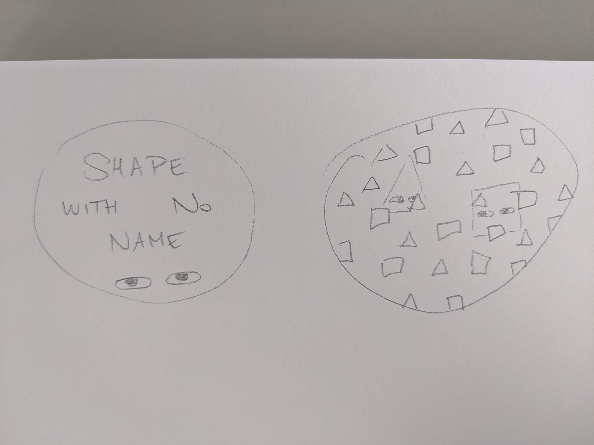
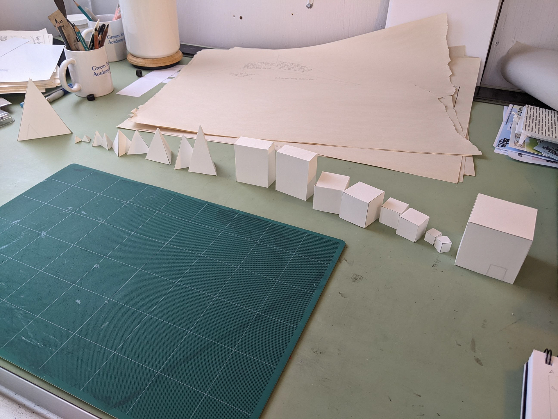
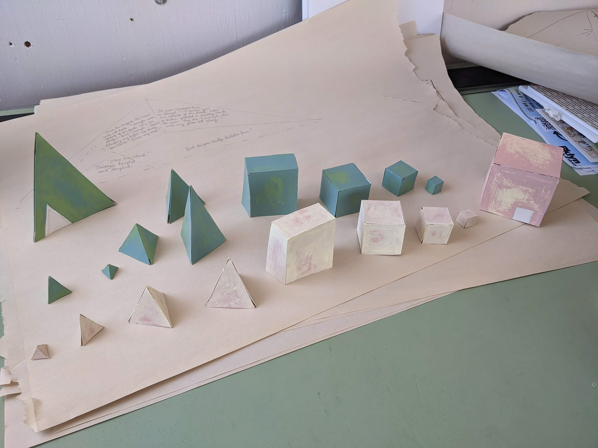
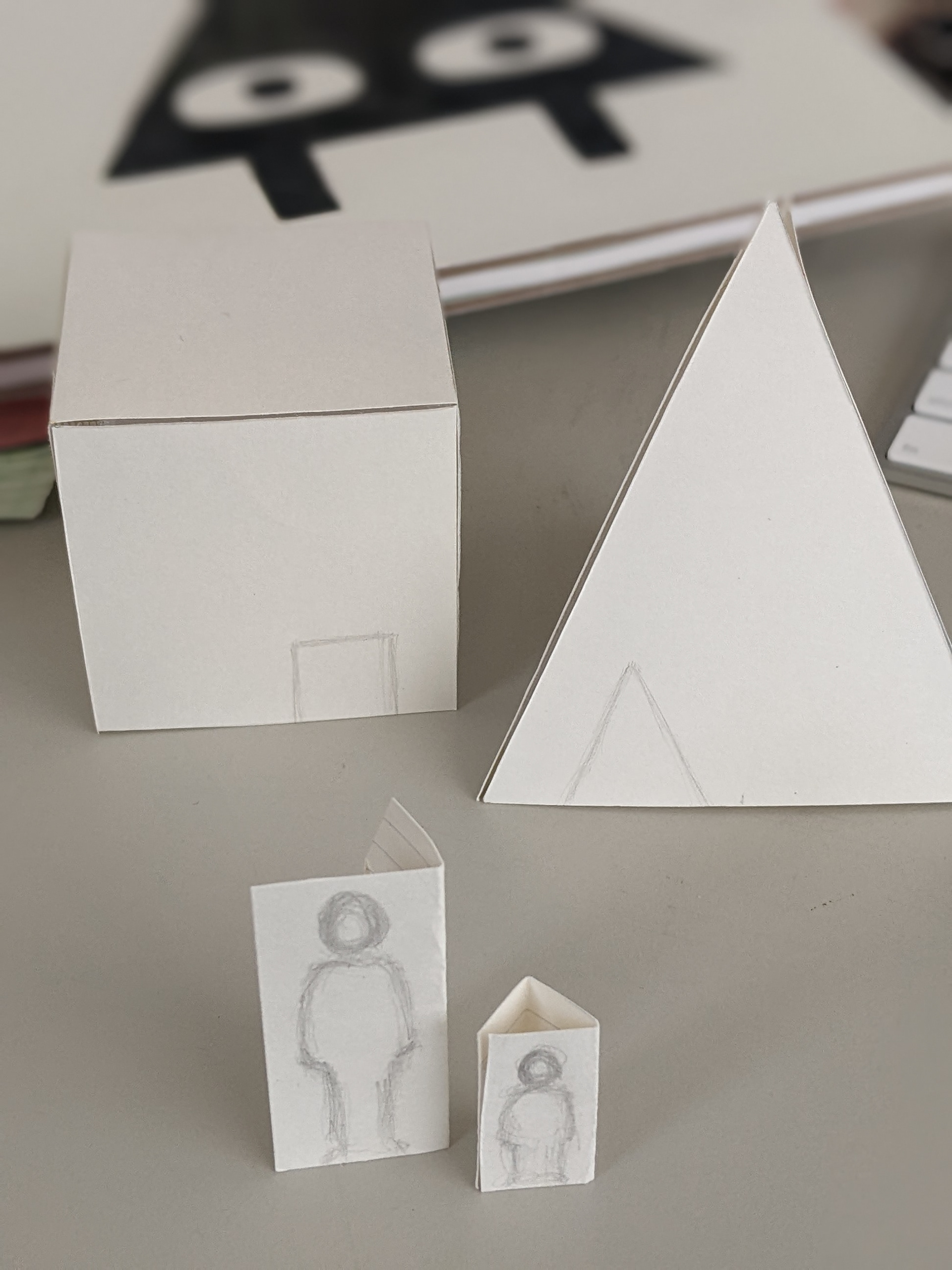
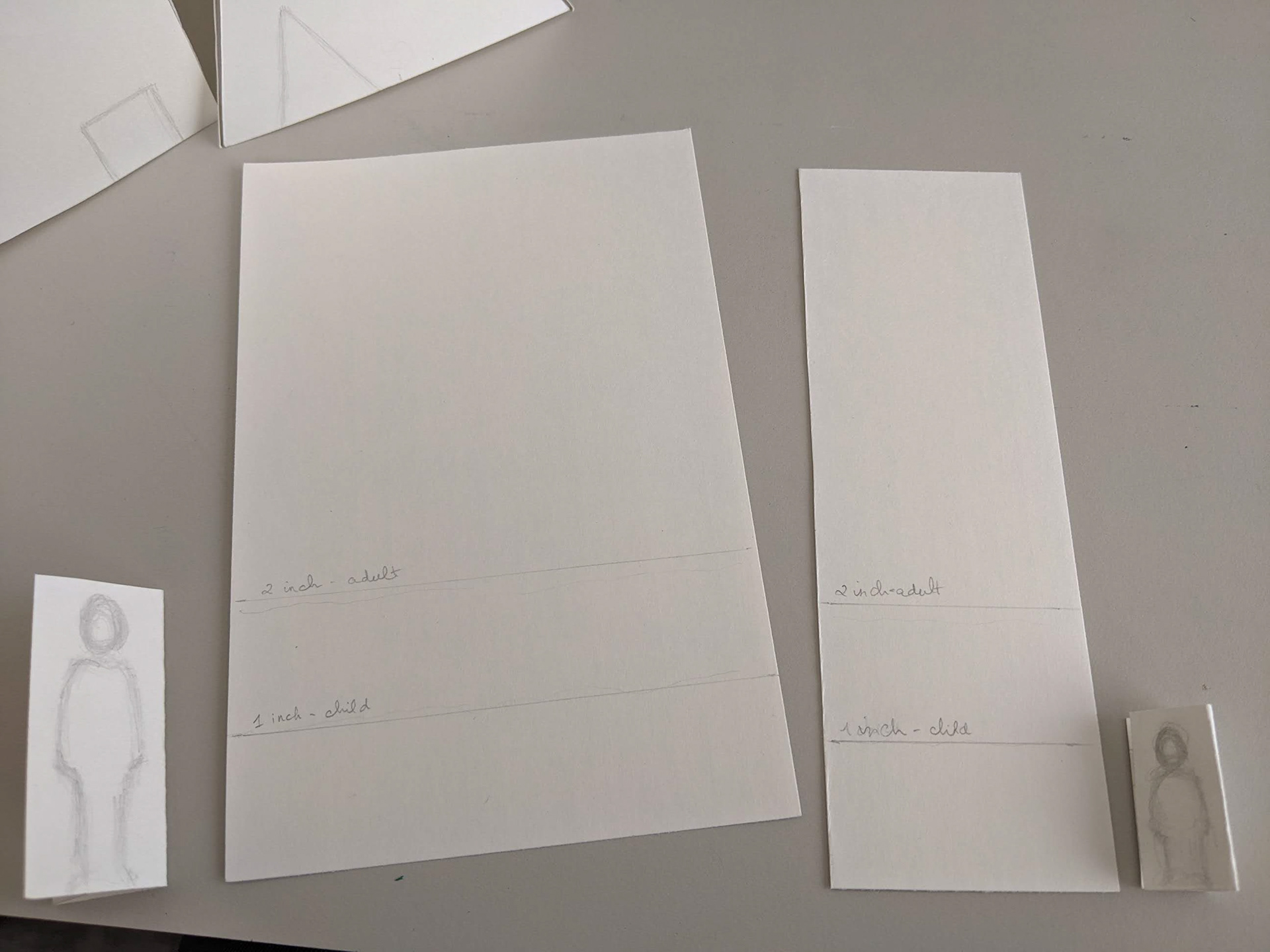
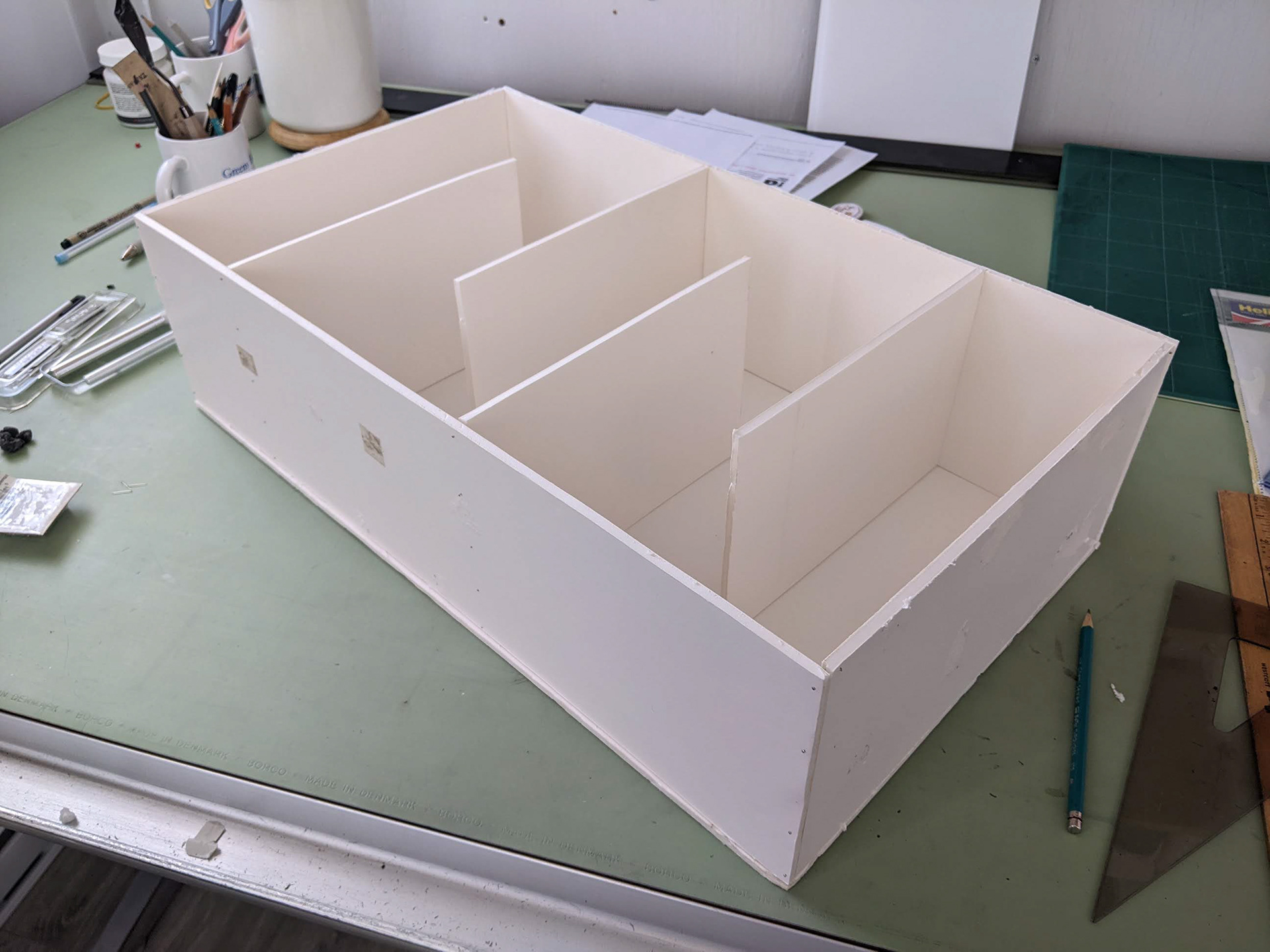
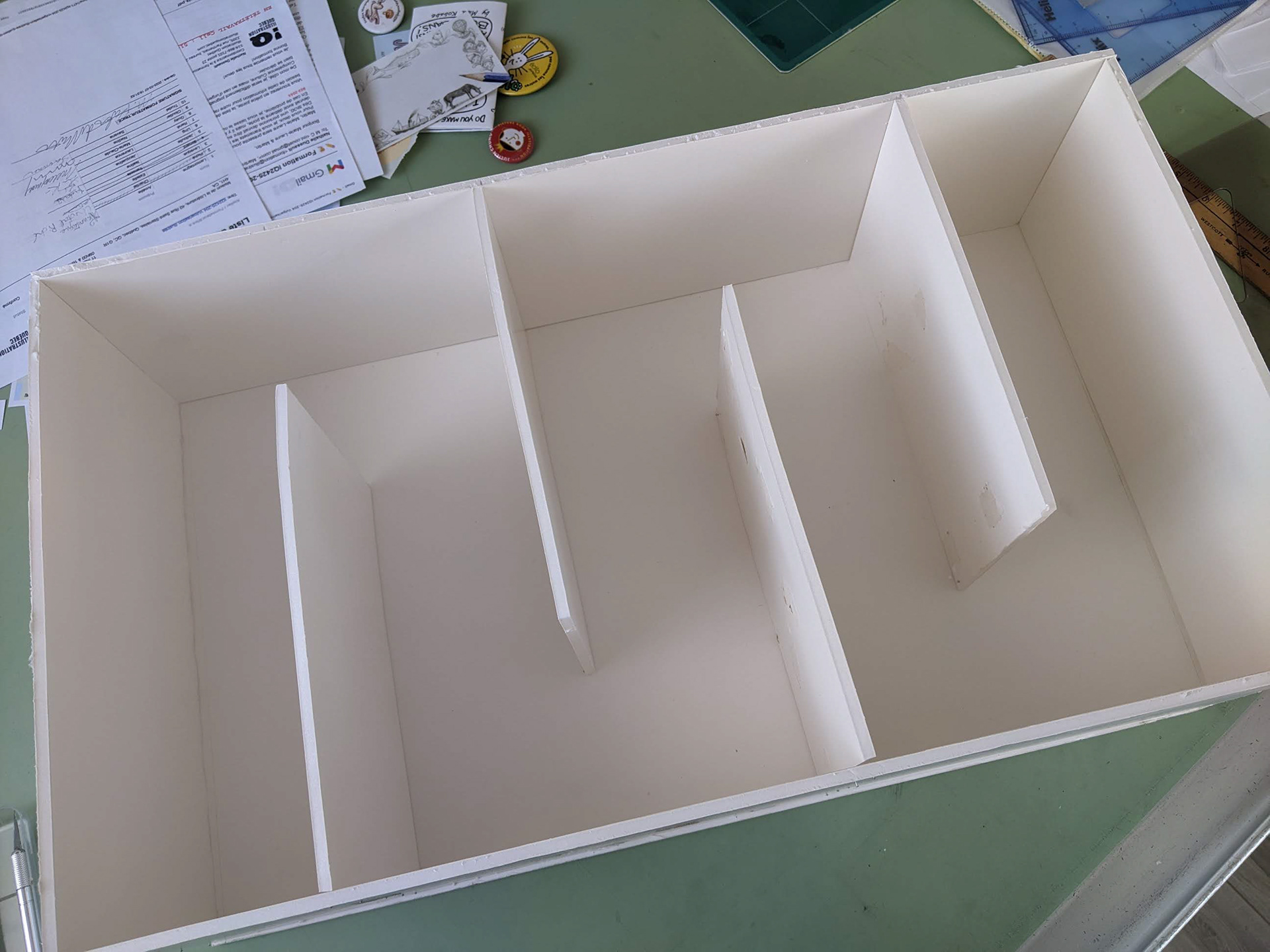
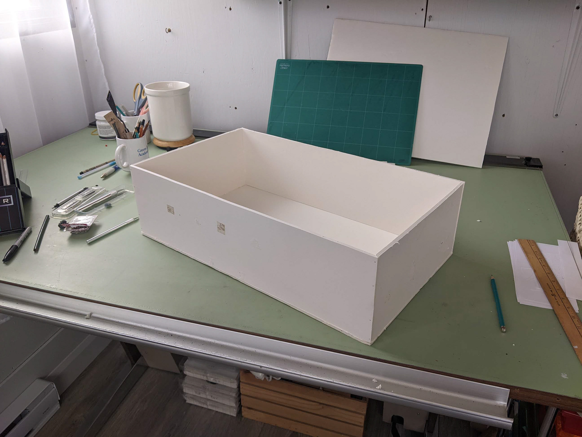
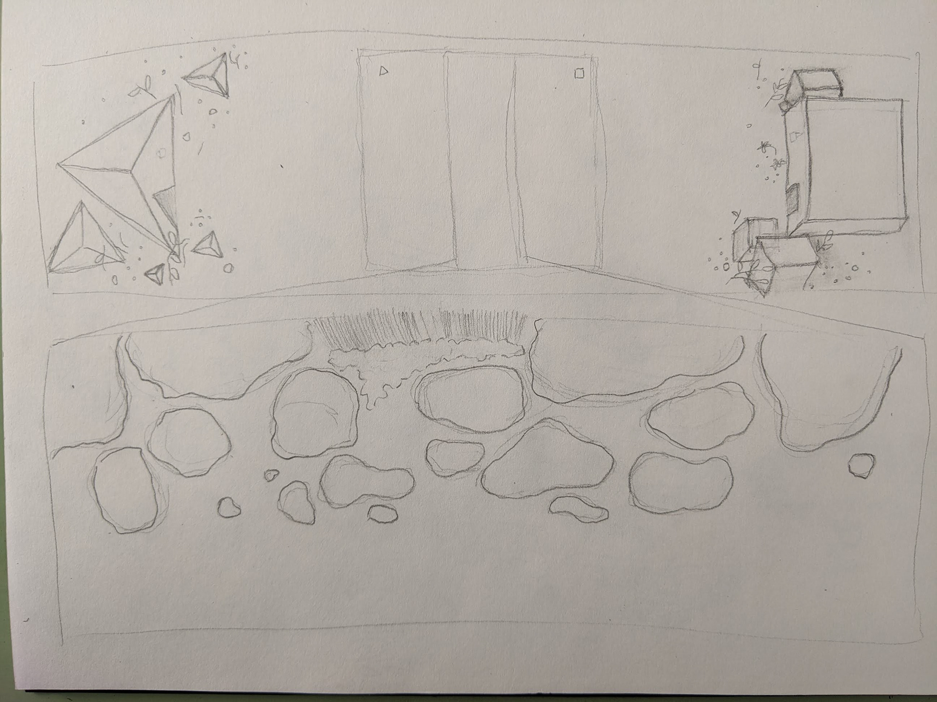
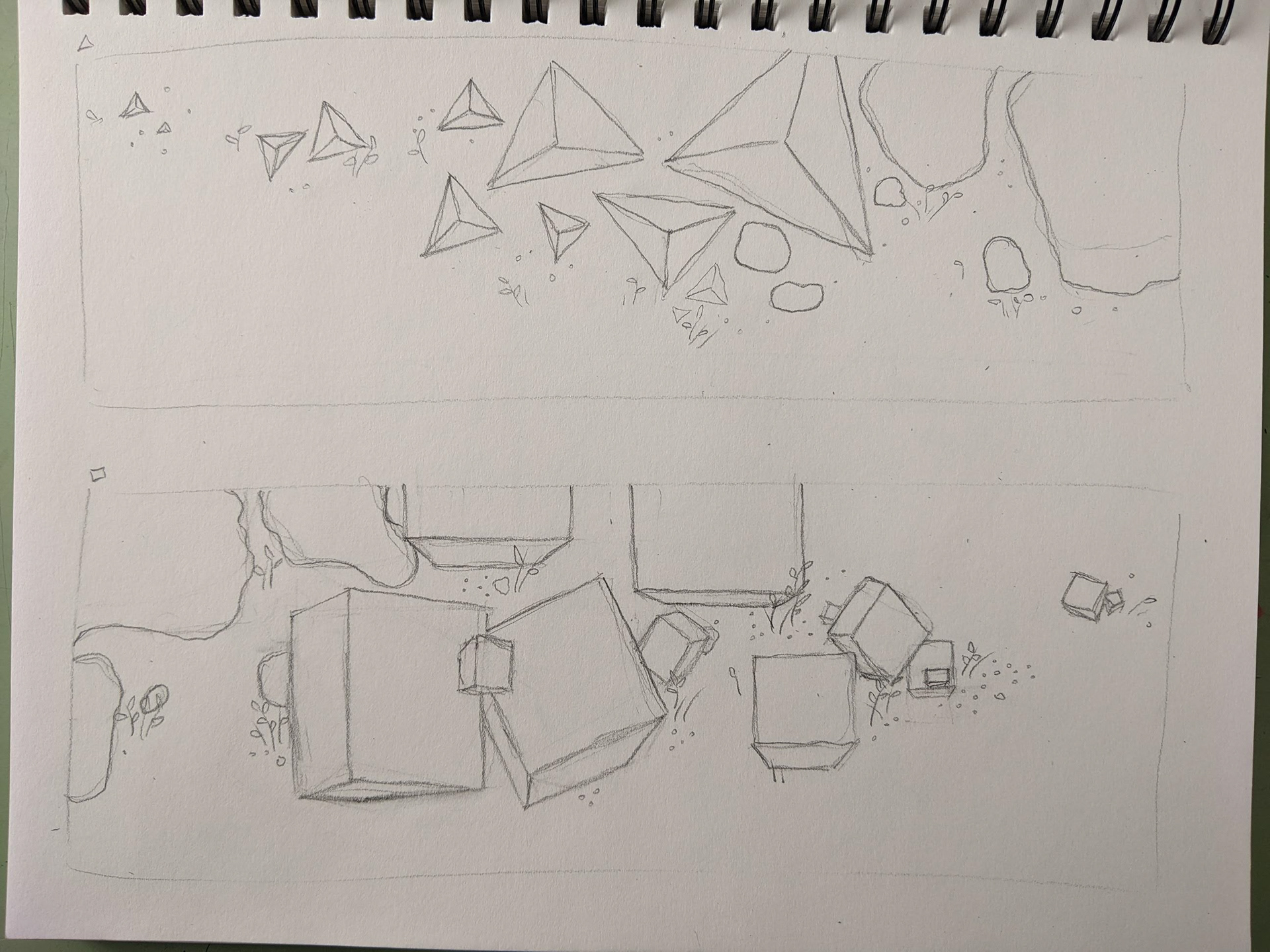
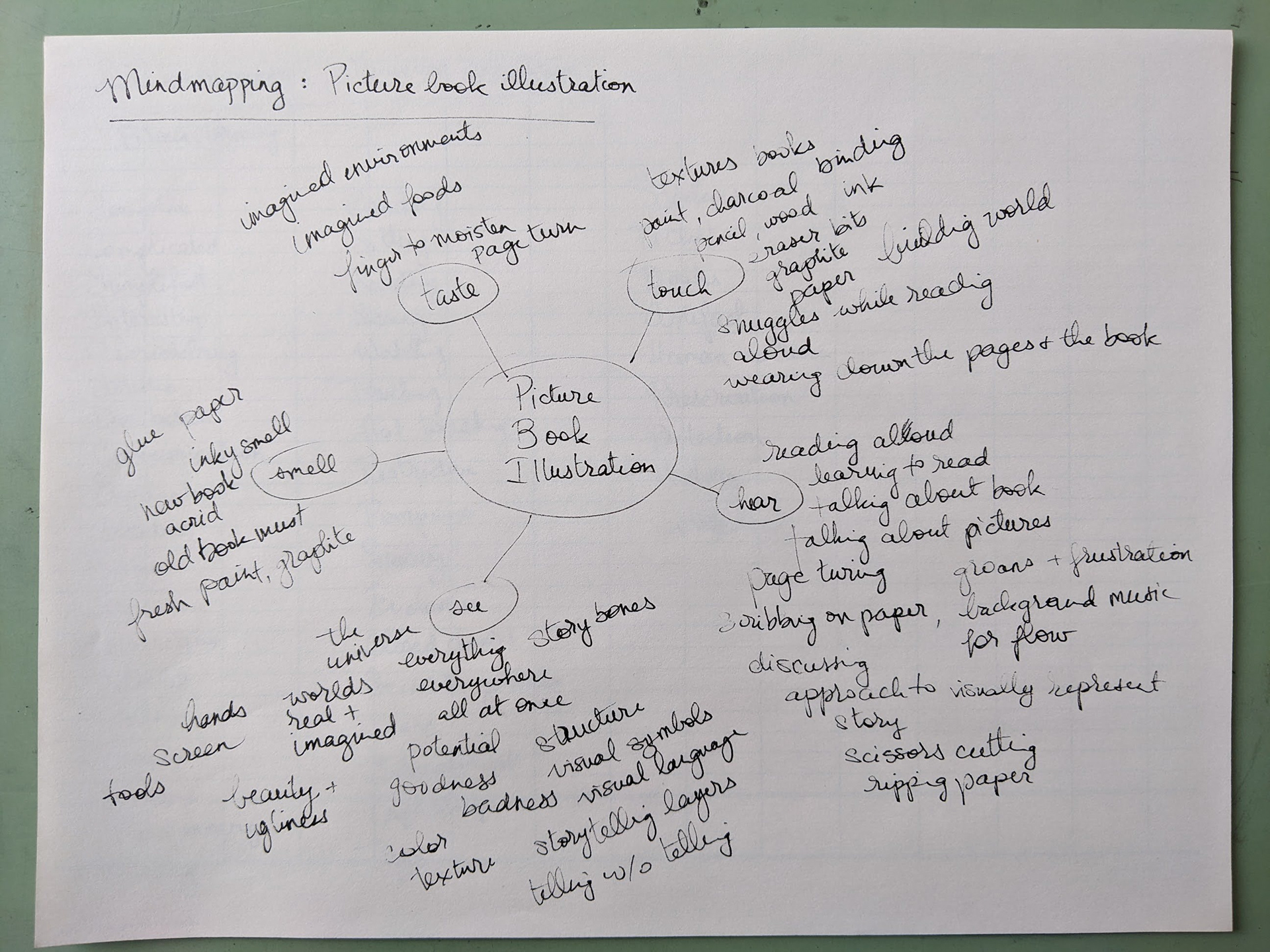
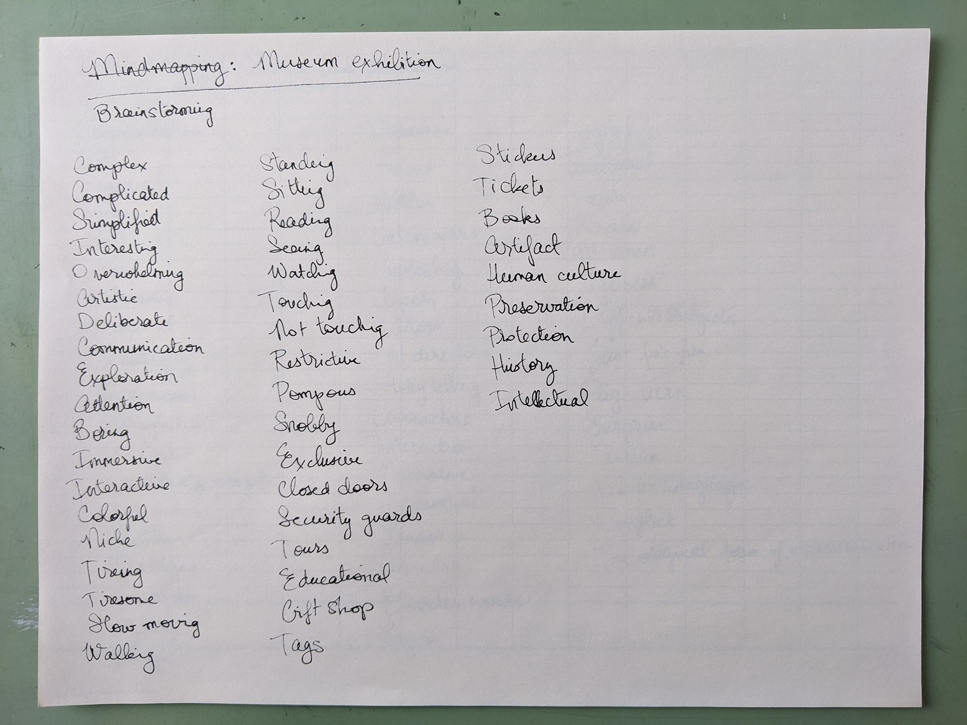
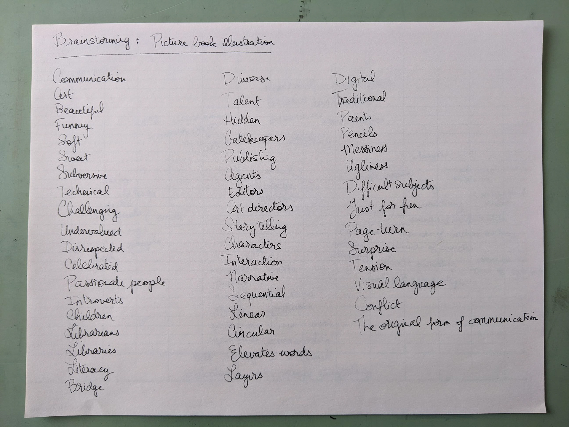
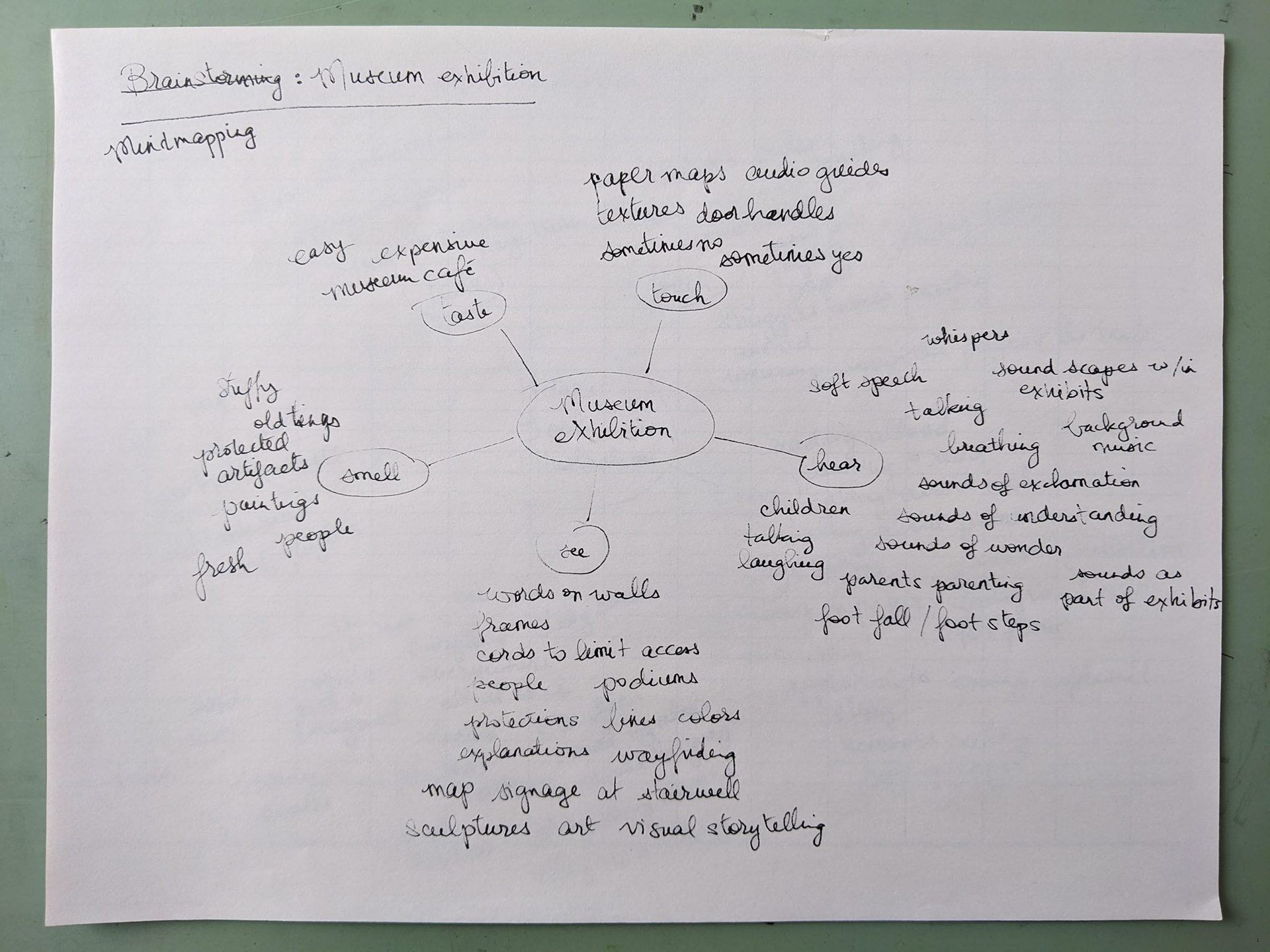
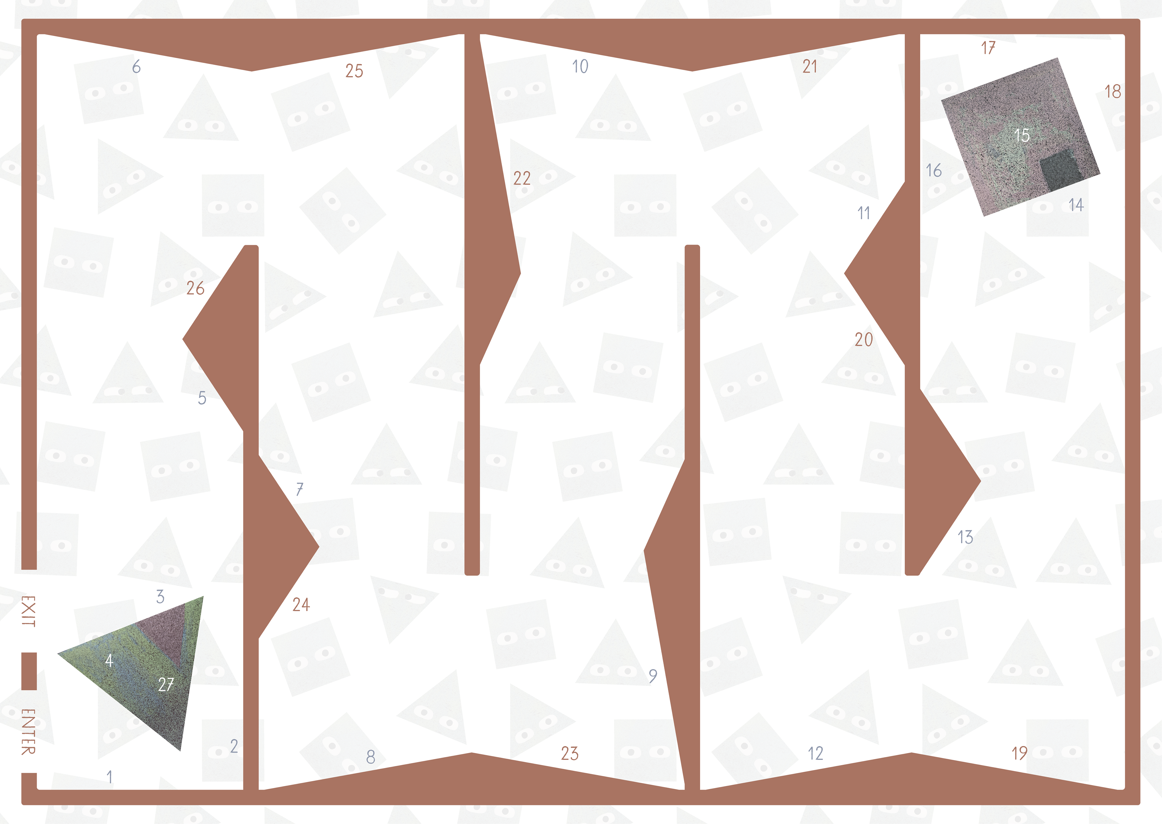
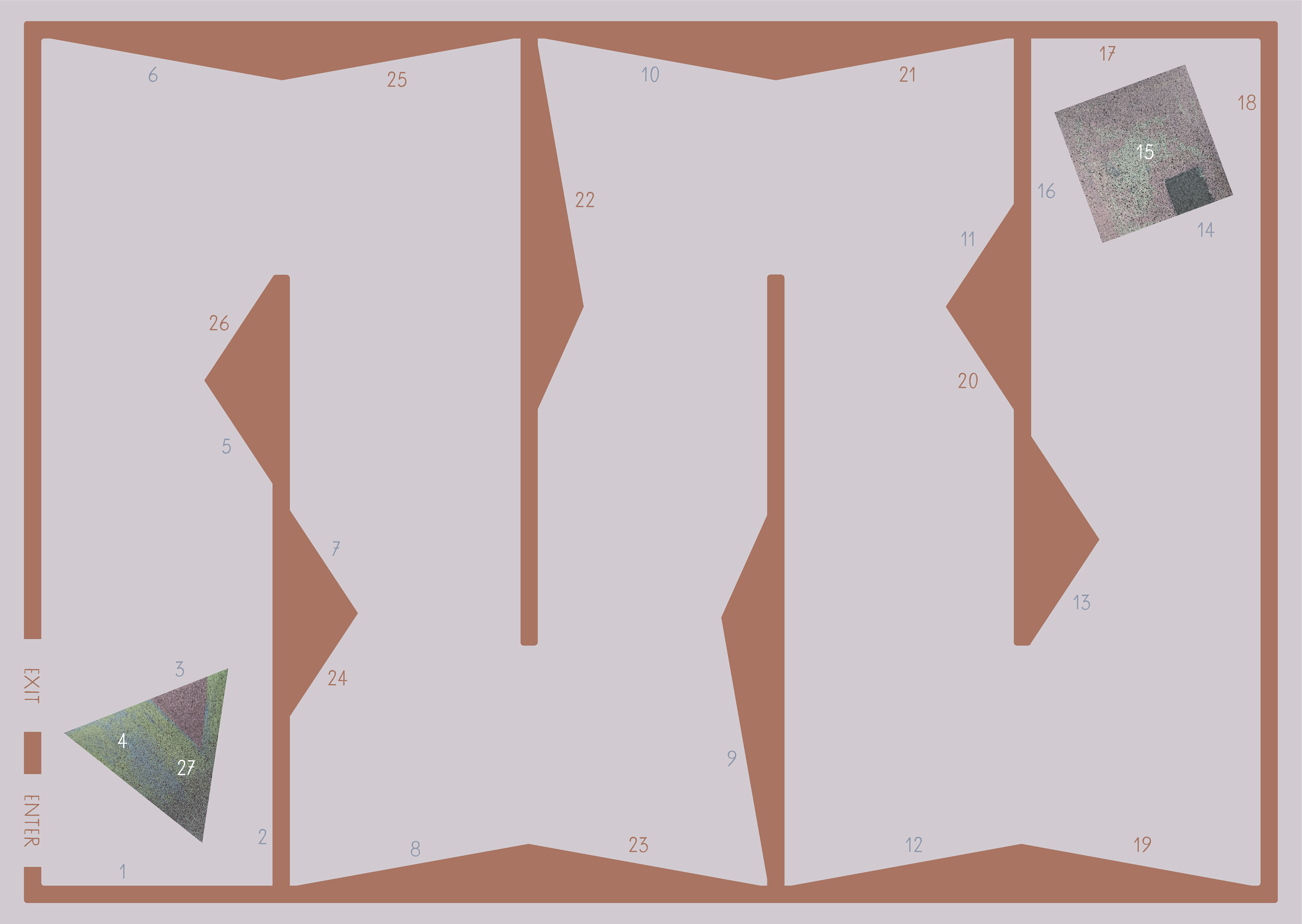
Process documentation:
Documentation du processus :
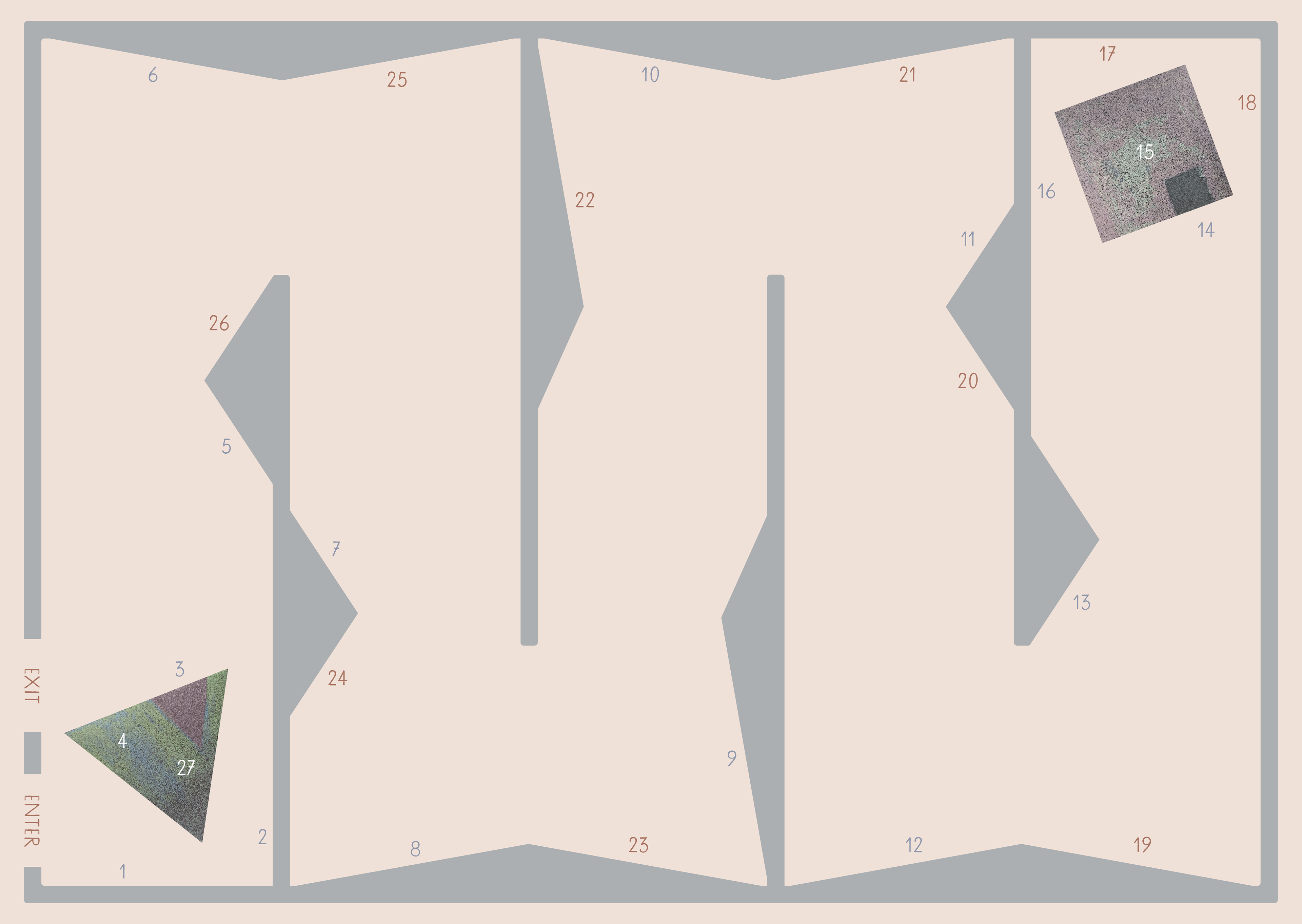
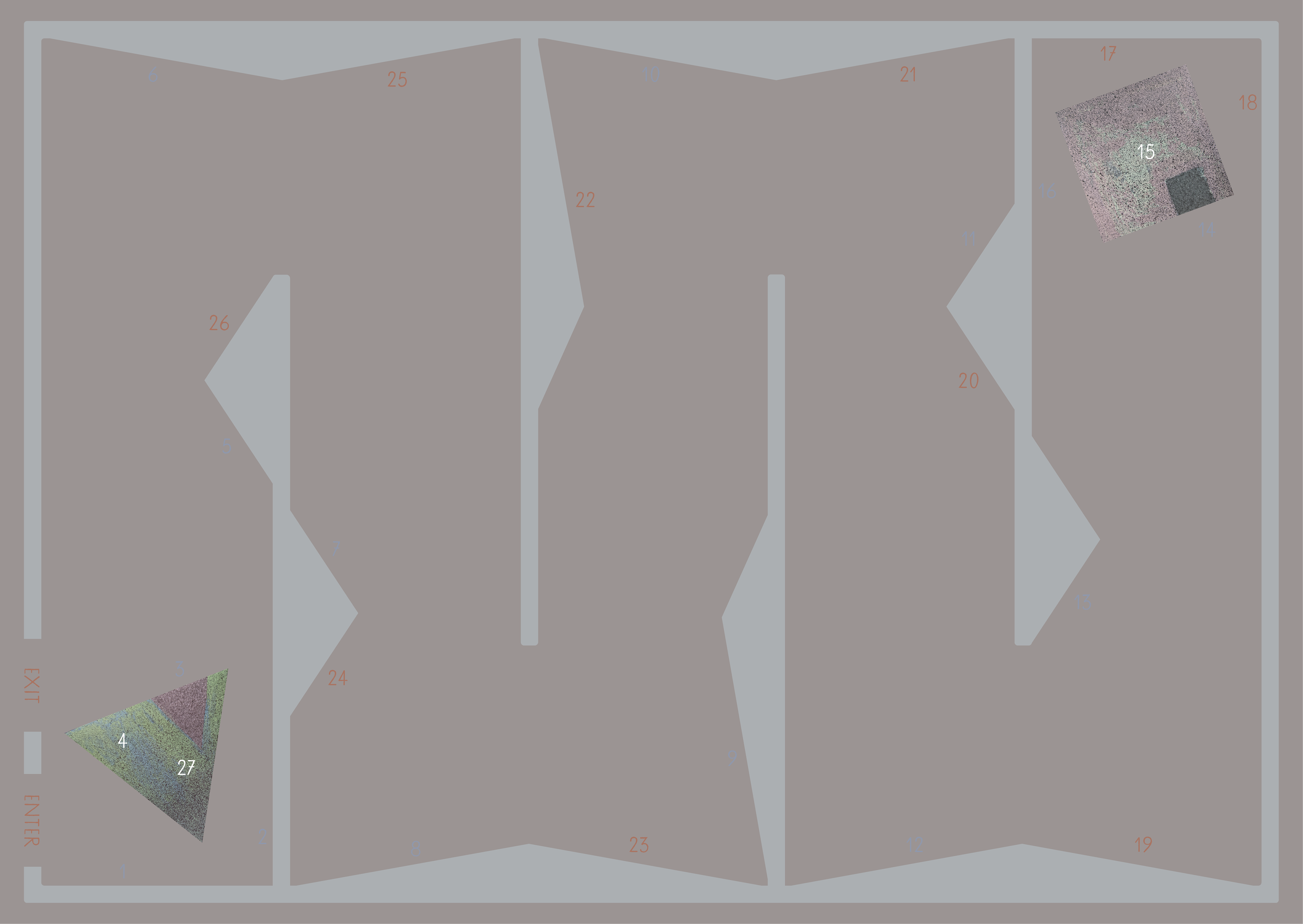
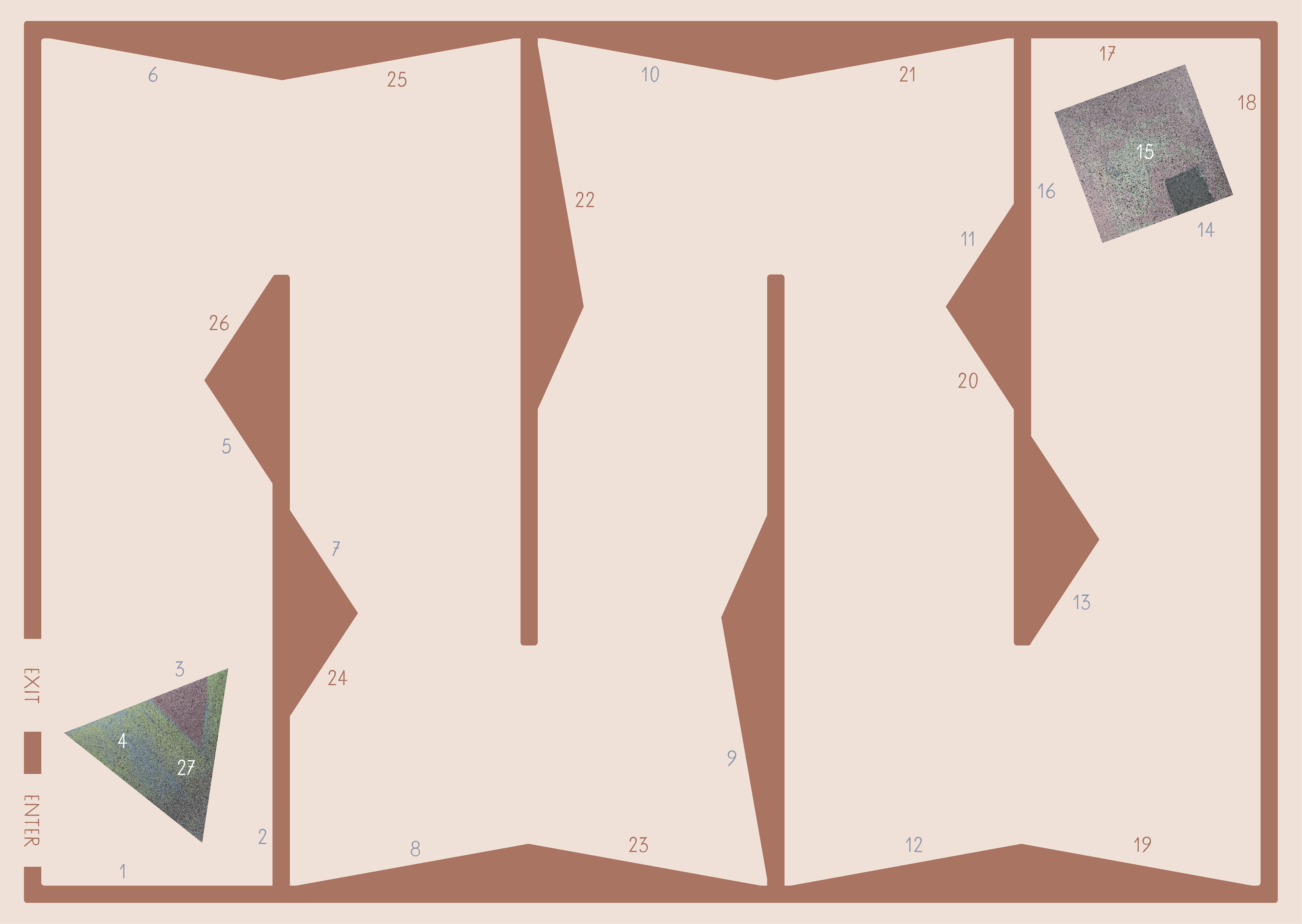
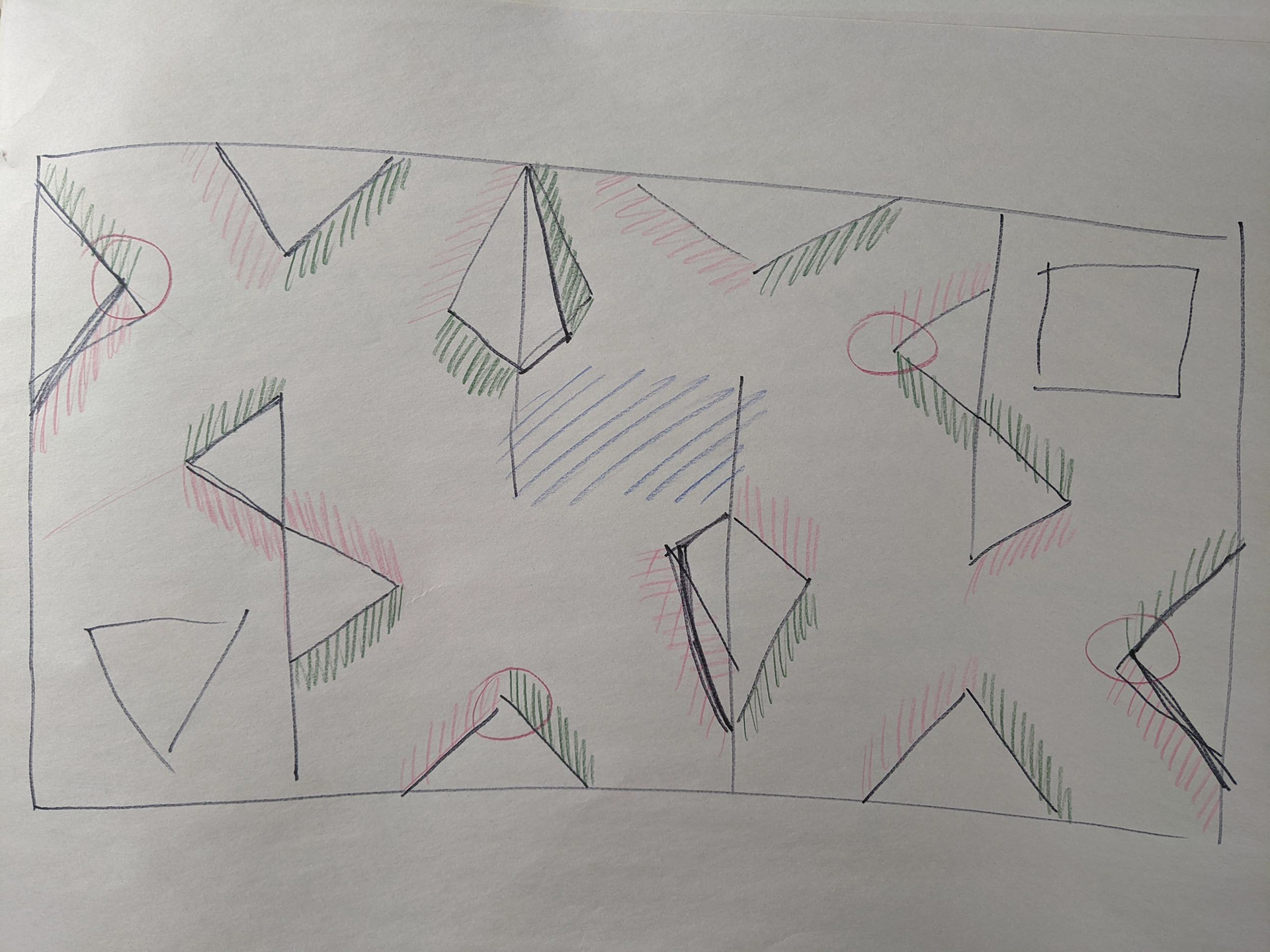
Abandoned designs:
Conceptions abandonnées :

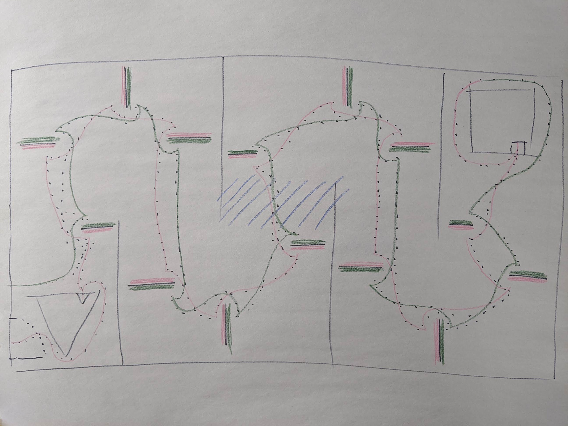
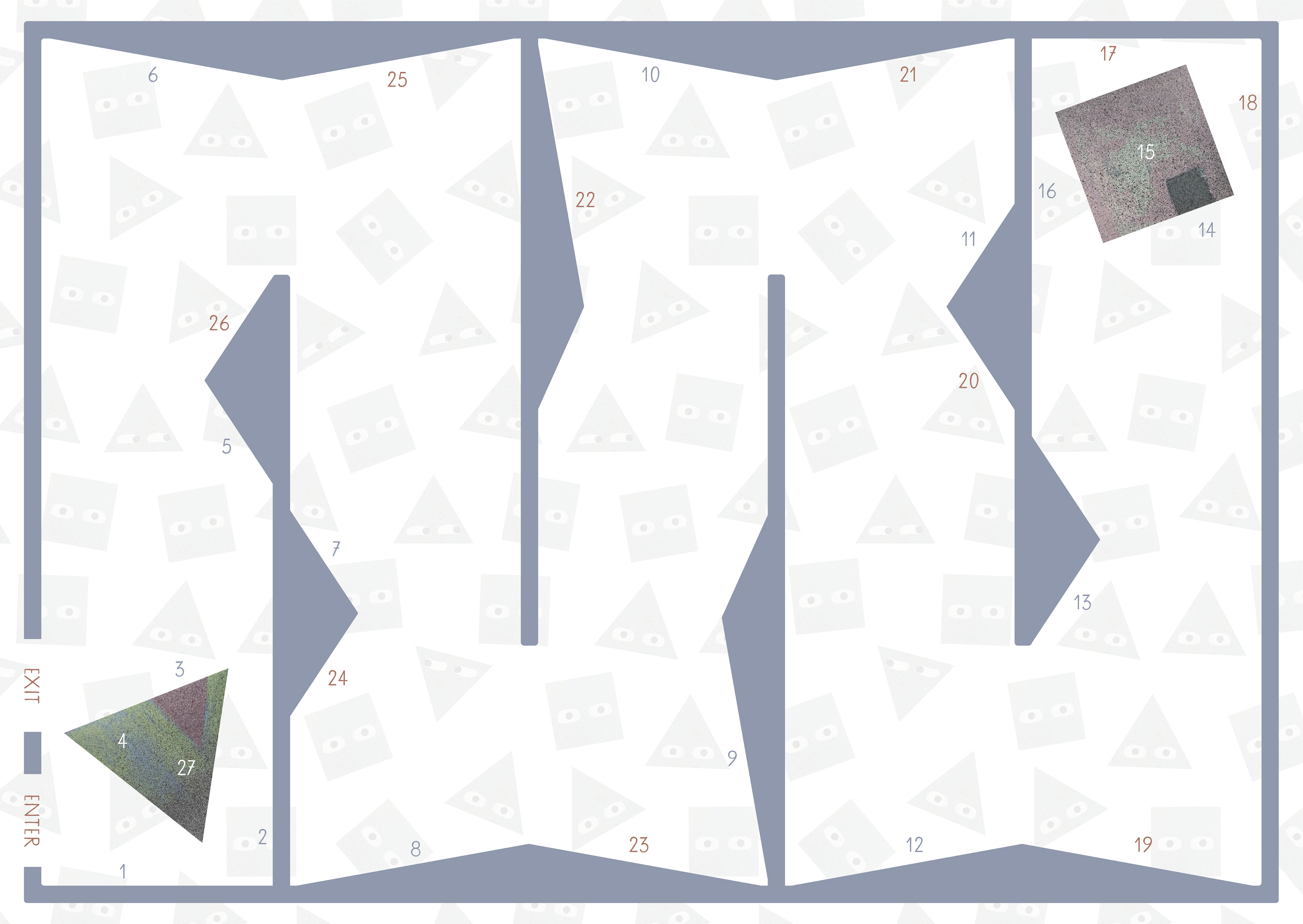
Process documentation:
Documentation du processus :